Possi ice-cream parlour by Antonio Gardoni, Brescia – Italy
posted by retail design blog on 2011-08-12
Add to collection

History
Possi ice-cream makers is a family run business on the market for the past 40 years catering fresh and delicious ice-creams produced in a artisanal and organic way. The Possi ice-cream never really changed trying to follow trends, it’s still served in generous portions using old style tumblers and adding classic decorations like paper umbrellas and coloured straws. It’s a joy for the eyes and immediately brings back memories from childhood’s holiday-arcadia period. No minimalist experiments, no dietetic tricks, no fashion flavours, just a pure creamy and fruity delicious food in the field of Italian ice-cream’s tradition.

Concept
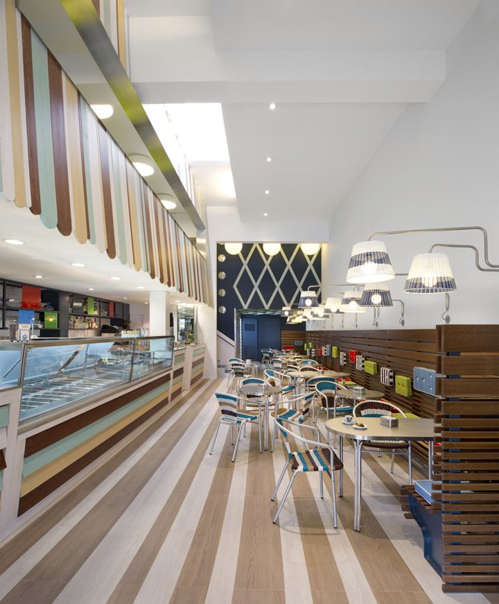
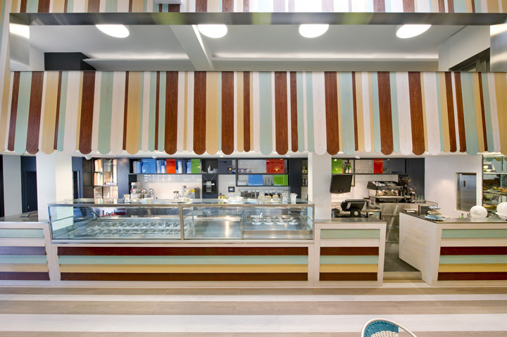
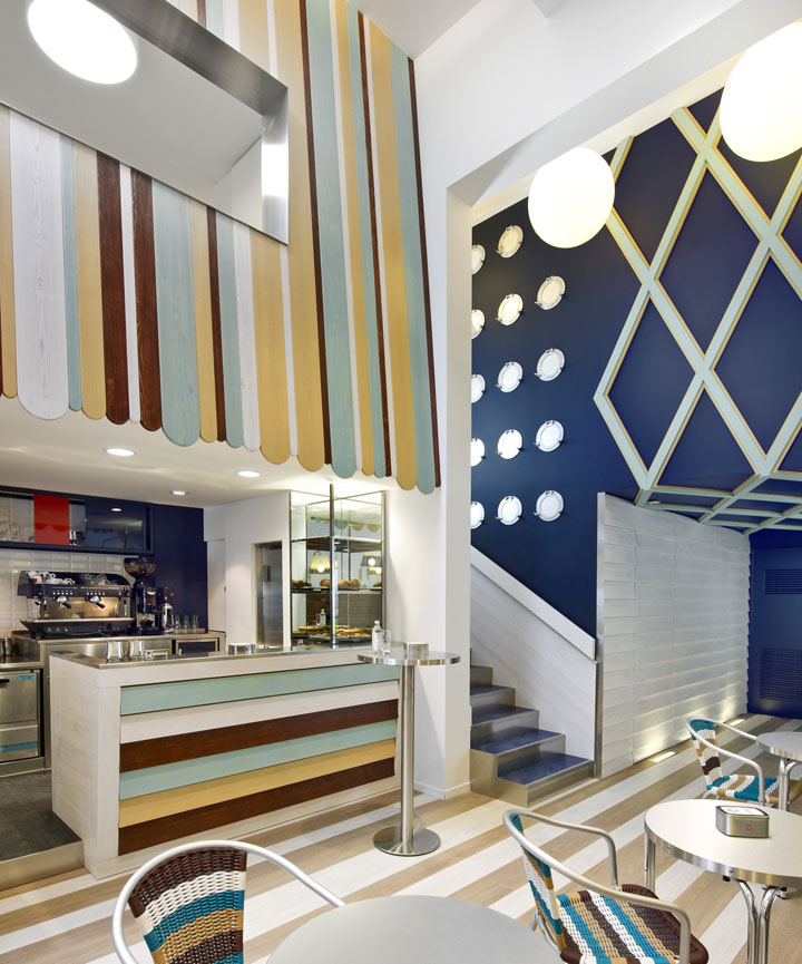
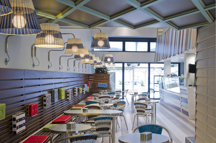
The idea behind the new Possi ice-cream parlour was to rethink the 50’s and 60’s spirit, shapes and language typical of “Riviera” holiday: pastel colours, geometrical patterns, natural and plastic materials, navy moods, etc. Antonio Gardoni’s idea was to refresh a past world without being literal but playing more with a mood that resembles past childhood’s memories in a contemporary updated way. References related to the product itself have been used as well like the wood stick to hold ice-lollies becoming the wood planks covering the walls or the ice-cream wafer geometries turning them into three-dimensional patterns.

Space
The Possi ice-cream shop always maintained the same address becoming a landmark for ice-cream aficionados and the space expanded naturally adding neighbours properties to increase the size of laboratories, storage and serving area. Antonio Gardoni’s studio was called to completely renew and rethink the entire space in order to give a clearer identity to the shop and improve its functionality and image.

The public space occupies a floor area of around 200 sq. m. and it’s divided in three main areas:
* serving and display area (located on the left side under the mezzanine)
* entrance and main central consumer’s area (occupied by the long bench, seats and tables)
* mezzanine area (above the display counters)

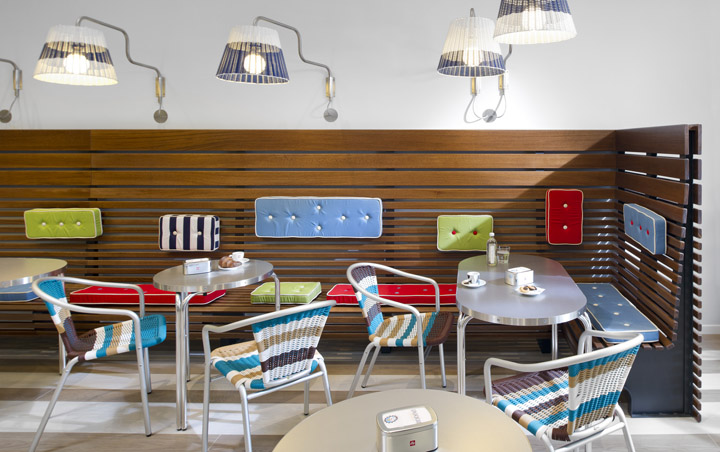
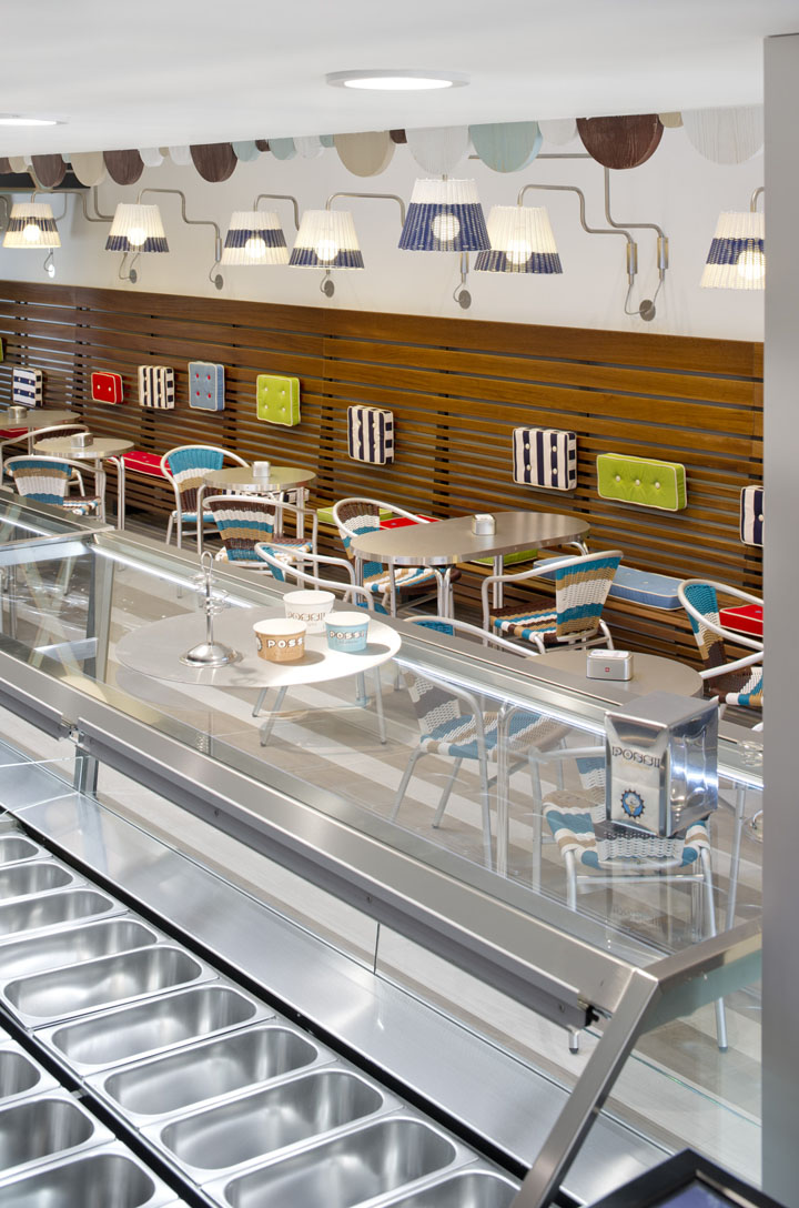
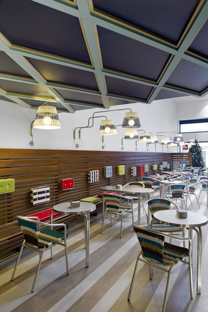
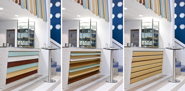
The whole space is characterized by the very tall ceiling (7 m. tall) with natural skylight, giving to the main room a airy clean feeling, on the right wall runs a long wood bench (15 m.) made to measure with differently sized wood strips and coloured cushions. The classic bar tables and chairs were redesigned with endless colour combinations using plastic wicker to match the adjustable lights fixed on the right wall.

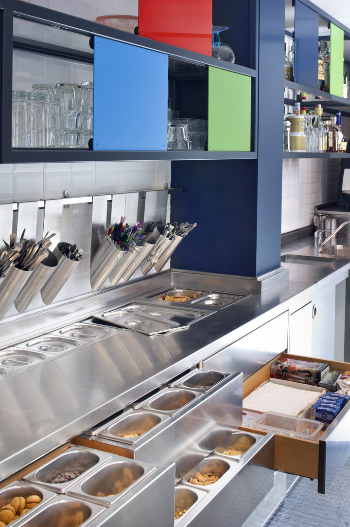
On the left side the ice-cream display and the counters are covered with wood planks in three different colours, these planks can rotate to create different colour combinations, above the counters an inclined wall is covered with wood strips with various thickness and colours to contain the mezzanine floor and to frame the serving area. An horizontal cut divides this wood strips wall to allow a view for the consumers from the mezzanine, the “cut” is defined by a deep stainless steel frame. The back of the bar counters and display is covered with diamond ceramic tiles and sliding coloured panels to hide and reveal the tools and the serving cups.

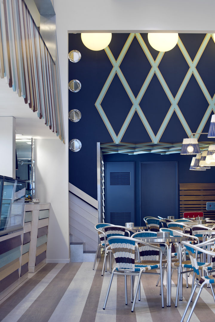
At the back of this main area the blue staircase’s wall becomes a lower ceiling to identify a more intimate zone with accesses to restrooms and laboratories, a three-dimensional lozenge pattern in contrasting colours identify this area. The floor of this main area is made in three different size wood planks alternating dark and light shades.
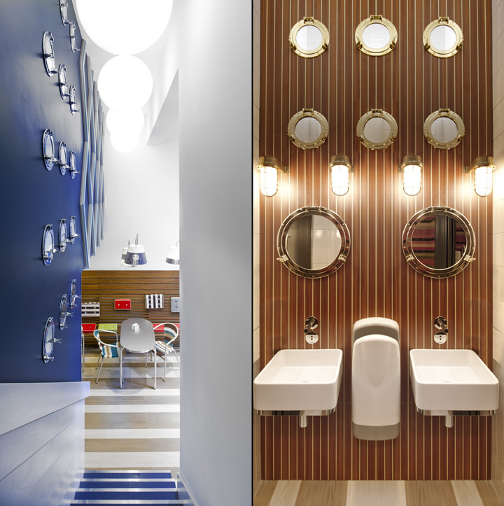
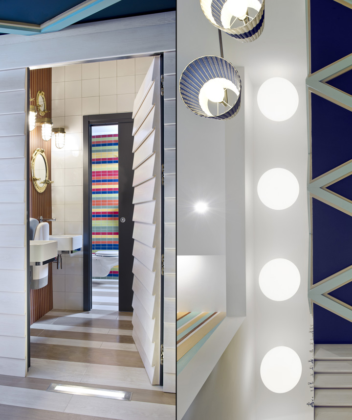
The staircase leading to the mezzanine floor is highlighted with five large ball shaped lamps hanging from the ceiling while on the blue wall a series of brass boat’s portholes are linking this passage to the entrance of the restrooms.

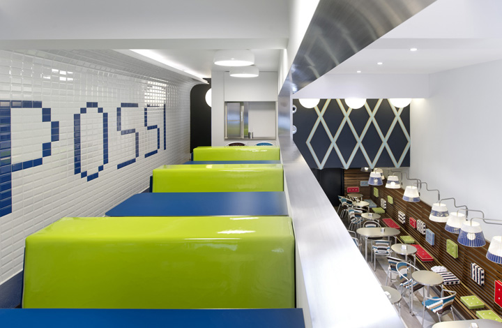
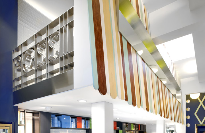
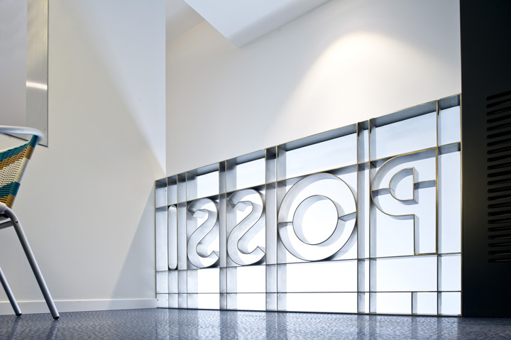
The mezzanine floor reveals a more urban feeling trough the long wall covered in diamond ceramic tiles with an out of scale written insertion in blue (Possi). The regular series of padded benches (upholstered in yellow vinyl fabric and blue leather) together with the laminate tables bring back memories of old diner’s cafes. The costumers can look downstairs from the long horizontal cut, maintaining a visual relationship with the rest of the space. The whole floor in this area is resolved with a rubber dotted pvc covering.

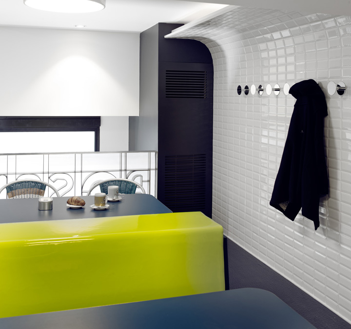
Even the restrooms have been carefully designed with a very tall entrance presenting vertical wood strips (same material used in Riva yachts) with brass portholes and horizontal multi colours tiles in the two separate toilettes. The palette of colours (white – blue, beige – brown –light blue, green – red – blue) and the endless variations about the stripe’s theme (references to the navy t-shirts, fences, benches,…) are together creating a vibrant environment full of memory’s references without being too literal. A childish touch softens the adults and makes the youngest to feel comfortable; the “Riviera” effect is achieved without nostalgic stumbles but in a happy, optimistic way.


http://www.antoniogardoni.com/
Add to collection