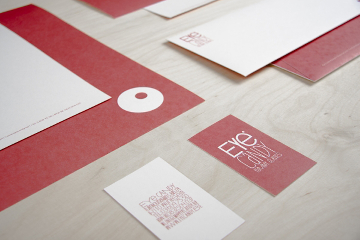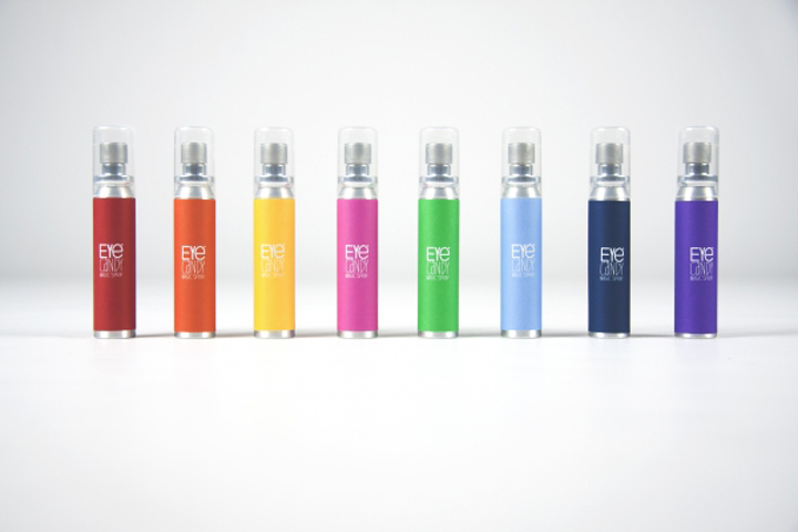


Never seen before… It takes no clairvoyant to see that most opticians are a sight for sore eyes. So when we were asked to come up with a concept for a glasses shop, we had a clear vision on what we didn’t want it to look like. Luckily, the people from Eye Candy shared this vision and trusted us blindly.

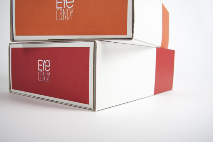
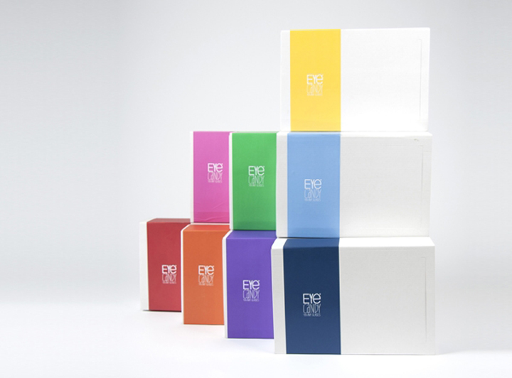
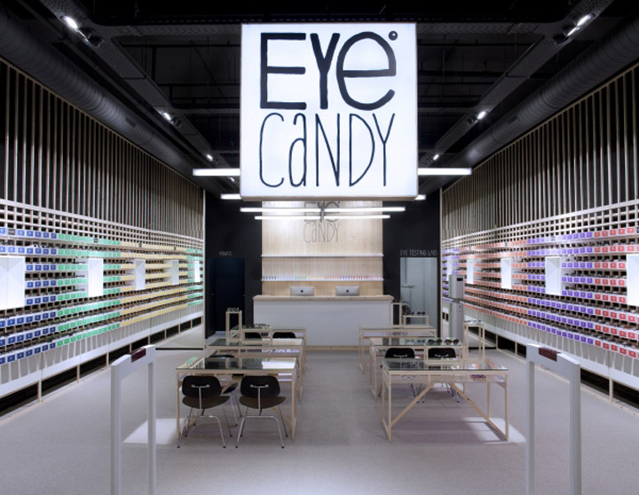
We created a unique shopping experience, in which the packaging became the store and the store became the packaging. Confused? It all makes perfect sense really: as a shop, you want to build personal relationships with your customers. What better way to do this than to literally send a piece of your store home with them?

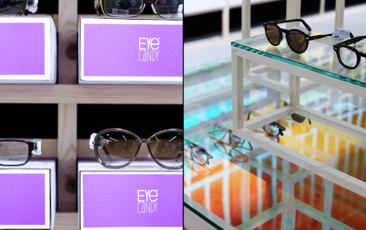
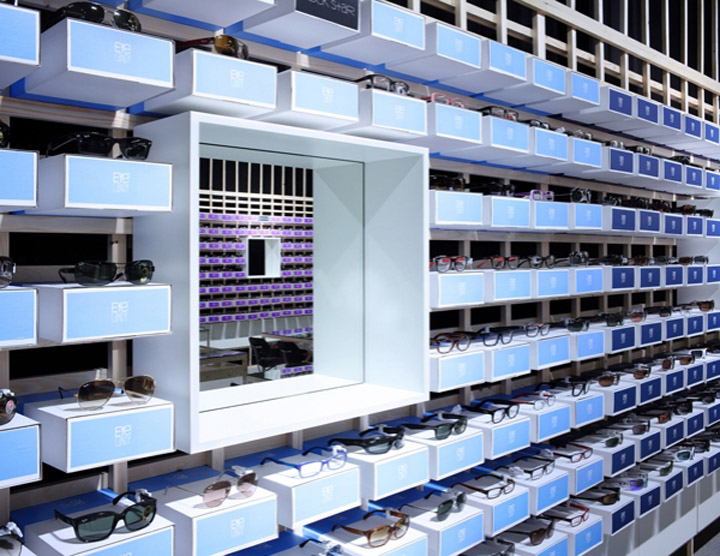
The design of Eye Candy came to use when we visualised the process of buying a pair of glasses. The entire shelving system is built out of boxes that serve as a display for the product. After the purchase, the box is removed from the frame, becomes the packaging and gets a carrying handle. So every time a customer buys his glasses at Eye Candy, he or she becomes a walking ad for the store.
Store design & identity by Creneau International


Eye Candy – Retail Design Case – Belgium from Creneau International on Vimeo.
