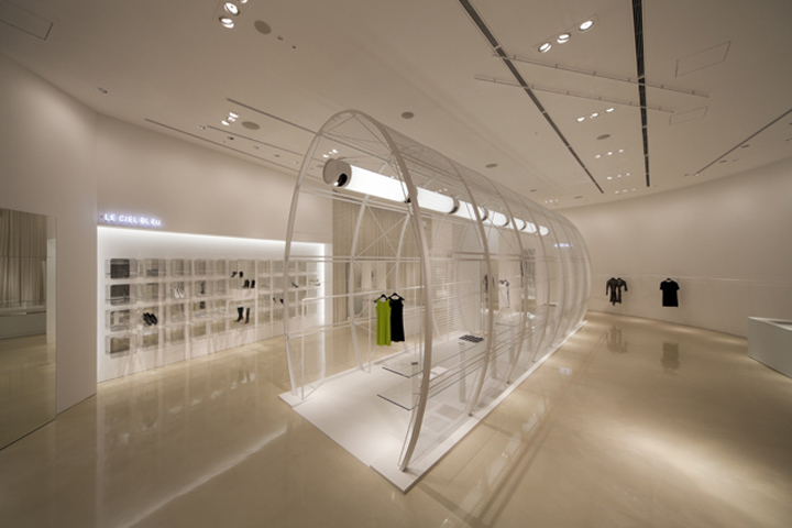

A white space in brilliant colors. This shop was designed for a retail complex called LUCUA, which was built as part of the redevelopment of the Umeda area in Osaka. It is a luxurious architectural space of about 250m2 with a ceiling 5m high. When approaching the design I simultaneously embraced the two opposing notions of the overall concept as well as the detailed design of the space.

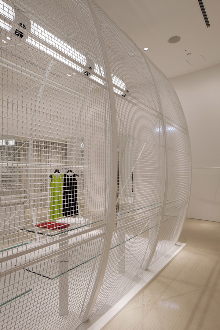
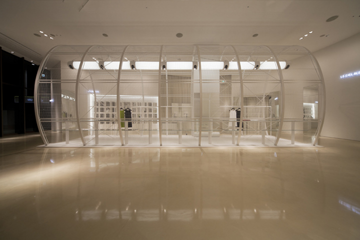
I was conscious that if I based my design on the functional requirements of the space such as the number of products that could be housed, I would end up with an interior resembling a fashion retail megastore. The design that I proposed was an interior space which incorporated another architectural space within it. This interior space was a cylinder made with a structurally self-supporting mesh.

Because of the size of the feature I wanted to avoid integrating it too much with the surrounding space, so deliberately aligned it off center from the axis of the building. This layout gives the space a sense of gravity. I also included custom-made hanging light fittings in my plan for the cylinder in order to make the interior space the central focus of the design.
Photographer: Hiroyuki Hirai
Designed by Noriyuki Otsuka


http://www.nodo.jp
http://knstrct.com/2012/02/02/noriyuki-otsuka-creates-le-ciel-bleu-japan/

