

We have designed 3 store branches of an imported shoe brand called YOSI SAMRA. The first branch (in Trinoma Mall, Quezon City) opened November 2011 and was so successful that a 2nd branch opened the next month (at Rockwell, Makati City). That too was a success and we are currently working on the 3rd branch at Alabang Town Center.
Photography by JOHN ANTHONY ROUX
Designed by Nina M. Santamaria
After the images you can read the design process of the kiosks.


Design Process for YOSI SAMRA
Once in a while a project comes along that is nearly perfect from an interior designer’s point of view — from conceptual design, client approvals, communication of ideas between contractor & designer, smooth transactions, to be capped off with an almost-no-delay timeline.
Best of all, this was a project personally dear to my heart as I am a frustrated ballet dancer who have an obsession w/ ballet flats & comfortable shoes!
So allow me to share the wonderful experience of designing the 1st ever Yosi Samra store in the Philippines (not exactly a store now, just a kiosk at Trinoma, but still it is the 1st in the whole world if I’m not mistaken)…so am very proud to share the very fulfilling design process behind it all!
in a nutshell…
August 2011: I was asked to submit a concept for a new store in Trinoma, (approx. 4×4 meters) by client Green Tee, Corp. for a popular line of flats from the States called Yosi Samra. I had honestly never heard of it, did not even sound familiar. I only knew Tory Burch or Tod’s to be the most widely known brands in terms of shoe comfort & durability. So anyway, when I checked the YS website, I started getting excited & realized there was no way this shoe store was NOT going to be inspired by ballet (duh). So I started w/ (1) the dance studio as inspiration:
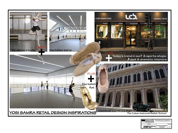
and…(2) based on my friend Archt. Buji Libarnes’ post on the recent trend in San Fo surf shop interiors, & the look of other sports & adventure /retail shops today, it was clear that BLACK was the way to go if you wanted drama w/ your retail, please. (for now, of course).
I added all that BLACK drama to the clean & rigid ambiance of the dance studio, plus felt the need to solidify this combination w/ the classical details of an opera house from say, you know, that beautiful & legendary dance school, the (3) Cuban National Ballet School (w/c I first saw in the Cuban music documentary Buena Vista Social Club & has then haunted me ever since).
I wanted to project through my design the endurance of a beautiful discipline like dance w/o forgetting that it should be fun & edgy too at the same time, moving w/ the times.

And, oh yeah, the shoes should be the focal point (oops, heehee, I almost forgot that)!
Sooo….w/ those 3 main inspirations in mind…I came up w/ this concept:

(and yes, those are my original pencil & watercolor sketches from my trusty Corona sketchpad, thank you very much. so it pays to not throw all original sketches away)
So given a 4x4m space (accdg to Client), I figured it was going to be in the middle of the mall, in the corridors, exposed from all sides including from above. So I had to think of branding from ALL sides including well..from above. So see my solution below:

The “Y” being the shape of the modules & the “S” being the shape of the carpet on the wooden floor.
I wanted to keep the presentation as simple as possible, hoping that the client would follow it easily & see what I was trying to do.
At this point, I was getting a bit carried away w/ the design development, and I wanted to hold back a bit, aware of the fact that I don’t have any signed contract yet nor down payment. But heck, this project was too special to me (my 1st specialty shoe store, *gasp!*) that I can’t imagine showing a mediocre concept or presentation.
So I thought, “Shoot, if they won’t get me then I’ll just take the designs back & bring them home. For now, OK fire. I just want to design a shoe store, pleeeease let me!!! pleeeeease!!!”.
aaaand so…after calming down & focusing back on the process, I returned to the drawing board. Honestly, it was very fast & swift. See my first layouts & schemes…experimenting w/ th “Y” & the “S” formations:

(sorry, I’ve decided not to show all schemes & concepts for intellectual property reasons) and so I’ve come up w/ initial, experimental layouts & threw in visual details like an actual ballet barre & a color scheme

so there. Then I presented all this to Client, nervous & jittery because I wasn’t briefed w/ any detail, any design direction, any other information except it was a 4×4 m space & that they were going to sell flats.
and so…Client approved everything! Except for a few details w/c involved the way shoes were to be displayed & lit. He wanted to highlight the shoes more & play with the layout & color schemes. He told me to submit my contract proposal (which I did that afternoon), and he signed it the next day. DONE DEAL! It was just awesome! 🙂
And so on to the tweaking…
Clients were suddenly a bit if-fy about the black finding it a bit overwhelming for a shoe store…so we were asked to experiment w/ colors. We submitted several revised perspectives showing color schemes of white, beige, & pastels, & black still. Our conceptual 3d perspectives looked like this:

Although the other color schemes looked appealing, I was still pushing for the black scheme. I thought it was just more striking & let the shoes “float” more. So after much deliberating & thinking….
Black was APPROVED! & Turns out the 4×4 space was just a peg & it might actually be a longer, bigger stretch of corridor space. So see working drawing showing final floor layout– longer, more spacious stretch of corridor, unfortunately deleting the use of the “Y” modules but allowing more dance studio-like, elongated shoe display:

And so….VOILA! After several production checks, we set up at Trinoma for a full 12 hours laying out the raised flooring of wood & carpet, positioning the modules, connecting the backlights, installing the signages, and oh….I almost forgot- displaying the shoes. 🙂
Thank you John Anthony Roux for the impeccably shot & edited photos. Love your eye, John!
For now, the red stools are placed there temporarily while the curvilinear fitting benches are still in production. I already got my own pair & bought another one for my Lola (who used to teach ballet) as a gift on her 85th birthday. Aside from a very fulfilling design process for the interior designer, and a near-excellent job by the contractor, to top it all off the shoes are just AWESOME. They are truly the most comfortable (not to mention affordable) shoes I ever had.
I got my Samras in Rose Gold. I practically made a bee-line for it when I first saw the displays. Grab your own pair, ladies! 🙂
http://chandelierbythesea.blogspot.com/2011/11/design-process-for-yosi-samra.html


Add to collection

