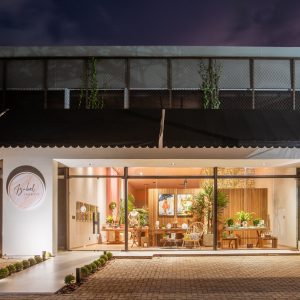
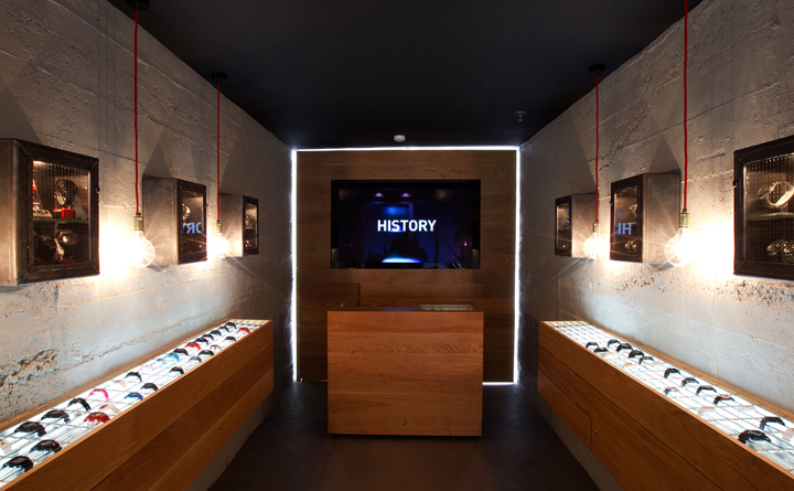

The brief was to create a retail identity and concept store that met with the demand of both Casio Japan and fit the New Zealand market. The store is located in the very heart of Auckland’s CBD and the most Challenging aspect was the size at 15sqm so with this in mind a minimal urban design was decided as the best approach to take. The exterior is minimal and chic, clad with rough sawn vertical pine stained black.
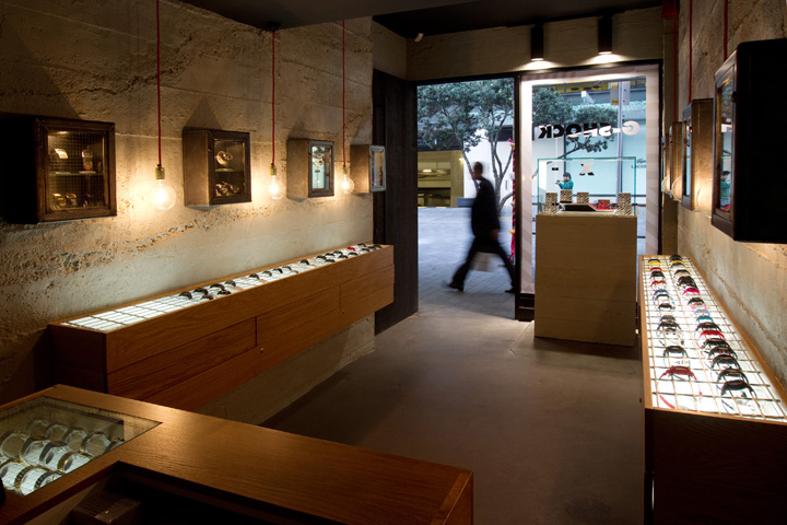
This finish extends across the front door so the small shop front is not ‘broken up’ visually and appears wider and more harmonious. Heavy set metal window frames and door handle and simple neon branding complete the exterior ‘city’ look. The colors are contemporary urban – walls of grey rough cast concrete, a black ceiling and the use of light Band sawn oak fixtures to add warmth and contrast.
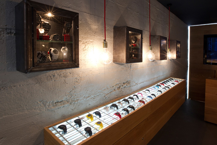
Along either side of the store are two long units of oak that showcase the bulk of the product range. These float on the wall and by not extending to the floor help to create an illusion of space. The product is lit from beneath and secured through a steel grate system more commonly used in a Commercial setting. Valuable and much needed storage comes in the form of sleek lockable cupboards underneath these units which draw the eye inwards toward the centrally located oak counter block and branding behind.
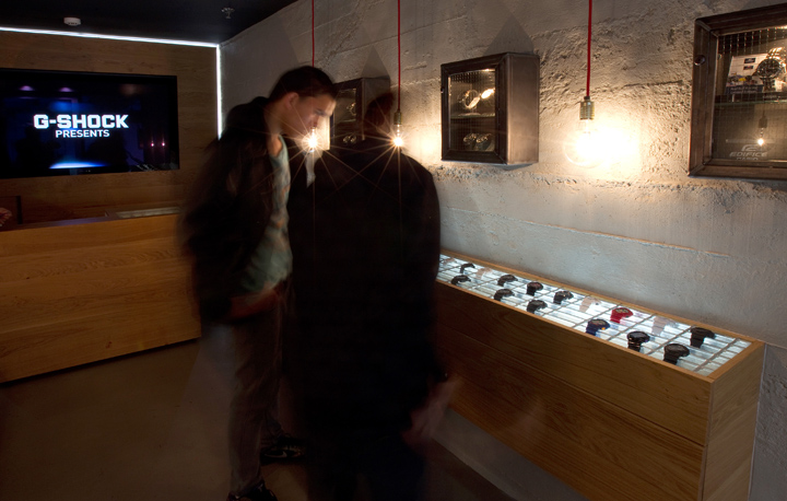
Higher on the concrete walls small steel cabinets are secured to house key collections and smaller groupings of product – visible through windows of safety glass. Lighting is kept to a minimum with no central source but rather light was used to highlight key areas – the product in the fixtures, the brand name, and the shape of the store with a simple lit outline of the full rear wall and two rows of feature lamps hung between the wall cabinets that emphasize the clean wall lines. To summaries the store is a cross cultural work embracing Japanese minimalism with NZ’s love of natural materials and muted tones.
Designed by Pennant & Triumph


Add to collection
