
Platinum Sports is one of the few shops open for business in the still-under-construction Victoria Park Market which, I imagine, makes for an awkward retail presence at the moment. For their sake, I can’t wait for the rest of the renovations to be complete, as the beautiful old market building is the ideal spot for a boutique shopping precinct, and the design of Platinum elevates the entire area already.

Probably due to the desolate nature of the rest of the market, there are currently few staff, which seems to emphasise the size of the lofty heritage shell. The wide aisles seem perfectly spaced to run up and down trying out new sneakers, although the emptiness of the customer-less store make me hesitate; instead, I stick to the edges of the room, and loop around until I can persuade someone to help me with shoe fittings.

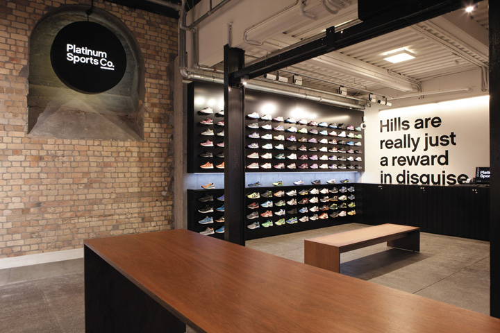
The design process at Platinum was led initially by Switch, who worked on the graphic design, wayfinding and branding elements before bringing in Frame Architecture to assist with a spatial interpretation of the brand. Platinum fits somewhere between a concept store and a fashion boutique. Concrete, brick and steel from the heritage carcass combine nicely with hardwood ply and mild-steel sheet, creating an elegant and raw background to contrast with the bright athletic gear.

There are enough splashes of neon in the clothes so the fit-out has remained subdued in colour, working more with texture, materiality and graphics. Large posters bearing mantras like ‘Hills are really just a reward in disguise’ provide visual interest while still keeping to the pared-back, design-led aesthetic of the space.

The plan is defined in a large part by oversized louvred screens that create walkways between the shelving on the walls and the central fitting rooms. The ingeniously simple design allows small shelves to be folded down for shoe display or flipped vertically to create solid panels to divide space and create sight lines through the store.

The neon Nikes perched on these timber shelves are siren calls that lead me on to the shoe area at the rear of the store. The space is generous; ideal for my (probably useless) stretches and hops in various booties as I try to gauge the fit. A huge wall of mirrors within the fitting room block allows easy access to see the shoes on. Already I feel lighter and fitter. Such bounce! Such pep! I’m sold. Not just on the neon shoes but on the whole store.
The store is the winner of the 2012 Interior Award in retail category.
http://architecturenow.co.nz/articles/platinum-sports/


