
As the second largest women’s fashion retailer in the UK and one of the most recognised High Street fashion brands, New Look strive to deliver fashion excitement, newness and value. Our design brief from New Look was simple – create a store experience, which expresses the brand personality, which is flexible enough to adapt across small to large formats and which drives sales and advocacy.
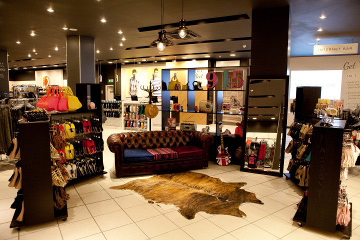
Store architecture aside, every element was open to be challenged, with the core aim of elevating the product as hero. We faced two distinct challenges, as a value fashion retailer with vast footfall, cost and durability were primary considerations. From the outset, the design scheme had to blend creativity and pragmatism to create a commercially viable solution.
An operational challenge was the pace of design, production and implementation, a requirement driven by the business. All of the trial stores have had minimal closure periods and the refurbishment of Nottingham’s 29,000 ft² store was completed in only 5 days.
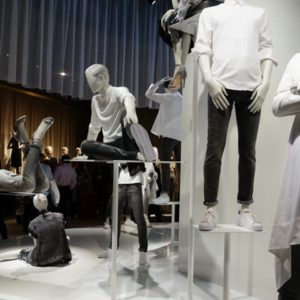
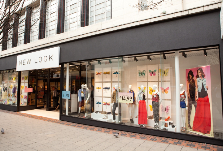
The change starts from the exterior of the store; with a new, simpler, legible logo – reclaiming the best name in fashion retailing – and the added drama and impact visible in the window displays. These simple branding principles continue throughout the store, where the conversation is focused more on the core customer, women in their early 30s, with snappy headlines or lighthearted service prompts communicating the essence of the brand.
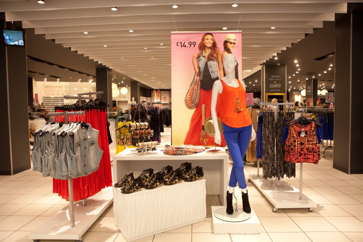
Just over the threshold into the store is the ‘third window’; this is a fast fashion fixture that allows New Look to spotlight and promote a hot product or trend, weekly or fortnightly – often reflecting the main window displays and creating an extra temptation to attract customers in, re-affirming New Look’s fashion credentials.
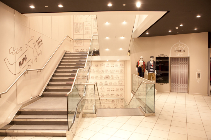
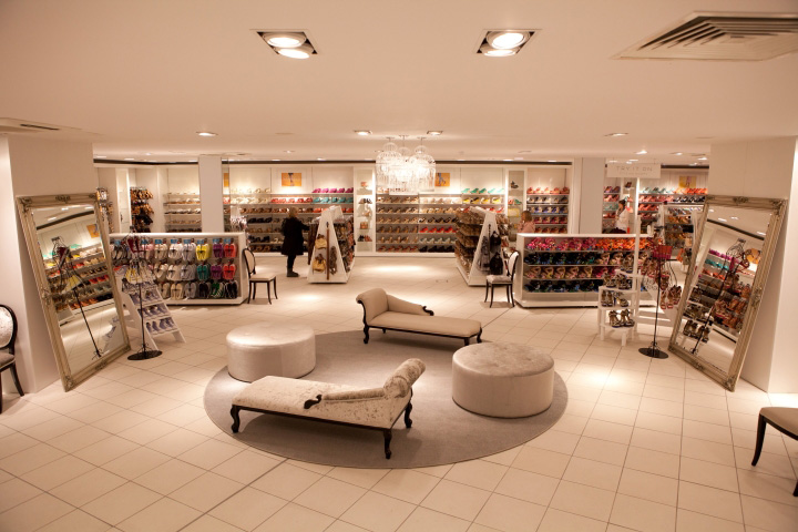
Within the store, the main challenges were in establishing identifiable, segmented product zones and creating more engaging product browsing, New Look wanted to establish a focus on four key product categories; denim, footwear, going out and casual.
The store design deliberately focuses on the products and these key categories, with focal merchandise walls punctuating the perimeter and creating intuitive customer navigation. We used a more dramatic and fully flexible lighting scheme to allow the store layout to evolve and the equally flexible mid-floor fixtures are predominantly four-way rails which present product options face first to the customer.
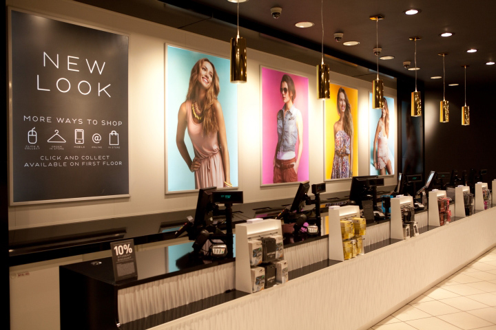
Throughout the store inspiration tables showcase the latest ‘New Look’, key styles and what’s hot right now within the category. All displays include garment rails that look like they have just been rolled out from the stock room, appealing to customer’s thrill of being the first to find that killer fashion item.
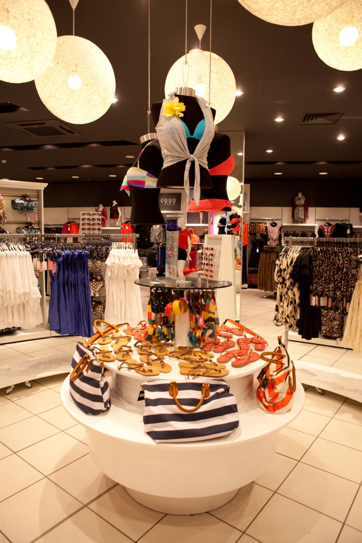
At the centre of the store a circular display with feature lighting creates a focal point for seasonal promotions, surrounded by curved hanging rails and wardrobes which showcase the ranges, enticing shoppers into the area. Accessories are displayed in their own distinct area, where visual merchandising uses hosiery and handbags to create vivid colour blocking to catch the eye. Further accessories are displayed in scaled wardrobes with large mirrors allowing customers to find the item to suit them.
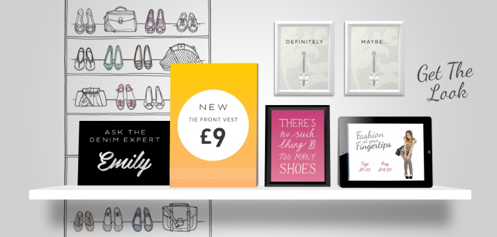
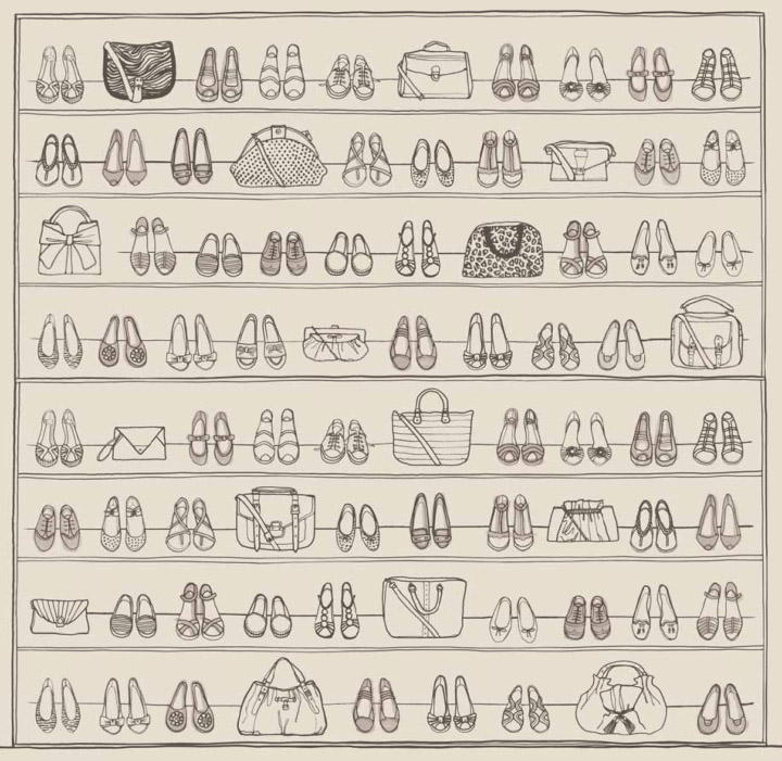
New Look’s footwear department has become a destination – renamed ‘Shoe Heaven’, and designed to feel like the ultimate walk-in wardrobe, it makes virtue of the thousands of shoes on display, confirming that a girl can never have too many pairs.
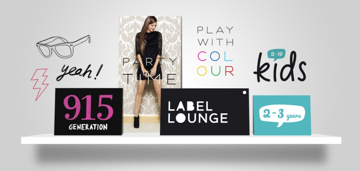
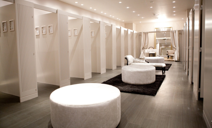
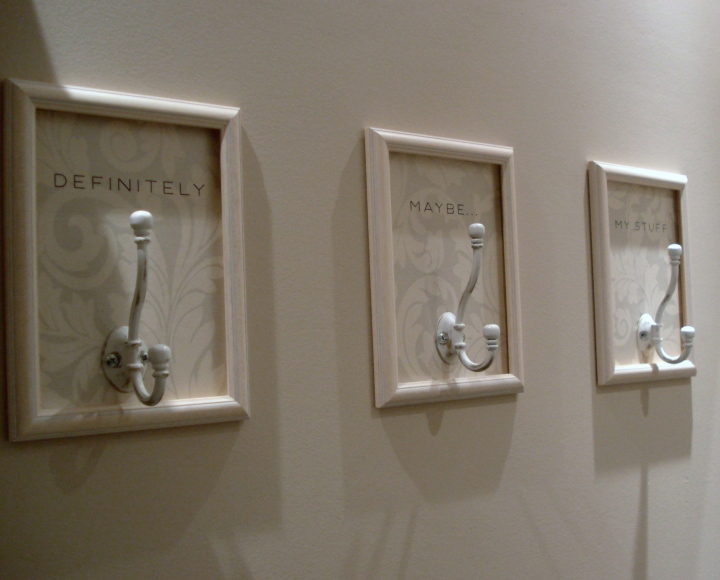
This design style is carried through into the fitting rooms, deliberately spacious and creating a relaxed area where friends can help decide the perfect outfit, it is also home to the ‘Style Advisor’ service, it uses muted tones and textures to provide a surprisingly indulgent space.
Customer research has already show that the all new sections across the store have been rated very positively with footwear and seasonal sections drawing the highest levels of awareness.
The new store design delivers a confident, engaging and relevant experience, demonstrating New Look’s commitment to providing fast fashion at great value and creating a better platform for a continued conversation with its customers. The first stores have opened to great customer and staff responses, increased like for like sales.
“Our investment in our new concept strategy has been an amazing success for the brand. The challenge was to find a way to further reflect the fun and energy that is part of our brand DNA, that true emotional engagement our customers feel with shopping and to best hero our product. The roll out has peaked into a serious programme of 14 stores a week hopefully resulting in 150 stores receiving the concept treatment and new logo by Christmas.“ Gillian Moore, Marketing Director
Designed by Checkland Kindleysides


Add to collection
