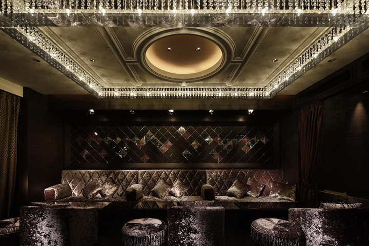

This members’ bar lounge targets to the executives who are keen in spending stylish city nights. It goes without saying that you will feel something special and extraordinary for those who want to become a member and who are willing to use this bar. What’s more, once you start using here, usability and comfort will play a great significance to the operation form. You might find these two aspects mentioned above quite odd, and to give just the right touch, was our challenge. Indeed, this “two aspects” was the keyword for designing this bar lounge.

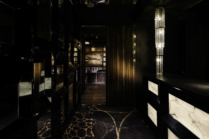
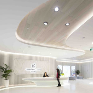
Take one step into the reception hall. Warm lights that transmit the stones illuminate customers. They find themselves reflected in the black-frame-mirrored wall surface, in which they have never seen before. Just by walking through this hall, it has a helpful effect of switching customers’ moods.

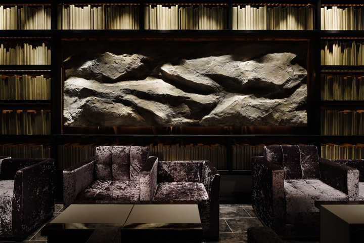
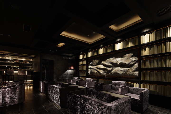
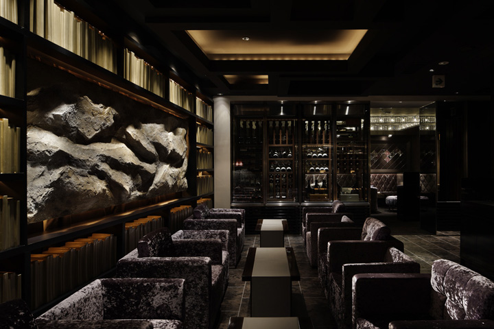
Bookshelves occupying the walls look like a luxurious study room neighboring the hotel lounge. From this style, customers will feel the relaxed atmosphere. On the other hand, to make a contrast with the artifacts (books), we set natural rock face as reliefs to offer extraordinary impressions. Furthermore, we chose a luxurious color, champagne gold, to make good balance. We set a custom-made wine cellar (you can see inside from both sides) for dividing the spacious room.

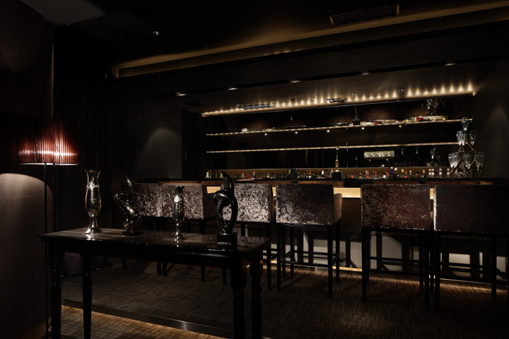
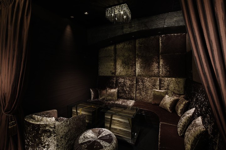
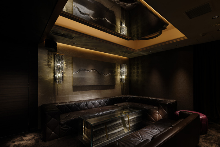
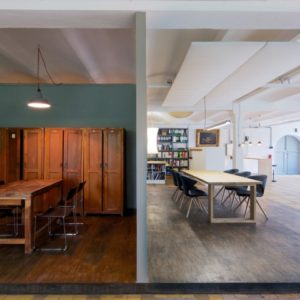
We made a see-through boundary to connect the modern space composition and authentic space composition. As for the VIP room tables, our image was to display moments of randomly-cut-wood into a glass case. Woods have the sense of stability and glasses have the brittle impression. When inverting these two designs, we can bring out two aspects of the materials. Thus, we gave bilateral character to the lounge space and material, by controlling the constitution of the bar. As a result, we were able to create a sophisticated and high-grade bar lounge.
Designed by DOYLE COLLECTION


http://www.archdaily.com/265268/cronnus-doyle-collection/
