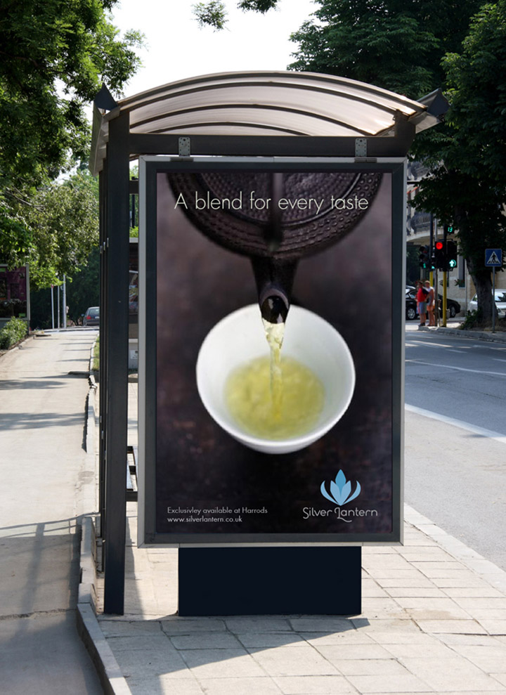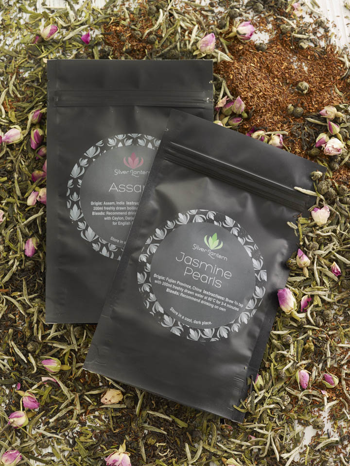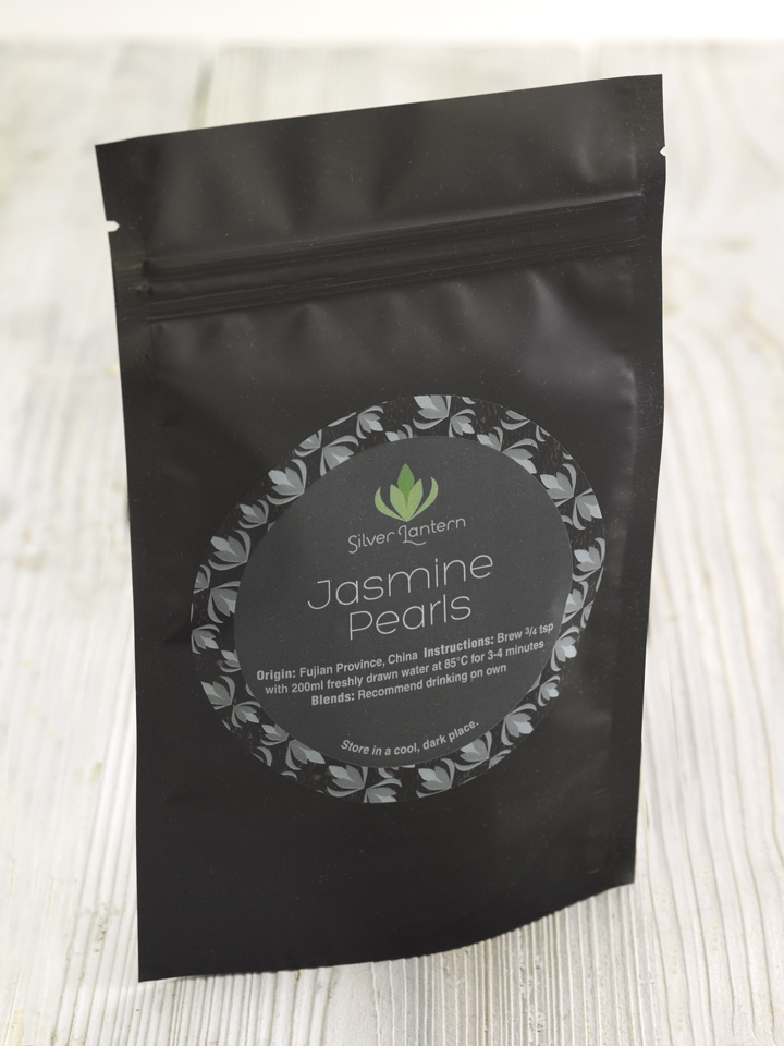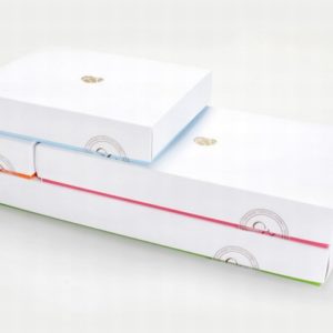
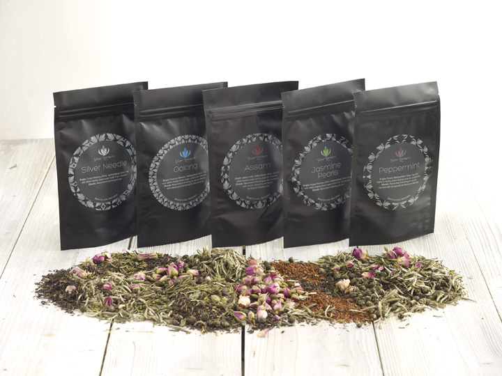

The objective of the project was to provide Silver Lantern with a premium looking brand that could be sold in high-end retailers and to a sophisticated audience who enjoy high quality tea. The logo is influenced by the Far East and the Orient, where most of today’s teas originate from. There are several visual devices to differentiate the range, with repeating patterns and colourschemes for black, green, white and Oolong teas and tisanes being used on the black foil packs, that will be initially sold via mail order.

The range will appeal to tea drinkers, both male and female, who are specifically looking for quality and taste. The packaging reflects the premium nature of the product and it’s audience with intricate details that balances both colour & illustration across the range of the 22 teas.
Designed by Eyeline Creative


http://www.eyelinecreative.com
