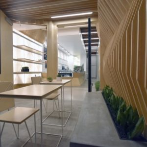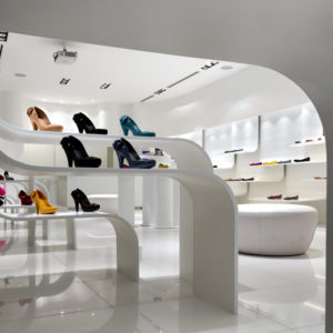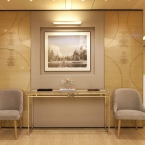


Cheungvogl created a cycle of concept case studies for the renowned Australian brand Aesop, in which eleven installations, signature stores and concept stores across Asia and Europe have evolved. Although each design is unique in its approach, materiality and character, the design rationale is consistently grounded in rigorous analysis of the brand’s philosophy and customer engagements with the brand’s sophisticated product range.
The case studies explicitly focus on the integration, interaction and communication aspects between humans and objects. The spatial organizations, operational characters and material palettes within the spaces are all directly responding to the holistic design thinking and adaptation of specific requirements within each given contextual environment. Across the eleven case studies, the projects are inter-linked with the intention to strengthen the synergies between the architecture, the brand and the site context. The outcome of rationalization and simplification of the design thinking results in a series of timeless, functional and commercially successful spaces.
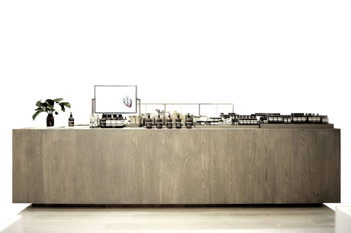
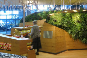
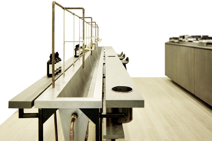
Aesop Selfridges, London is designed to merge the operational and practical merits of a workbench with generous spacing for consultancy, encounter and communication. The design consists of an elongated timber counter with varying heights for product presentation, storage and points of sales systems. Adjacent to the presentation counter is a 4.5 meter long steel sink installation, which provides ample space for the customers to test and engage with the products at the consultation area.
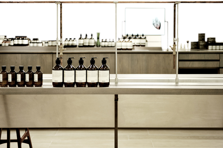
The presence of the installation is grounded in the analysis of the brand’s philosophy and core values. The design takes on an in-depth study of analyzing product dimensions, optimizing sightlines, providing flexibility to accommodate changes over time and changes for specific events to enhance and communicate the values of the brand. These parameters are then translated into a set of simplistic and flexible design discipline to encourage interaction and communication between the customers, the consultants and the products within the space. The design utilizes English Oak, black milled steel and copper piping as a representation of form following practical needs.


Add to collection
