
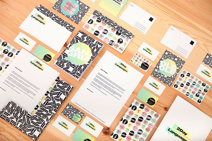
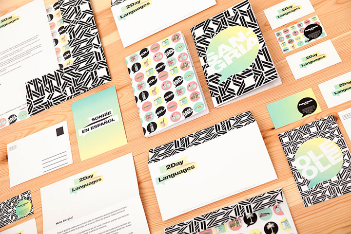
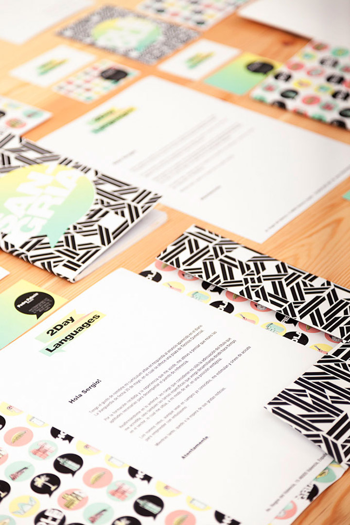
Masquespacio present their last project done in a central area from Valencia, Spain. The studio specialized in interior design and communication created in this case the interior and the identity of 2Day Languages, a new Spanish school in Valencia.
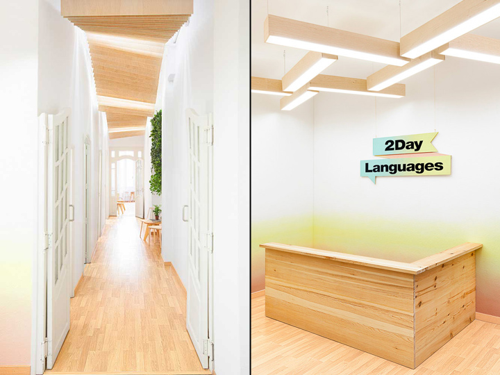
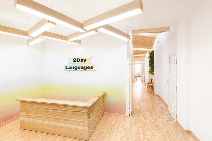
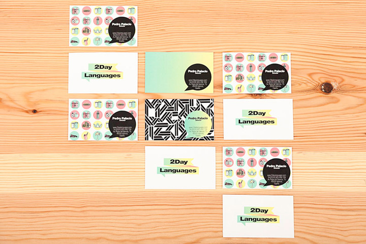
This project in first case is based on the identity of 2Day Languages represented by a flag that is fused with a text bubble including the three fundamental characteristics of language learning: the levels, the goal and the conversation. By the other hand it integrates the historic values from the city of Valencia that mixes modern and old architecture. A fusion symbolized in this new Spanish school through its neoclassical architecture and the intervention from Masquespacio’s designers.

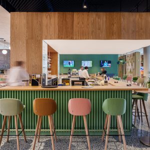
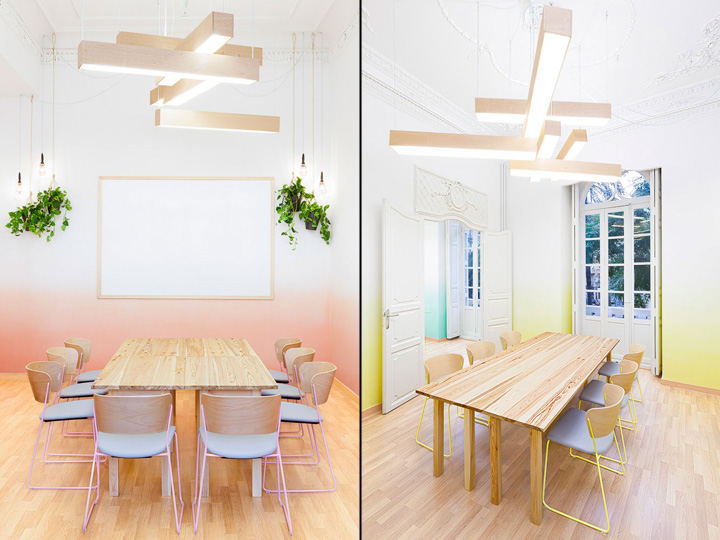
The space is developed on an area of 183 m2 that contains three classrooms, a staff room and a lounge. Each of the classrooms and common rooms are a defragmentation from the brand identity of 2Day Languages and also incorporate parts of the Spanish language and the architecture of Valencia. In first place it can be seen that the classrooms are containing the three brand colors, which in turn are a representation of the three levels A, B and C established by the Common European Framework of Reference for Languages, here seen as the colors blue, yellow and pink.
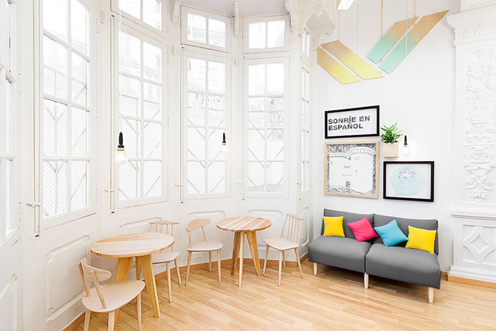
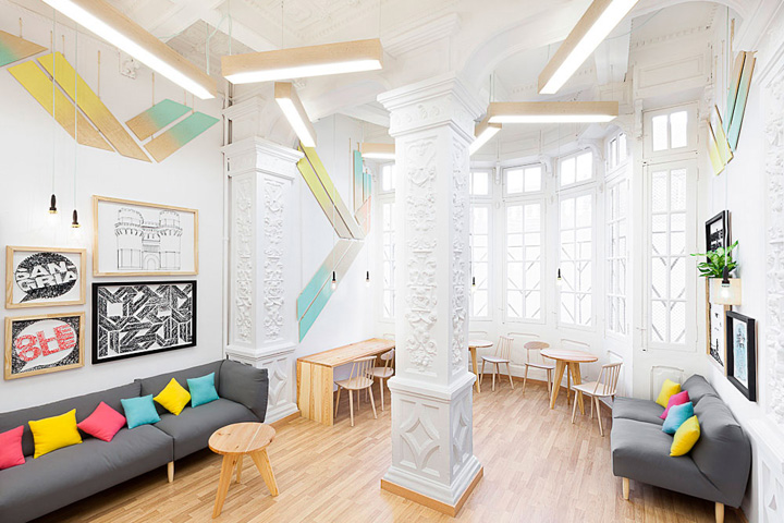
Every classroom contains a different color that is fading as if presenting the progress in language learning. On the other hand the sculptural lamps are another defragmentation from the graphical elements.

Ana Milena Hernández Palacios, creative director of Masquespacio comments: “As in the classrooms the students and their teachers are the protagonists, we wanted to limit our intervention to a minimum, without forgetting the freshness and ‘good feeling’ that needed to breathe each space, as well as the importance to equalize the mix between modern decoration and the beauty of the neoclassical architecture of the building. We opted for warm materials like pine to generate pleasurable sensations with functional features to make easier the school operations. 2 tables instead of 1 in each classroom were chosen to be separated and stacked during activities. Also the chairs were chosen to offer maximum comfort to the students and with stack options for better circulation during activities.”

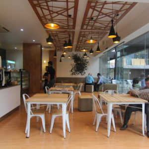
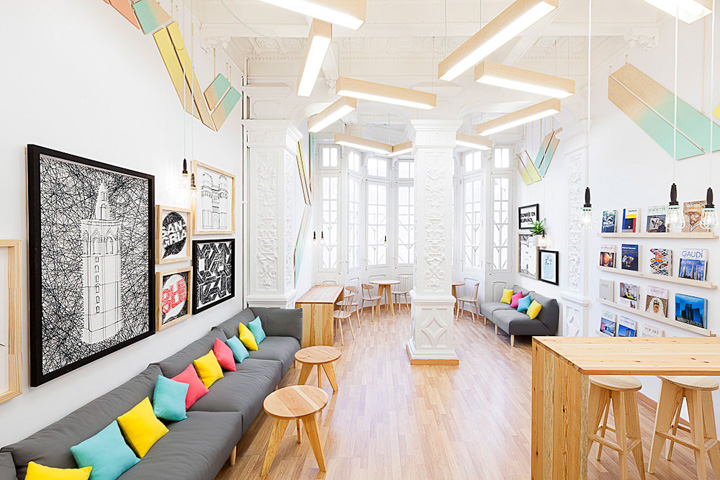
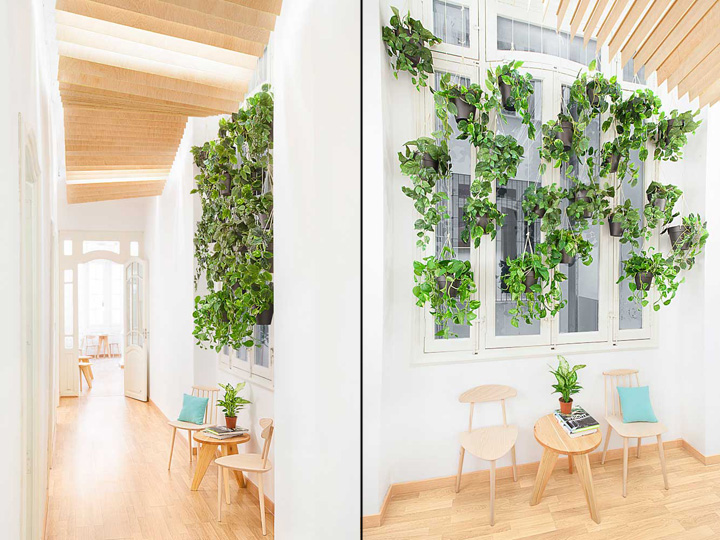
Getting out of the classrooms in the common areas, where the students of the different levels meet each other, levels and colors are mixed up together. This happens in the reception, but also in the hall through little shreds from the gradient colors added to the bottom part of the wooden ceiling. Last but not least the lounge room follows the same unity of colors, but this time merged into the decorative elements subtracted from the brand identity.
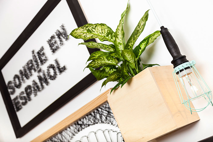
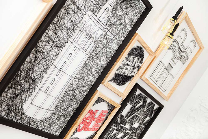
Undoubtedly this part of the project is the one where the decoration has a more prominent role, faithful to the design established in other parts of the school. Headliner here is the representation of the communication elements, relevant words of the Spanish language and some icons from the architecture of Valencia, using a technique of knitting with wool and nails.

Masquespacio in this project wanted to remain true to its philosophy traduced into creativity, identity and democratic design always under the concept of designing a space to live and enjoy with a freshness that makes the users feel comfortable while being overwhelmed by emotions generated by the space itself.
When we were contacted by 2Day Languages in first place the project would be developed in another space with a more common character so we wanted to use more casual and economic materials like OSB. Although due to the location change and the neoclassical architecture of the new location we opted for materials of a higher quality and above all with more elegance like pine wood, without losing the first idea of a casual design to attract the young target of the language school.
As we wanted to give a major importance to the original architecture we chose for pastel colors: softer and also identifiable by their audience between 20 and 30 years old. By request of our client due to the limited budget the original floor was maintained. For the same reason 90% of the furniture was realized in carpentry, maintaining higher material qualities, but reducing the costs in comparison with the same furniture by brands with the same characteristics.
Just like that all the decorative elements, tables and lamps where designed by us with the technical support from the carpentry and lighting specialists. The chairs and the couch are the only pieces from furniture brands used in this project. As in every project we also incorporated some elements created by us like the frames that represent different characteristics from the brand, Valencia and the Spanish language.
6400 nails and 2500 meters of wool were used to knit a total of 10 frames. 120 veneers were destined to the hall’s ceiling. Perhaps at the end it is also relevant to mention the low budget of 25.000 € with which we designed this project.



Add to collection

