Add to collection

CLIENT & BRAND BRIEF
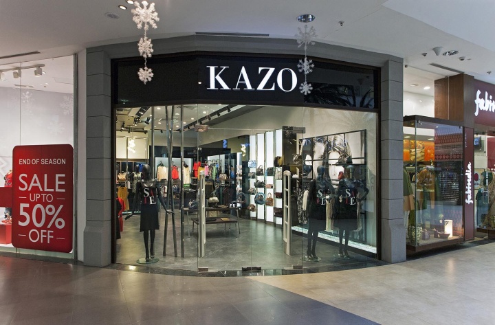
KAZO – A high fashion premium Western Women’s apparel brand from Delhi/NCR looking at expanding their export business into Retail. The company has been in exporting of western women’s wear for many International Brands, ventured out into retail business in the year 2005-06. The Brand mainly looks at High Fashion affordable-premium women’s wear in western category catering to the new age Independent, working Indian woman.

The Brand also has accessories, foot wear etc as a part of their portfolio apart from Western Apparel and wanted to create the right store ambience for their merchandise. Client brief is to design the retail space to merchandise its products and offerings to its target customers through the quality, attitude oriented store taking inspiration from west street scape. The changing demographics and shopper behavior of women in India with more than 55% of Urban Indian women working, the requirement for fashion oriented apparel suiting their needs also plays an important part of the retail land scape.

Globalization in work culture also leading Indian working women to follow the trends of western culture, & life style to suit their profession and style. Hence the requirement of a store and ambience to suit the new age women who are responsible, independent yet fashionable in outlook. The merchandise being very colorful and fashion conscious the store ambience had to be subtle yet sharp to support the merchandise.

DESIGN STRATEGY
Kazo, being hi-fashion western wear and catering to likeminded target audience, inspiration for the store design was evolved from Western Architectural and street influences. So design strategy was to create a store which reflects the west through architecture forms, and interior color scheme along with the method of display where customer can browse the entire product portfolio in a positive ambience. A thorough study has been made on west fashion streets, high street building forms and shapes, materials, & lifestyle. These studies are crystallized and made a base foundation for the next level of design concept.

STORE DESIGN SIGNATURE
The Visual language for the store design as evolved from Western Architecture and street, the store ambience also portrays a subtle yet strong elements using black and grey hues. The Ambience hence created has a huge visual impact on the customer that differentiates store ambience and provides the right platform and mood for enticing the customers to shop.
The signature elements of the store is the tones of black and grey which in synergy with lighting and rest of the elements creates the right ambience for the brand required.

STORE FRONT DESIGN
“KAZO” store façade is inspired by western high street architecture building exteriors, which has solid dark grey pillars/wall with a deep groove running horizontally & growing vertically.
These forms surrounds the periphery of the store to highlight at the same time it cuts off any usual influences disturbances from neighboring stores. Primary signage is lit with solid acrylic LED back lit letter with frame of chromium SS finish edge & solid sides. This has been placed on black glass running on top horizontically across the store. As window display plays part of the façade entrance. It is kept open without any mood/covered windows and only SS chromium finish pipes runs from floor to ceiling in a zigzag manner. This builds verticality of the store. Mannequins are placed in front this. This makes the store fully visible from entrance and at the same time doesn’t intimidate the customer to enter the store. Dark walnut finished wood gives the cement portal a frame inside edge and highlights the store in a frame.

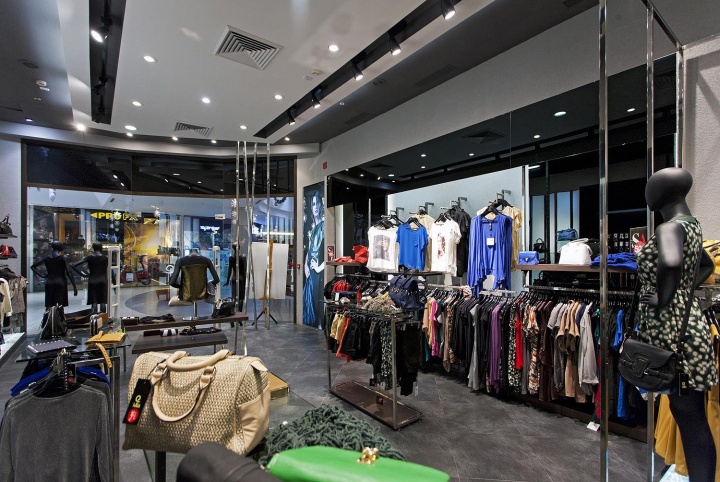
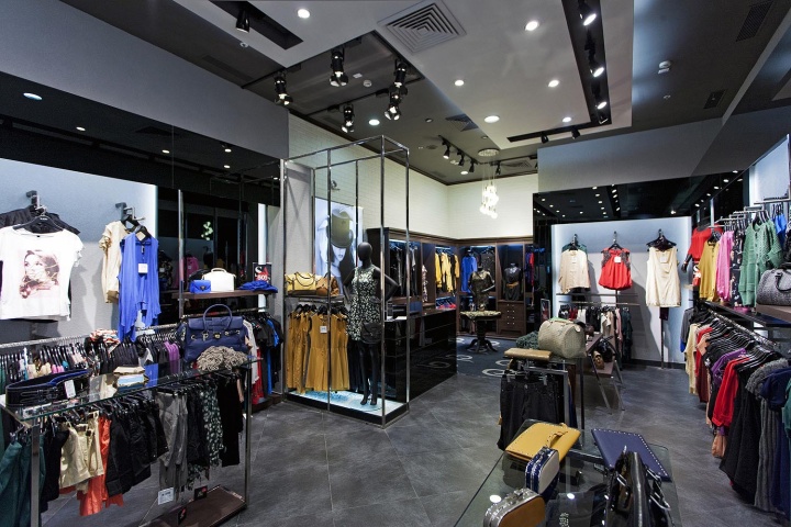
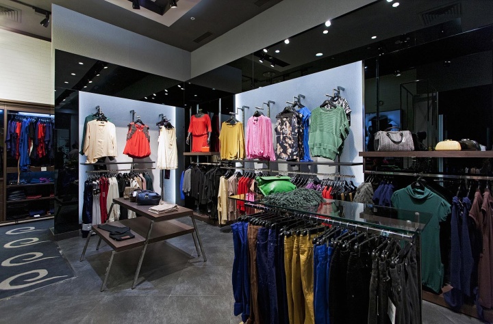
STORE INTERIOR DESIGN
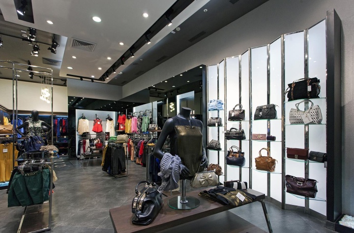
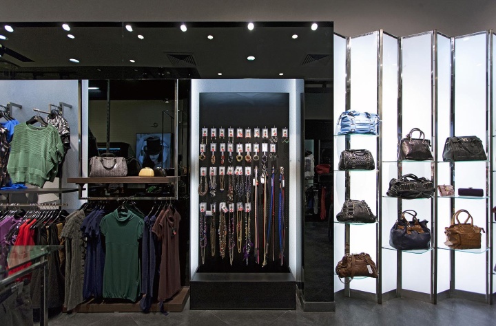
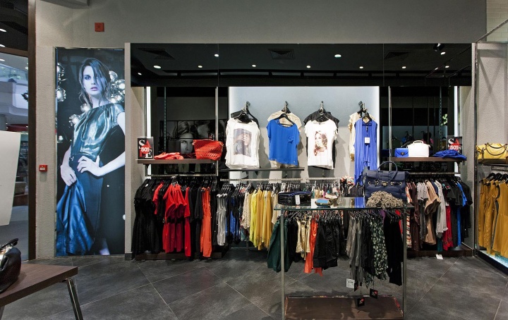
Over all store interiors has been derived from the black and grey tones/hues. Shiny black glass portals have been created to categories the product and styles. Within this block further partition has been made into rough cement plastered texture as a background to the product and shiny black glass panels for the product back drop. SS Mirror polished fixtures carry the products in hanging and starting mode.

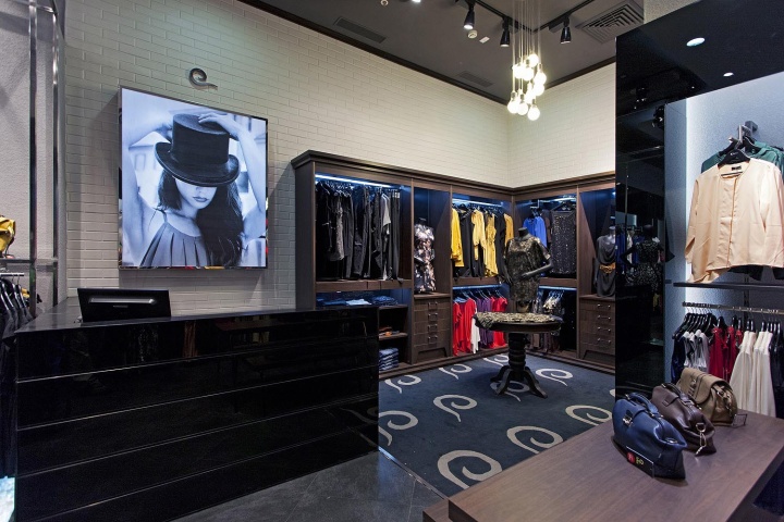
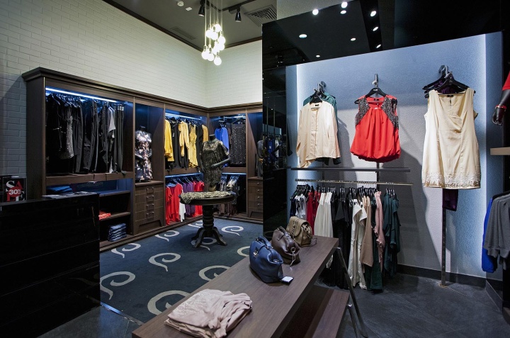
Flexibility has been provided in the fixture to orient the merchandise display as and when required. White light around the product creates the aura/halo effect around the product where as ceiling lights highlights merchandise & their details. A vertical SS frame open box is created next to the cash counter. It homes the mannequins with the focal product display and accessories and this has been highlighted with barn doors light fixtures to give the studio look & effect. Cash counter follows the architectural elements with cash book having life size visual of a “KAZO” girl. A special corner is created with the elements of western classical wardrobe units. Here one of the product categories is displayed along with dressed busts & cross merchandise with accessories.

This section has carpet as a floor where a custom designed carpet done with brand mnemonic on the carpet in a synchronized repetition. A round table in dark wood occupies the centre of wardrobe section with designed chandeliers highlighting the merchandise and VM props on the table. Trial room is adjacency with the ward robe section gives the customer the dressing room feel with seating couches and mirror to see themselves for appreciation when they are trying the product live.

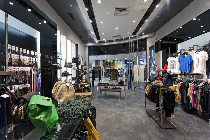
Main accessory panels have been provided in one of the blank portal other than hanging accessory all around the store. Design handbag being the one of the highlight product of Kazo, Bag wall is made of acrylic lit back walls for the full wall length is a open bellow format. Diamond shaped glass shelves carry the hand bags in different level against the lit background. This gives the shapes of the bag a significant importance and also the front lights the detail gone in the design of the handbag.

At the right entrance big visual grid is made where it can accommodate visuals in the tiled form as well as merchandise is hanging a stacking position. This wall has the multipurpose utilities of having only visual or, only product and both. On the floor this unit is highlighted by white pebbles with light running under this unit.
Gondolas and nesting tables have been designed in a minimalist feel for easy browsing and selection.
Floor is dark grey textured tile laid in diamond shape to give the high street floor look. Ceiling has two levels in black and white to bring contrast to the ambience.

INNOVATION USE OF MATERIALS & FINISHES
The store design being evolved/derived out of black and grey tone and as the product colors are vibrant. Interior had to be worked in a shade where product had to be given attention. Different texture of the black and grey has been exploited to break the monotony. Like cemented plastered in the façade and some areas of the background to the product. Satin finished uneven pattered vitrified tiles for the floor in blending with soft custom designed carpets are used as flooring material.

Mirror finished black glass into adjacency with matt black and dark walnut finishes are used to bring subtle and premium-ness of the brand. Soft toned water mark, decorative wall paper enjoys on the wall of the trial room. Finishes from the west old architectural building is developed and used in façade portal along with mirror finished black glass. Chromium finished SS fixtures gives little jazzy, and crisp separation for the ambience.

LIGHTING
Lighting is a key tool used in the store for complete differentiation and highlights the merchandise boldly.
The complete lighting for the store has been differentiated into 3 categories
1.Accent lighting for merchandise for both wall display as well as floor display units.
2.General ambient lighting for walk ways and general areas.
3.Special lighting using back lit halo, edge light halo or using feature pendant lights.

The synergy of the above three lighting methods creates the right mood and ambience for the brand. Day light color (4200K) light fixtures in Barn door lights and track lights recessed in niches in ceiling, to accentuate the merchandise on the wall and floor units. White light within the units used for halo glow together gives the right depth and also highlights the merchandise. General ambient lighting is a mix of Day light color (4200K) CFL and CDMT down lighters of 35w to give the subtle lighting. Special lighting like the chandelier in the Wardrobe section and custom pendant lights in trail rooms give the store the premium light language. The back lit section of the handbags unit and The under lit section in Mannequin display sections all add the extra flavor of highlighting the story in the overall ambience.

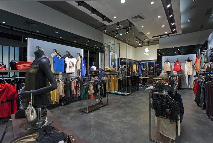
STORE ZONING & LAYOUT
The store zoning and layout is done in line with the principle of simple straight forward planning based on merchandise positioning. The high-premium designer merchandise is at the rear of the store along with the trial rooms. The zoning is done in such a way that it navigates the customer from one product to the other adding a sense of newness in every section.
The cash wrap area is right in-between the hi-premium and general merchandise zone. The grid wall on the right side of entrance acts as collage which takes on the brand visuals/communication apart from taking on merchandise. This provides huge scope to change the look and feel and have the entry part of the store new and enticing to the target customer. The backlit hand bang zone is positioned opposite to the cash wrap area, providing a break to the continuous apparel wall. The entre zoning and planning brings in a quiet drama into the store and creates happy anxiety to the customers.

VISUAL MERCHANDISING & DISPLAY
Visual merchandising has been built in store design as part of the design, the whole store itself visually merchandised along with some spots highlighted with VM to give focus on to that category. KAZO being young, and premium western wear brand related props have been used. Products have cross merchandised to make customer easy for their styling and selection.

GRAPHICS & SIGNAGE
KAZO being a fashion style statement this has been highlighted by the larger than life style model. Visual photographs have been shot in Italian fashion streets add to the ambience and brings the store alive. These visuals are in monotone and color depending on the sections. This visual language depicts and connects the Fashion statement to the customer one on one.
Designed by 4D


Add to collection