

Grange Interiors homeware boutique by Stefano Tordiglione Design, Hong Kong
posted by retail design blog on 2013-09-05
Add to collection


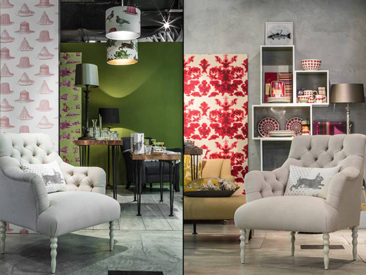
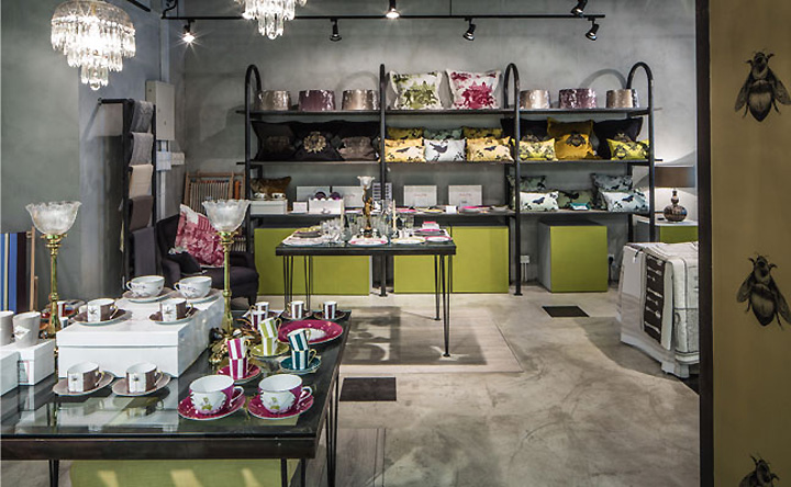
In a sleek concrete space in One Island South in Aberdeen, Grange Interior’s stylish homeware strikingly stands out from the store’s subtle interior design that was conceptualized by Hong Kong-based Italian interior design studio Stefano Tordiglione Design. Grange Interiors, from name to aim, references a grange, that sprawling British country house that is a grand old dame of property. It was from this that Stefano Tordiglione Design drew his inspiration, referencing that classic manor house and its stately yet simple country interiors through his design.

Squares of rusted metal permeate the concrete floor at Grange Interiors, while intermittent wooden paneled stages form a base for highlighting the various products on sale. These products sit atop Stefano Tordiglione Design’s very own tables: elegant creations with long, slender legs topped with framed panes of glass, reminiscent of a Hong Kong window, or with sleek, shiny plates of copper, stylishly curved at the edges, the material harking back to the traditional homeware of old Europe: heavy, brass-coloured pots and pans found in country kitchens. Simple yet elegant sets of shelves hold further items, while the various products are split from each other through the use of screens that not only enable non-obstructive separation, but are ingeniously covered in wallpapers that are available at the store.

A feature wall behind the cashier desk is a focal point and displays the brand’s logo, also created by Stefano Tordiglione Design, which is a reflection of the store’s concept. ‘Grange’ appears in a classic English font, capitalized and made from a hard metal, while ‘interiors’ is lit in neon, italicized and representative of the more contemporary side of the brand. Surrounding the logo is a design of various shaped plates that hark back to the store’s essence.

The simplicity of the furniture and the surrounding design highlights the quirky and unique European products that Grange Interiors imports from countries such as England, France and Italy, from brightly painted crockery and stylish cutlery to pillows, candles and lamps. Highlights of green on sleek cabinets used for storage and on the cashier’s desk are reminiscent of the countryside in which a grange might appear but the subtlety of the highlights of the colour again refrain from taking anything away from the items on offer. The concept is warm, with the choice of materials like wood and copper adding to a feeling of accommodation that harmonises the diverse products on offer and brings everything about Grange Interiors together as a whole.


Add to collection