
Every detail their own doing
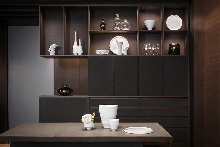
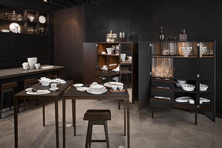
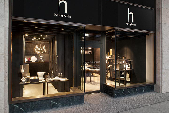
Hering Berlin is run by its owners – and the owners do everything themselves. Accordingly, nothing about the design of the flagship store has been left to chance (or to outsiders). The impressive and harmonious overall effect goes far beyond a simple presentation of the products. Everything fits beautifully, every detail in the design is just right. If we weren’t talking
about a shop, we might be tempted to call it a total artistic experience. No wonder, then, that the shop concept and the complete decor and furnishings are pure, original Hering Berlin.

“A room with an agreeable atmosphere, with agreeable lighting, with agreeable materials.” Such was the self-imposed goal, says Götz Esslinger, architect and husband of designer, Stefanie
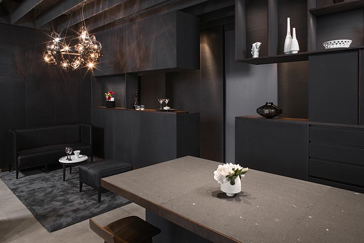
Hering. He was the one whose job it was to pull it all together. Esslinger wanted to “create a lot of space in a small surface area, to generate depth,” – and also to facilitate discussions with customers in an atmosphere of intimacy. As the intellectual source of both concept and design of the brand, he not only drew up the plans, but took on the project management and coordination, taking pains with every detail of the realization of the store: from the furniture to the horsehair wall covering.

Like a chateau or the Oslo Opera
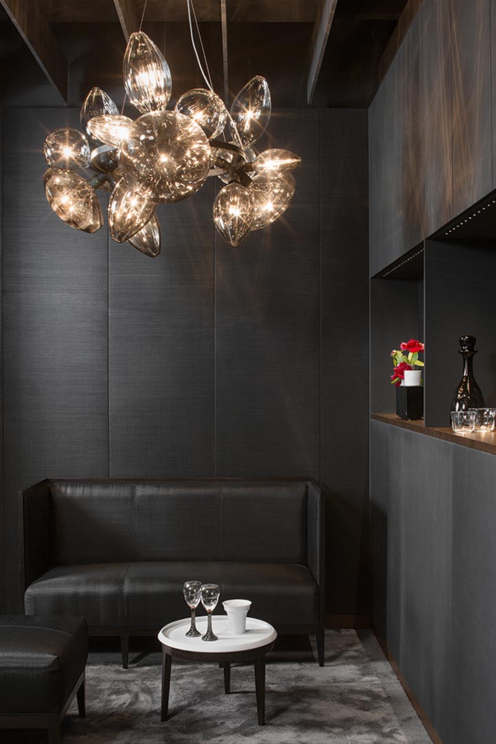
Yes, indeed: horsehair wall covering! Or rather wall panels. The walls in the store are completely covered with horsehair panels, in a soft black, with just a few dark brown panels to create
accents. The panels were made by Clemens Bayer, Berlin. Emil Rotter, also from Berlin, supplied the horsehair – a great local cooperative venture, therefore. Rotter confirms that, in this
realization of the design, Hering Berlin has the “largest area of horsehair wall covering in recent times other than that in the Opera in Oslo.”

There are very few horsehair panels used anywhere. It is a shame, because they look wonderful – warm and homely and are even better to touch. “They can perhaps be found in some old castles and at Julius Meinl am Graben in Vienna,” says Esslinger. Exaggerated luxury? Not really: “The textile panels are very important for the acoustics. To stop any echo.” Of course, you can
achieve a similar effect with felt or other coverings,” but “we’ve been using horsehair for at least eight years.” It is not for no reason that horsehair found a regular place on the Hering Berlin stand at trade fairs.

So it is a material whose qualities Esslinger is intimately acquainted with and greatly appreciates himself, passing on his enthusiasm for it by using it for the benefit of his customers.
Not only does horsehair have that quality feel, as well as being a functional material, it also has that “special sheen” and is extremely hard-wearing,” explains Esslinger, so that it has now become “part of the Hering DNA”.

Horsehair and raw steel: undiluted materiality
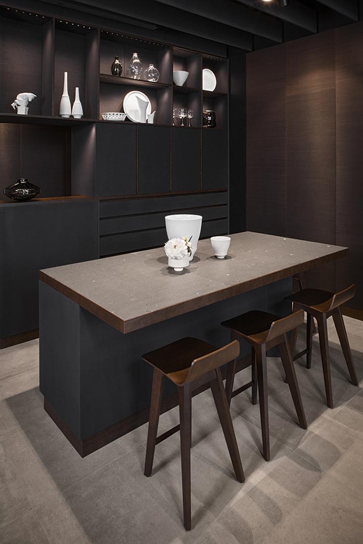
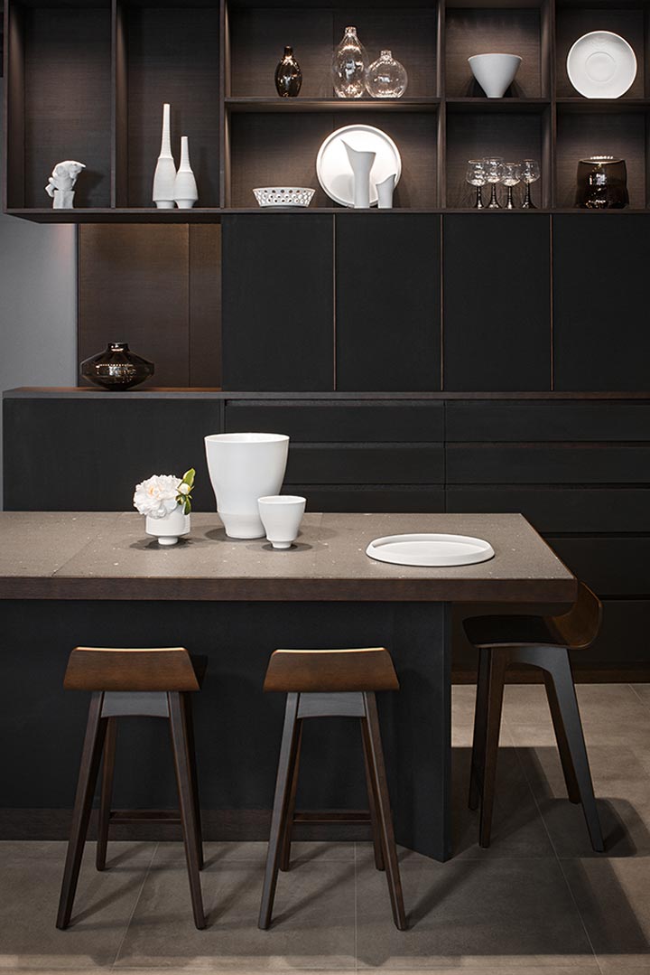
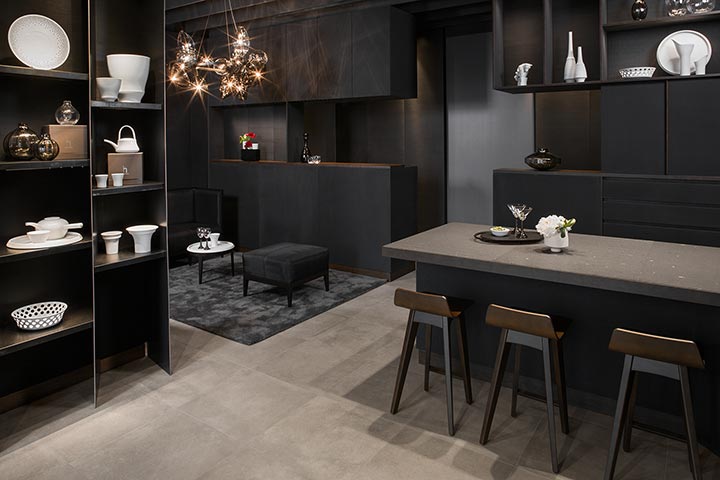
Once again it becomes evident that Hering Berlin is all about undiluted materiality. Be it in the basalt of the display table, as it was in the very first workshop that Stefanie Hering and Wiebke Lehmann had some 21 years ago now, or today’s horsehair and raw steel. On the left of the room, we see three full-height steel shelving units, specially built to drawings by Götz Esslinger. All the built-in furniture and the ceiling are painted in blackboard paint, the moldings and other elements are in oak.

For the metalwork, Götz Esslinger has joined forces with Anderl Kammermeier, Berlin. The works of this artist and craftsman have been honored with many awards and are on show, inter alia, in
the German Historical Museum (DHM) in Berlin, in the Museum of Applied Arts in Frankfurt am Main, in the Bauhaus Foundation, Dessau and in the Vitra Design Museum in Weil am Rhein.
Kammermeier featured in the film “Craftsman of the World” (1994) and, according to the AD – ARCHITECTURAL DIGEST – (2011), numbers amongst the “best of Germany”.

On the ceiling – which looks higher than it is, as a result of the use of louvered paneling – there is a resplendent chandelier that you just can’t miss: the latest piece of work by Stefanie Hering and not yet available on the market (the one hanging in the store is a prototype). The generous shapes in smoke-grey and crystal glass (18 pieces altogether) were made by experts from the Glashütte Theresienthal glass factory, who also blow drinking glasses and Lampion vases for Hering Berlin. The electrics were the responsibility of Steng Licht in Stuttgart, a family firm and a partner in various projects of many years standing.

Friends of friends, mostly in Berlin.
When all is said and done, everyone involved is a friend. Indeed, many of them are also based in Berlin. Hence, it was Torsten Rullmann from the Schönhauser Allee (Schlotfeldt Licht), who
created the atmospheric lighting in the shop. The lighting designer has already done work for the Waldorf Astoria Berlin. He has also worked on the Joop Store, the facade for Louis Vuitton in Hamburg and the Documenta festival in Kassel. His influence, too, stretches well beyond Berlin’s city limits.

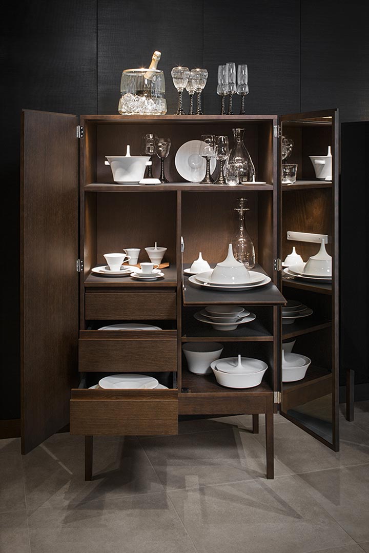
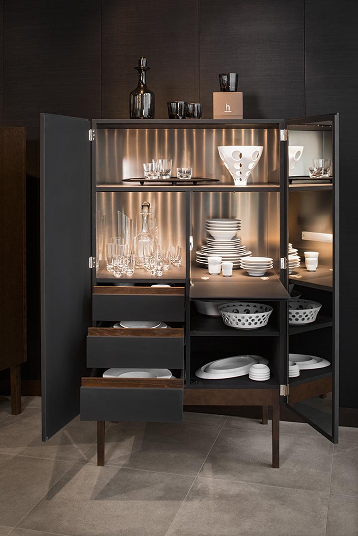
The woodwork was undertaken by Josef Prödl Möbel Design Werkstätten in Kirchberg/Raab, a long-established Austrian carpentry firm, which specializes in creating contemporary design with first-class traditional craftsmanship. Prödl’s customers include the Mozartmuseum (in the house where Mozart was born) in Salzburg, the Schlossberg Restaurant in Graz and they have an international clientele, too, for the design of lawyers’ offices and wellness areas in leading hotels. The interior of the Loden Steiner flagship store (in Schladming, Austria)’made by Prödl’ is a perfect example of the symbiosis of the traditional and the modern, which is ideal for the way that Hering Berlin always sees things too.
Project/Address: Hering Berlin Flagshipstore
Waldorf Astoria Berlin
Hardenbergstr.27
10623 Berlin
flagshipstore.heringberlin.com
Design/Concept: Hering Berlin
Architect: Götz Esslinger
Pictures: Jens Bösenberg
