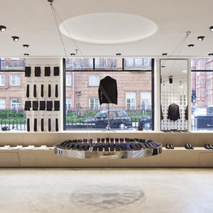


Brosway, the Italian fashion jewelry brand, has recently unveiled its flagship store’s refurbishment in Piazza San Babila, Milan. The project is the result of the cooperation between Stefano Sagripanti and the Design Department of the Company. The narrow, long, high space is characterized by the combination of natural materials, bright colors and sharp shapes.

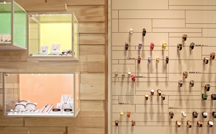
One of the aims that led to the definition of the concept has been the opportunity to customize this retail space from time to time, according to visual merchandising strategies. In fact the backlit backgrounds of the hang display cases can be easily alternated.

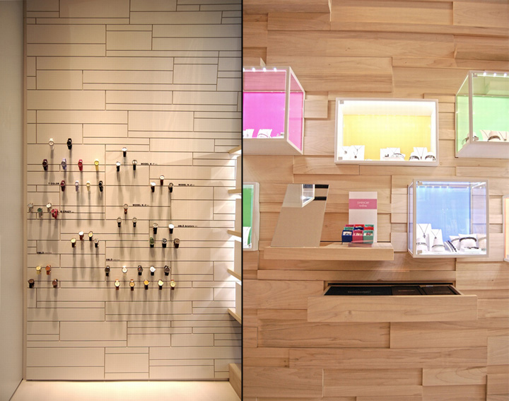
The all-over solid wood (white poplar) walls provide elegance and motion to the space, while acting like undertone for framework-shaped visual displays, in which products are clearly highlighted, thanks to a thorough lighting project.

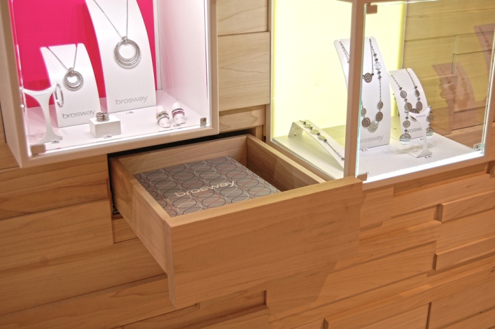
A series of drawers are hidden within the solid wood walls: at first sight it’s hard to realize whether each wood lath is the front of a drawer or not. Besides providing space for stock, these timber walls house tiny pullout shelves equipped with mirrors. The geometric pattern produced by the repetition of timber laths has been rearranged for the exhibition wall specifically designed for watches.
Photos by Annalisa Lever





Add to collection


