Doctor Manzana mobile store by Masquespacio, Valencia – Spain
posted by retail design blog on 2013-12-13
Add to collection

Masquespacio presents their last Project realized for Doctor Manzana, a store specialized in technical service for smartphones and tablets, besides being a seller of design gadgets for mobile devices. The project consists in the redesign of Doctor Manzana’s branding and the realization of the design for their first point of sale located in Valencia, Spain.
The project starts from the necessities from Doctor Manzana’s brand to open their first physical point of sale after the great success reached through their technical service offered until now only online in Spain. Due to the growth of the company in first case design studio Masquespacio redesigned the graphic identity of the brand with the purpose to strengthen the identity and apply it to the point of sale.
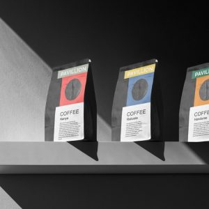
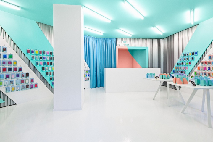
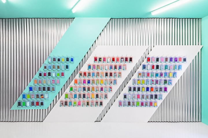
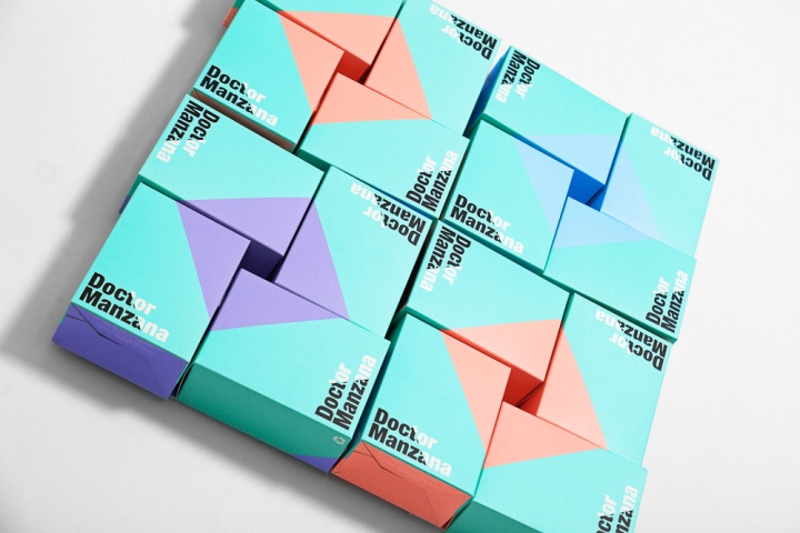
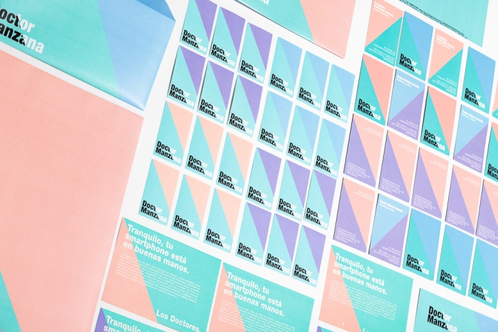
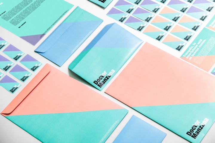
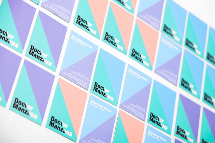
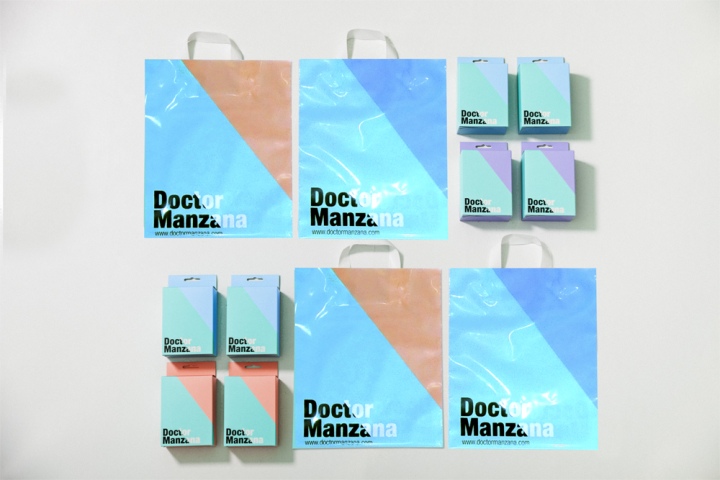
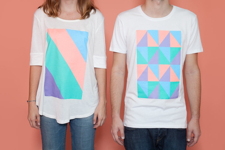
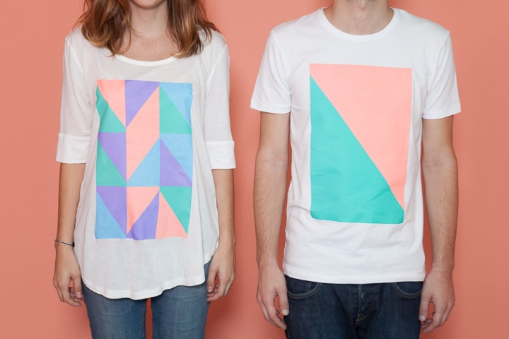
The logotype starts from the principal axe of the company ‘the touchscreen’ and his reflection that creates an angle of 54 degrees. That angle ends being part of the whole communication and his defragmented into different applications that create an infinity of forms able for the graphic and interior design. Ana Milena Hernández Palacios, creative director of Masquespacio: “Talking about the colors as we started from a company name allied with a doctor we wanted to create a concept based on a hospital, however as we didn’t want to create a conventional design, we discarded this option, but maintaining blue and green colors as a reference to the first word in the company’s brand name.”
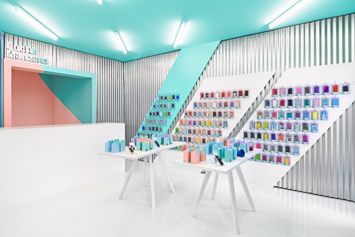
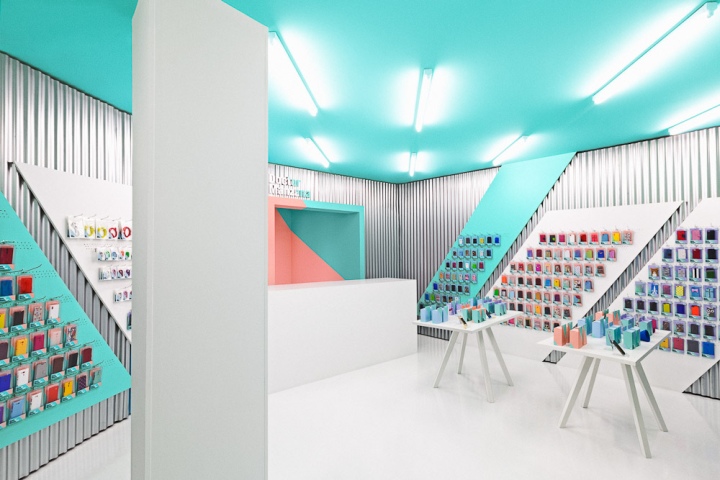
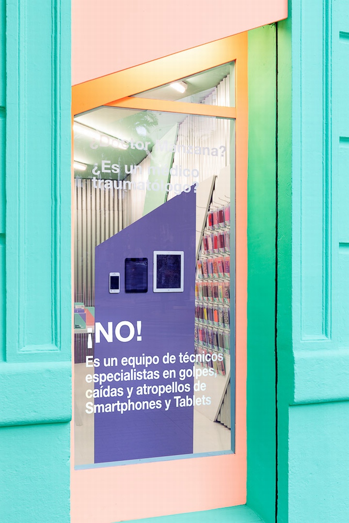
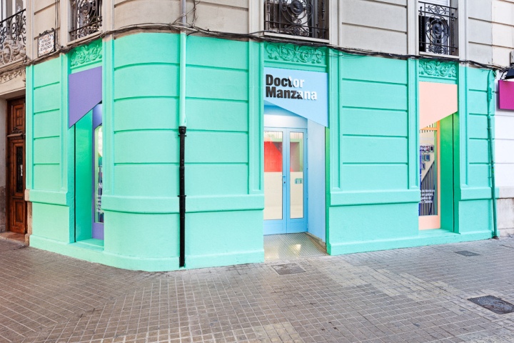
Looking at the store everything starts from the striking façade that incorporates the same angles and colors like for the graphic identity. The blue and green colors like a reference to the doctor, the salmon color for the fashionistas and the purple for the freaks. Both windows contain texts like “Doctor Manzana? Is it an orthopedic doctor? No! It’s a team of technicians specialized in smashes, drops and accidents for smartphones and tables” communicating Doctor Manzana’s services in a funny way.
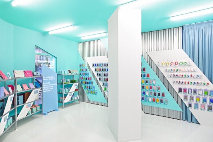
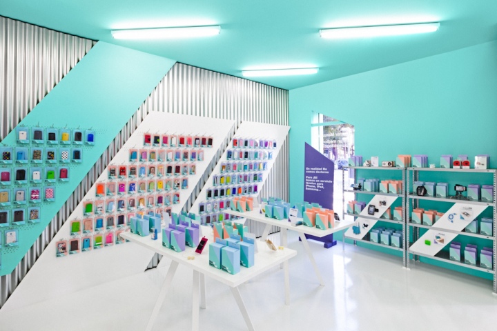
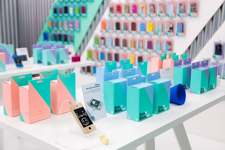
Entering at the store we can see how the interior design as the graphic design contains fresh funny colors and a bunch of angles appearing continually in their original form or defragmented, making reference to the reflection of the touchscreen. A technological air blows through the store, while some details like the blue curtain refer in a metaphorical way to a hospital. Materials like the galvanized steel sheets are doing their more industrial work in the space, while white furniture is offering a light warm touch to the whole. Meanwhile, the different pastel colors bring the diversion part of Doctor Manzana’s identity to the space.
Masquespacio through this Project shows again that creativity has no limits and that high budgets aren’t needed to obtain an explosive result for brands looking to transmit a sober or a funny image like in this case with Doctor Manzana.
Adicional Information: When we saw this location for the first time the floor, walls and ceiling where in really poor conditions. Like in every project we looked for innovative and resistant materials, that could reduce the cost and obtain a more attractive result. Just like that we decided to use galvanized steel sheets, a resistant material with a lower price than that needed to restore the walls. The laminated floor that above being in poor conditions didn’t fit with the overall concept was painted entirely offering a more resistant and durable solution.

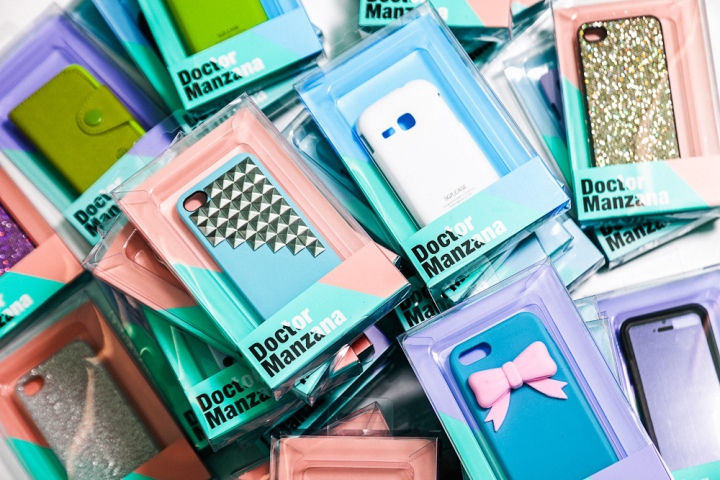
Talking about the logotype’s defragmentation we can see how the cube behind the counter is a replica from the packaging also done by our studio. Other curiosity is the angle that changes according to the point of view of the spectator. As last for the exposition of the smartphone cases we decided to opt for less products on sale and more in stock to obtain a visual more attractive result and offer a better view for the buyer to buy their favorite model for their favorite phone.
Design: Masquespacio
Designer: Ana Milena Hernández Palacios
Graphic design and interior designed by Ana Milena Hernández Palacios
Photography: David Rodríguez


Add to collection