
Fika Bar & Kitchen, based in Brick Lane, East London, has built up a loyal following since its 2008 launch. In recent years, however, the venue’s weekday trade has suffered from an influx of new bars, restaurants and cafes into the increasingly trendy Brick Lane area. To combat this threat, Fika needed to freshen-up its brand image to re-engage with its audience, encourage customer loyalty and re-establish its credentials as a fun, quirky place to visit. We were asked to devise a flexible, easy-to-implement, multi-faceted identity that would be effective across multiple touch-points.

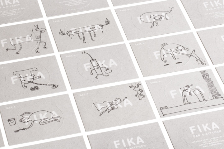
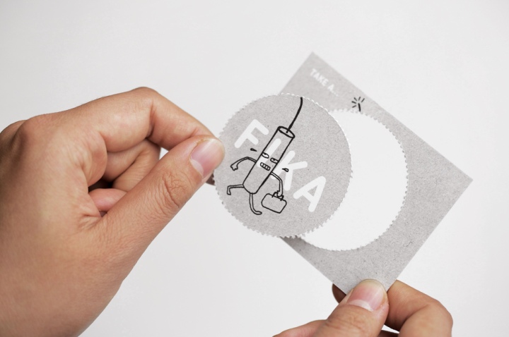
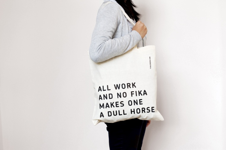
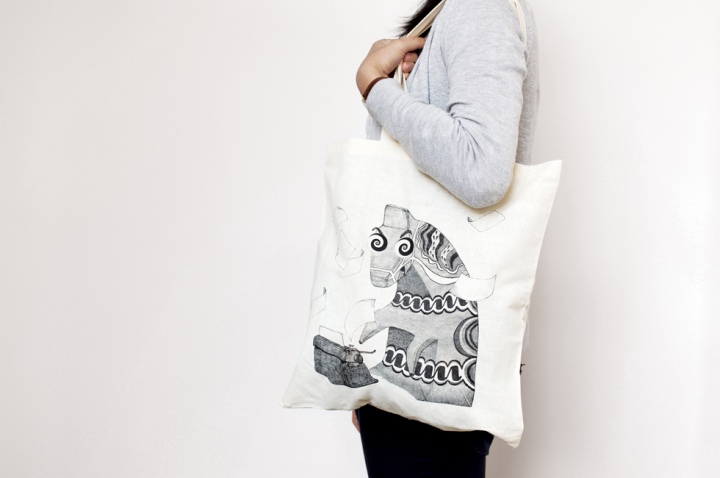
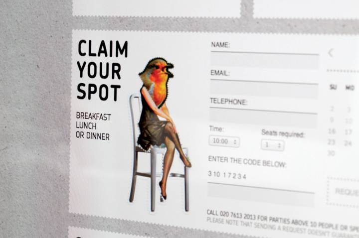
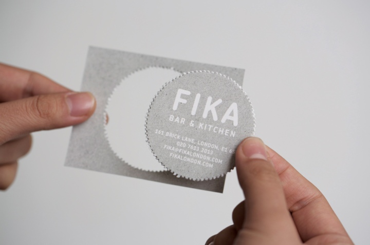
Fika is named after the Swedish word for coffee break and we needed no encouragement to express its ‘Take a Break’ proposition in a way that matches the brand’s quirky personality and cosmopolitan location. Our branding solution is based on the notion of a break from the dull routine of daily life. This is subtly expressed by perforating sections around and within a mix of photographs and illustrations.

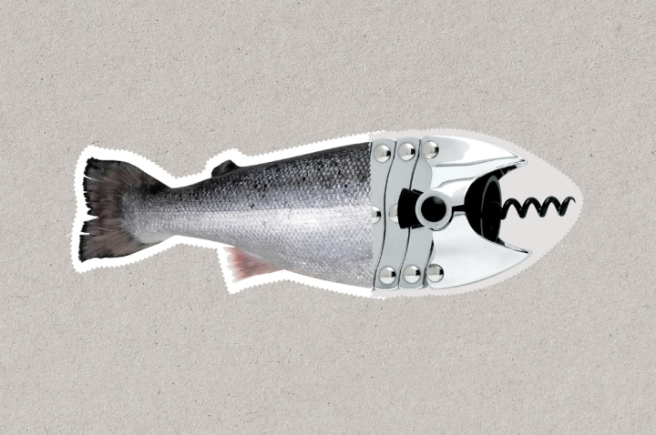
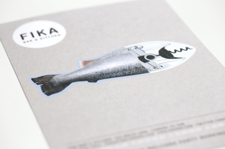
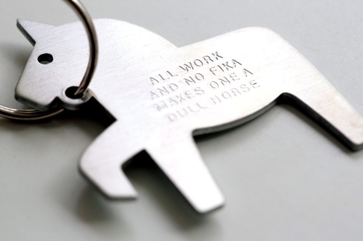
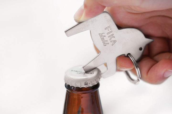
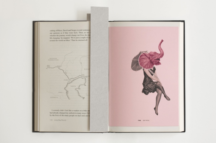
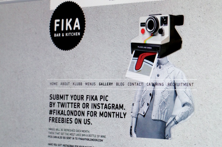
Sections are perforated and removed and either assembled as collage or used individually to express a variety of messages. The perforated edging detail links each image back to Fika and the theme of ‘Take a Break’. The website photo-gallery, for instance, is illustrated by a cardigan-wearing lady with a Polaroid camera head and the catering section features a casserole dish walking with the aid of cow’s legs to communicate ‘Fika away from Fika’. These surprising collages continue with the pairing of a corkscrew with a fish (Bar and Kitchen) and a hand wearing a chef’s hat and holding cooking utensils.

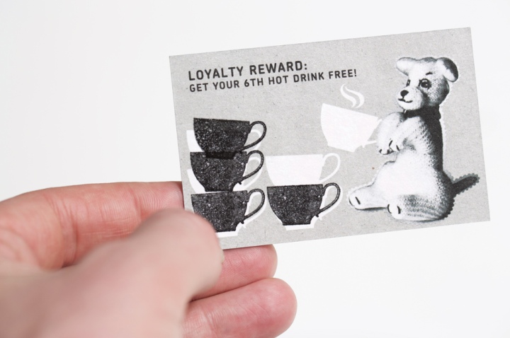
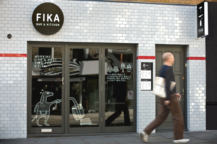
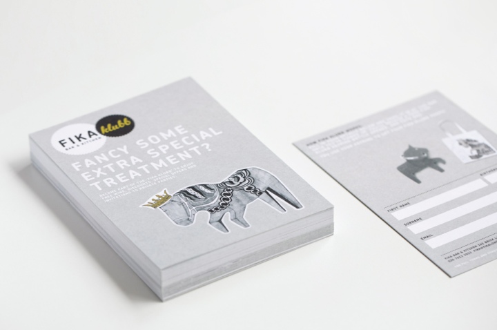
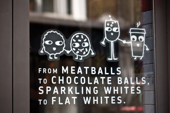
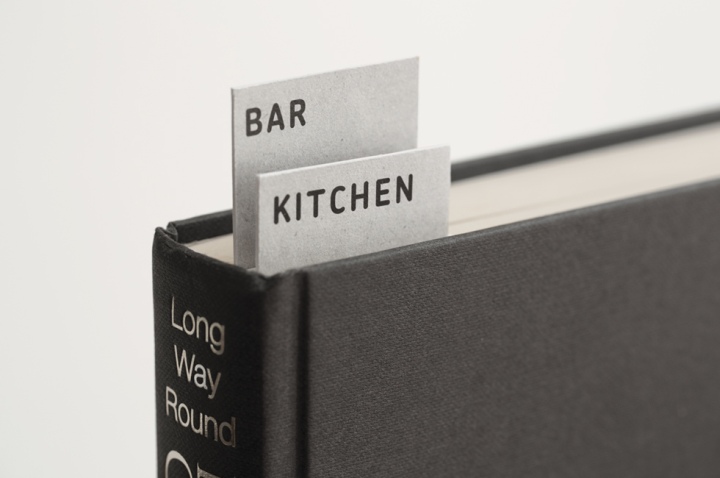
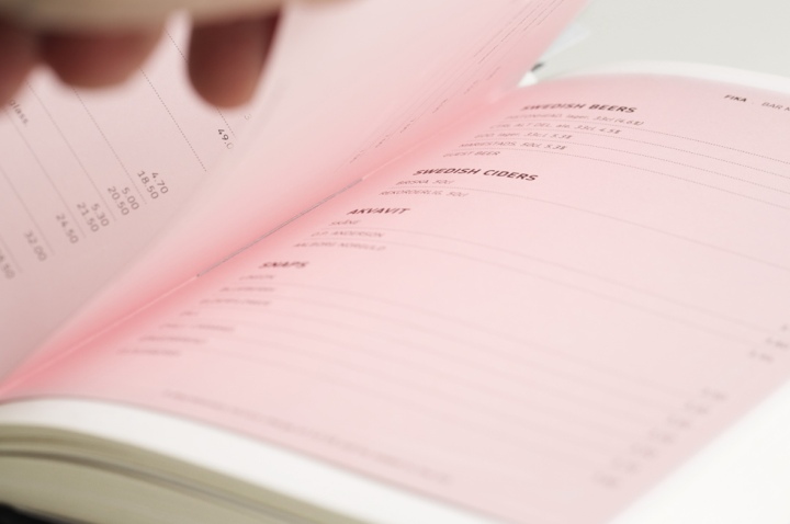
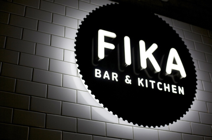
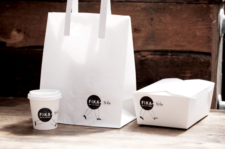
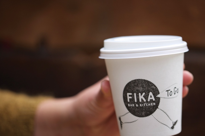
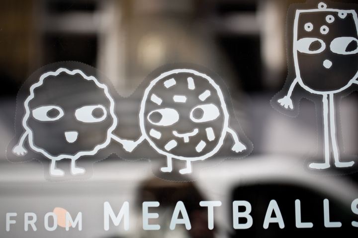
For the window signage, we featured monotonous situations that ‘break’ when the cafe door is opened…a vacuum-cleaning dog is separated from his chores by the opening door. We put branded bookmarks in classic novels to help find food and drink menus and provide a break from the story. We’ve also adapted the branding concept to many other situations, including a loyalty scheme and Fika’s takeaway offer. Altogether, our Fika branding is a feat of joined-up, broken-up thinking.

Fika’s weekday trade has approximately tripled in volume since the new exterior signage and window displays have appeared and the recently launched ‘Fika Klubb’ has gained a steady growth in numbers. The brand refresh has been implemented in stages and further positive results are expected.
Designed by Designers Anonymous


http://www.designers-anonymous.com
