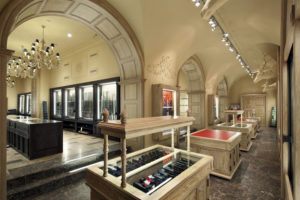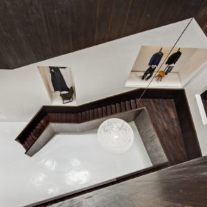


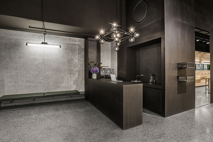
When passion and perfection meet, an appropriate staging is needed. Reason enough for the Munich optician Chris Leidmann to realize his dream of the perfect eyewear shop with his third store. A rather reserved and yet exceptionally expressive optical shop opened for business in 2013 on Munich’s flamboyant shopping avenue. The concept is as simple as it is ingenious: Clear-cut lines of colors and shapes. Purism meets the nature of a loft.

Every element reveals an affinity for perfection and an eye for detail as well as the devotion to craftsmanship, quality and tactile feedback technology. The focus is on almost nostalgic values. Back to perfection and an all-encompassing service for the customer, taking time and showing transparency. Two Munich architects are responsible for the design: Kirsten Scholz and Stephanie Thatenhorst. The interior concept arose in close consultation with the company founder Chris Leidmann, combining an international flair with the charm of a functional eyeglass factory.

Natural materials of the highest quality were used: Untreated oak, oiled carbon steel, fair-faced concrete, and leather were skillfully put into place with superb workmanship and attention to details. Another visual highlight is the visible office at the endpoint of the shop, in which a wall vegetated with real moss directs the eye upwards and establishes the reference to nature and the natural materials often used in the eyeglass designs.

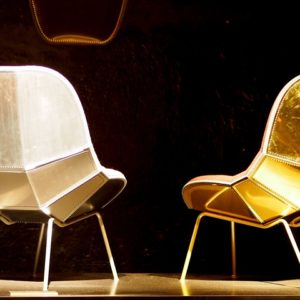
Nevertheless, the “star” is and remains the eyewear. Through a minimalistic product display, the shop’s interior design guides views to the essentials: The hand-selected eyeglass models (see list below) as well as their own eyeglass designs from the House of Foret-Leidmann. Hidden drawers, presentation display cases, and inlaid work utensils are the secrets of this simple and elegant room design. Accent pieces of furniture (including chairs, glass pendant lights and side tables from Classicon) complete the picture.
Planning, Approach, Concept: Architect Dipl.-Ing. Kirsten Scholz & Architect Dipl.-Ing. Stephanie Thatenhorst & in close collaboration with Chris Leidmann.
Graphic Partner: ID&CO
Photography: Derek Henthorn
Website: www.leidmann.de
Brands Maximilianstraße: Ralph Vaessen, Barton Perreira, Céline, Masunaga 1905, Dita, Reiz, Cutler and Gross, Lancier, Wolfgang Proksch, Lindber,g Precious, Mykita, Thom Browne, Onono, Foret & Leidmann


Add to collection

