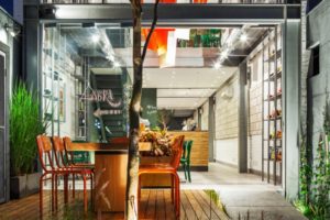
Spar supermarket flagship store by LAB5 architects, Budapest – Hungary
posted by retail design blog on 2013-12-28
Add to collection


MOM Park is a shopping mall located in a wealthy district of Budapest. When SPAR decided to open its supermarket there, they had the idea to build a flagship store, and have a unique design for it to achieve elevated experience of shopping. They invited architects and interior designers to submit design proposals in a non-open competition. LAB5 architects won because of the look and feel of a market space, with a friendly industrial atmosphere. Luckily later 90% of the original ideas could have been realized.

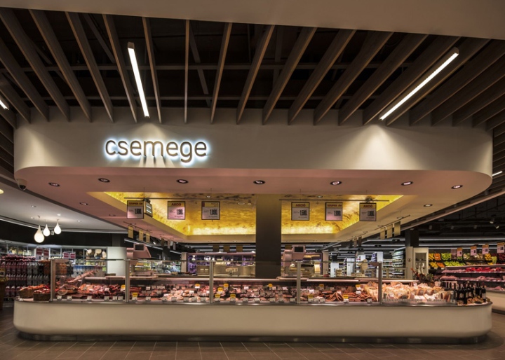
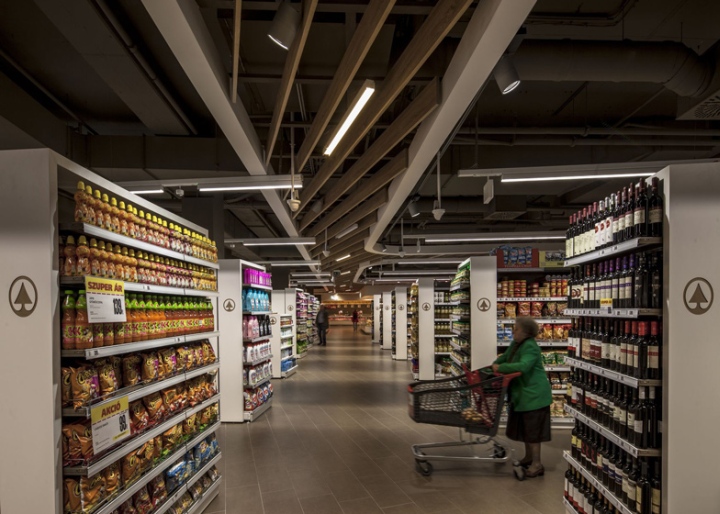
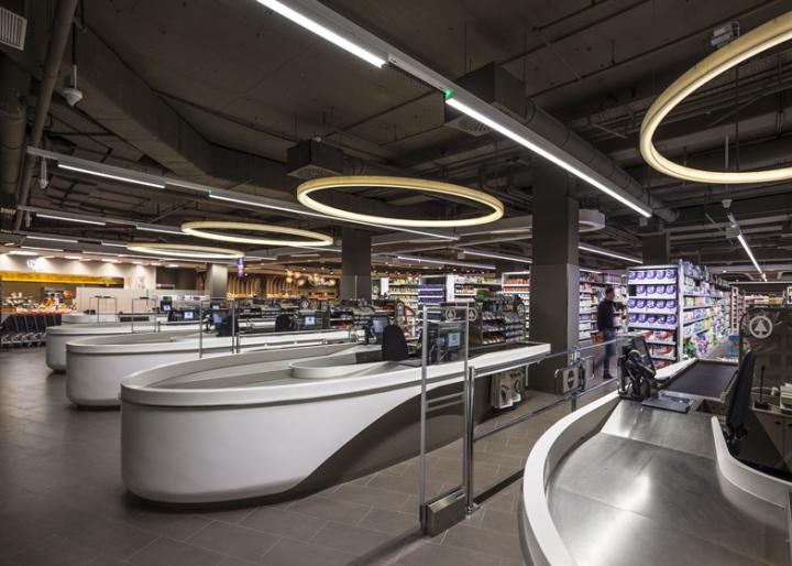
Located in a shopping mall, this retail can draw mainly three kinds of costumers, so the layout is organised accordingly. One can be shopping very quickly even not entering across the gates. There is a “short route” for quick daily shopping, and a “long route” for weekend buyers. All the forms in the interior are inspired by this flow of costumers. From the entrance the ceiling is attracting you to the back zone, and then shows different possible ways to go on. The block before cashiers doesn’t have suspended ceiling, and it is just clear and organised.

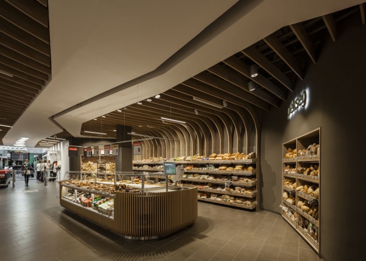
Due to the condition of the modest internal height, we wanted to gain the space above the suspended ceiling zone, so we didn’t put a ceiling, unless it was really necessary, and also in a free-form way. Where we could we used solid white surface, and where we had to put additional elements (lights, sprinkler, etc.) we used optical ceiling. Where possible, shelves and counters are forming islands, just as if they were standing at a market.
There are two zones where the ceiling converts into a 3d form by flowing down to the ground. At the bakery products warm feelings are strengthen. At the wine section, the lamellas of the ceiling are continuing down to the ground to form a space of a cellar, and to indicate at this point the quality and the culture of the product. Generally saying, as the ceiling is the element that can be seen from everywhere, it became one of the main elements in orientation and of impression.

The Dutch word “Spar” meaning pinewood gave the idea of using “wood-like” materials at the ceiling or at the winery. It also helps to create a more cosy atmosphere in spite of many industrial elements. We chose acryl (corian) for the finishing of all rounded furniture, as they had to be white, shiny, clean, durable, and supporting the “fluid” effect. Due to many contradictory specifications we couldn’t apply concrete for the floor as we planned, but the single colour solution of grey tiling is perfect for the goal.

Maybe because of the fact that we are architects and not interior designers originally, we were seeing this retail as being one part of the big shopping mall, so we used the colour brown of its public spaces, on many elements (floor, ceiling, rear of shelves, etc.), and no other colours (beside grey and white).


http://www.dezeen.com/2013/12/24/spar-supermarket-displays-groceries-between-curved-wooden-ribs/


Add to collection