
The Spanish studio creates the new retail branding strategy for the Spanish shoe store chain
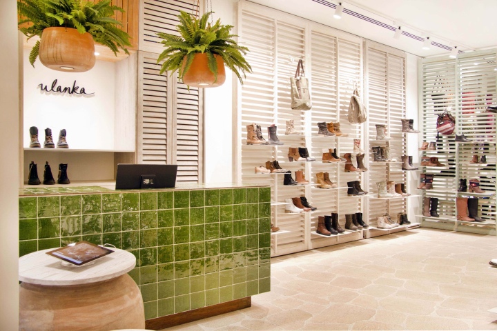
CuldeSac™, one of the most impactful studios in our country, has coordinated, designed and executed the entire project of giving Ulanka shoe stores a new identity and store design. This was an ambitious retail branding project that plays on the brand’s Mediterranean positioning to prepare the way for its globalization and is done in response to the ideas of the freshness, the quality, the experience of a company that has been around for over 20 years and which has 75 stores throughout Spain.
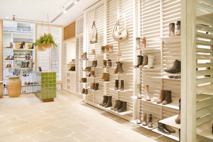
In addition to generating a new logo and graphical identity for Ulanka, CuldeSac™ has worked on the concept, design, production and application of the brand in the stores, thereby increasing the quality of the buying experience –bringing innovation and increased value– and generating an emotional link between the client and the firm. The retail approach developed by CuldeSac™ arises from the dual need to build a distinctive spatial identity and provide, in turn, a unique and memorable experience.
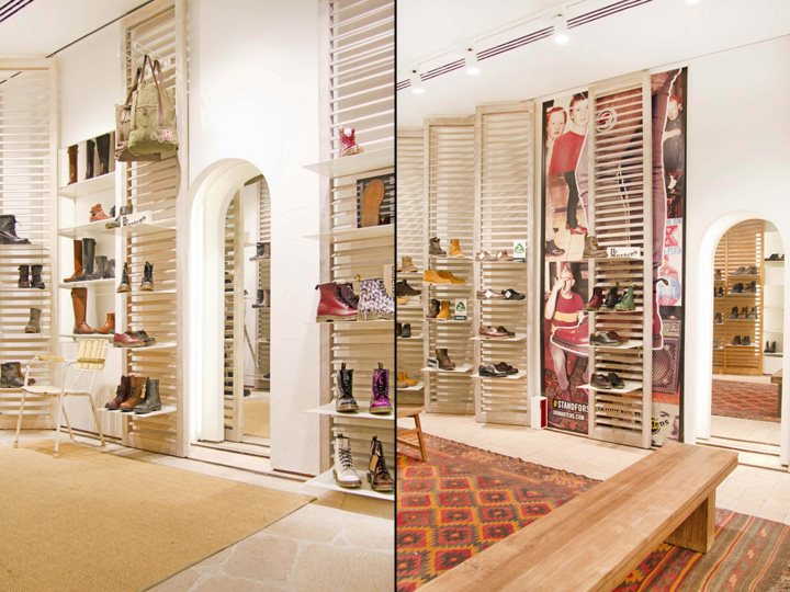
From an impersonal experience to a Mediterranean and positive experience
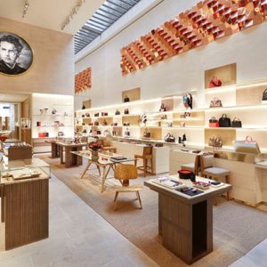
Based on the new brand image created by the branding department, CuldeSac™ Retail proposes that the values be transmitted via the Ulanka points of sale. This is possible thanks to various factors: the ad hoc exhibition partitions created to offer a new buying experience, the care for exhibition rhythm and the sampling of product more segmented and concentrated into mini-spaces within the complex, the open-air windows that add value to the product and make them shine, the dressing room mirror and the campaign images.
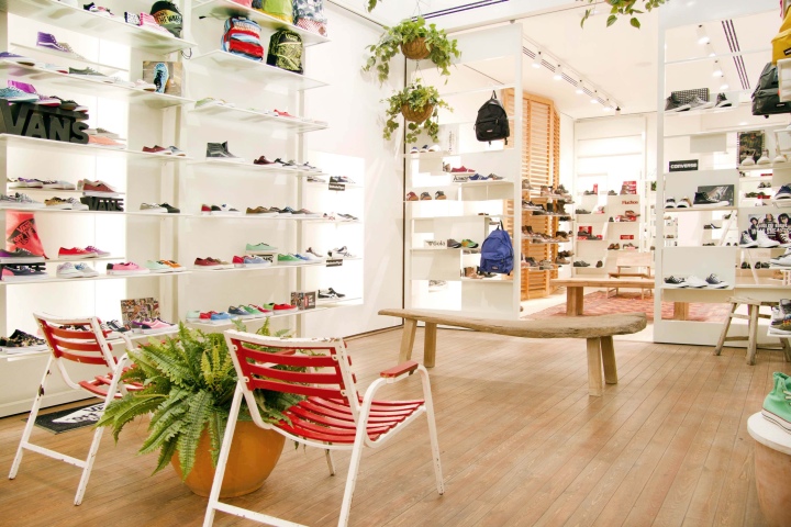
Each and every one of the essential elements of the project has been conceived as a “permeable” layer in the space: exterior light, exhibition walls, exhibition partitions, branding campaign and dressing room areas. In this manner, the traditional concept of a store as a closed box gives way to a new functional and operational exhibition system that gives rise to lighter and more enveloping sensations. The Mediterranean look and feel of the new Ulanka establishments emphasizes the origin of the company and its culture through light, the materials and its freshness. With that, the spaces emanate energy, are natural and express life. Ultimately, they are “positive stores.”

Accentuating the message in order to win over the consumer
With the aim to define the DNA of Ulanka, the work by CuldeSac™ has contributed to ensuring that these new stores possess an unmistakable spatial identity, showcasing the product and creating a cosy and fresh ambience.
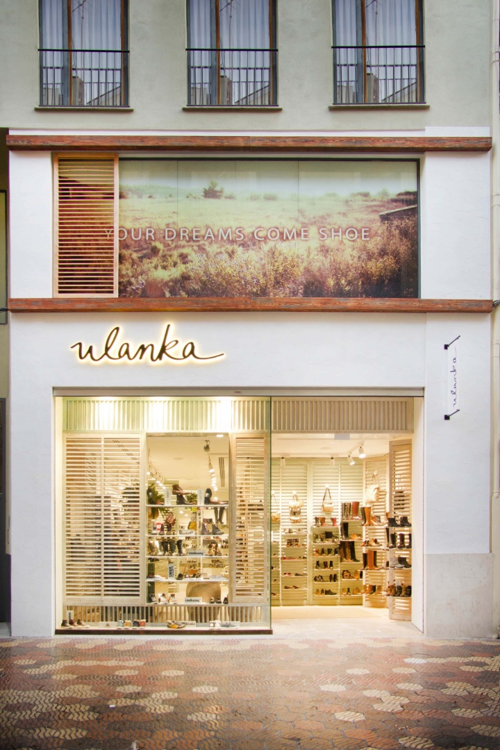
The company’s expectations clearly have been met, plus Ulanka’s new image has made it such that it “speaks the same language” as its potential audience. Even though a younger audience (15-25-year-olds) already regularly purchases Ulanka products, the goal of the work performed by CuldeSac™ has been to capture a more diverse audience, comprising the set of people aged approximately 25 to 40. Through this exercise of retail branding, independent spaces have been created for the three types of consumers (girls, women and men), a strategy that has proven its success with an increase in sales.
Photograph: Misael del Rosario


Add to collection

