

The exhibition was curated by Dezeen columnist Sam Jacob – one third of experimental architecture studio FAT – and Wouter Vanstiphout of Dutch firm Crimson Architectural Historians. Entitled A Clockwork Jerusalem, it encompasses the New Towns created by postwar British planners in the 1950s, 60s and 7os, alongside references from popular culture including Stanley Kubrick movie A Clockwork Orange.
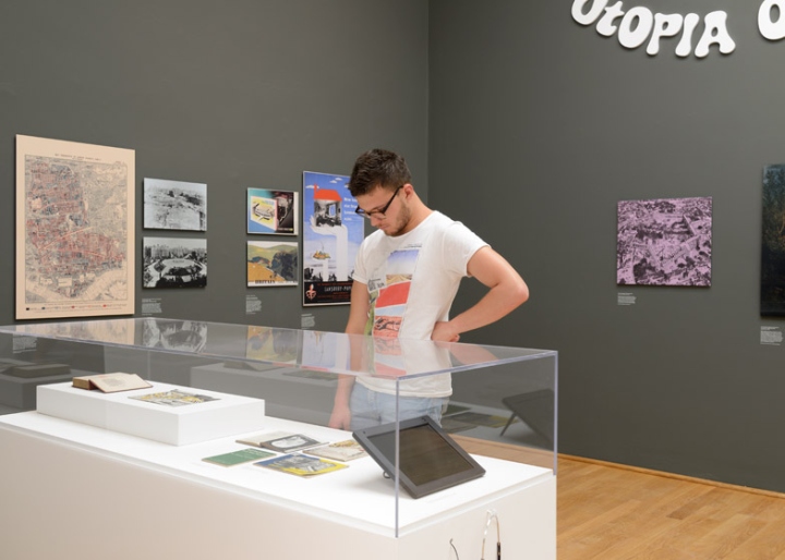
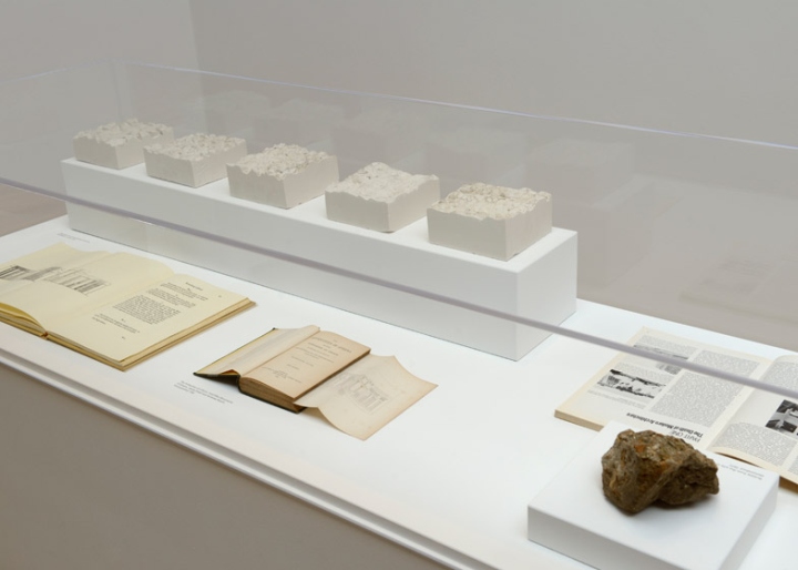
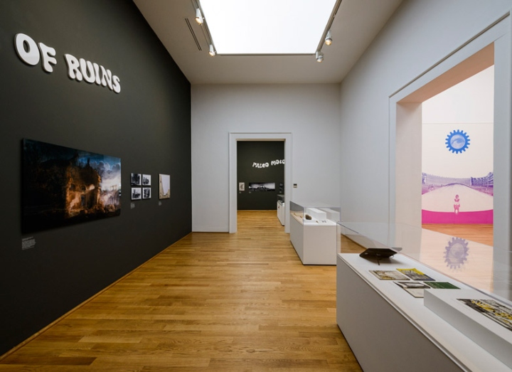
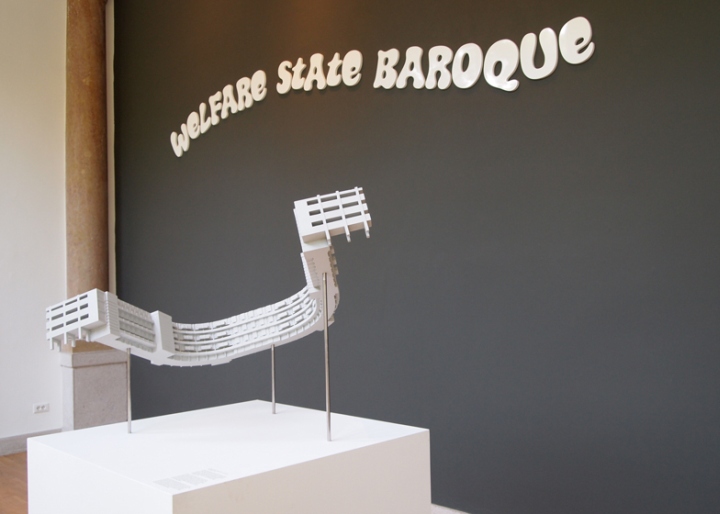
“The ambition we have for the British pavilion is really twofold: one is to tell a historical story, to describe what happened and why, and what it did,” Jacob told Dezeen. “But it’s also a call to arms for contemporary British architecture, for it to to reengage with the imaginative visions and the entrepreneurial spirit of actually being able to affect change.” The exhibition uses images, models and artefacts to depict Britain in the aftermath of the industrial revolution. Exhibits vary from Cliff Richard record sleeves to models and photographs of significant housing projects in unfamiliar places such as Hulme and Thamesmead.

“A Clockwork Jerusalem describes a world where ruins become utopias, where archaeology and futurism merge, the picturesque is reimagined as concrete geometry, and where pop culture, history and social ambition are fused into new national futures. It argues for a rebooting of the British tradition of visionary planning,” said Jacob. Vanstiphout continued: “Britain sometimes seems to forget its own long history and tradition as a country of town planners, from the New Towns Act (1946) through to the pop-radicalism of Archigram and Cedric Price, and the entrepreneurs – strange cultish groups and activist communities that have also hugely contributed to the national debate about shaping the environment.”

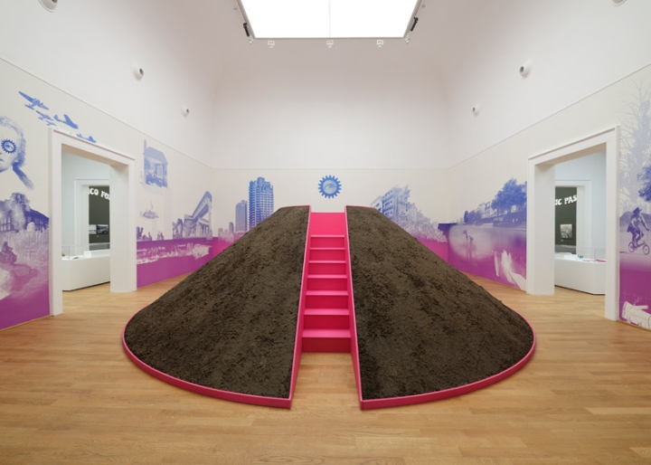
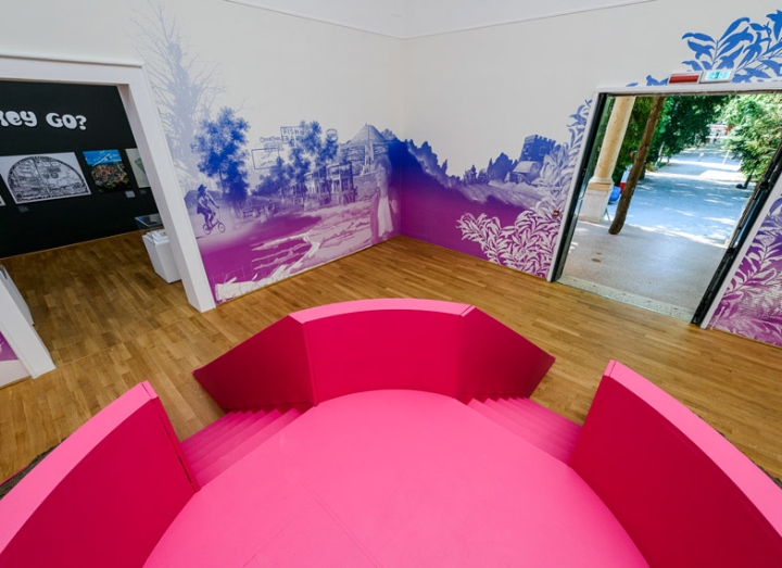
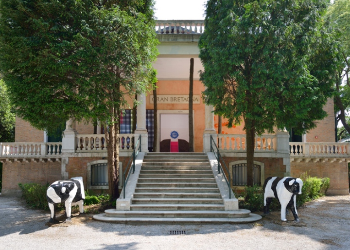
At the centre of the pavilion is a seven-metre-wide earth mound, with stairs on two sides allowing visitors to climb on top. According to the curators, the mound was a notable landscaping feature in many housing projects, including Arnold Circus and Robin Hood Gardens. In the spirit of Venetian lions, two cows make the entrance to the pavilion. These artworks were created by artist Liz Leyh in 1978 for Milton Keynes – the most recent of Britain’s New Towns. The wall of LEDs is located beside the entrance and displays an image of a galloping horse, in reference to white horse carved into many British hillsides.
The pavilion was commissioned by British Council director Vicky Richardson. “A Clockwork Jerusalem is a witty and insightful exhibition that we hope will provoke debate about British architecture,” she said. “The exhibition uses images and language brilliantly to link a series of complex issues that we hope will lead to a new debate about the UK’s plans for housing and New Towns.”






Add to collection

