

Tonic Room by Material Creative, Auckland – New Zealand
posted by retail design blog on 2014-06-18
Auckland
Add to collection
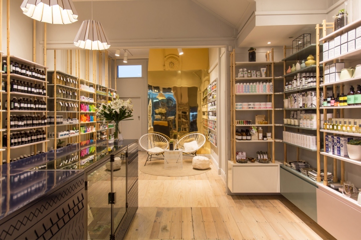

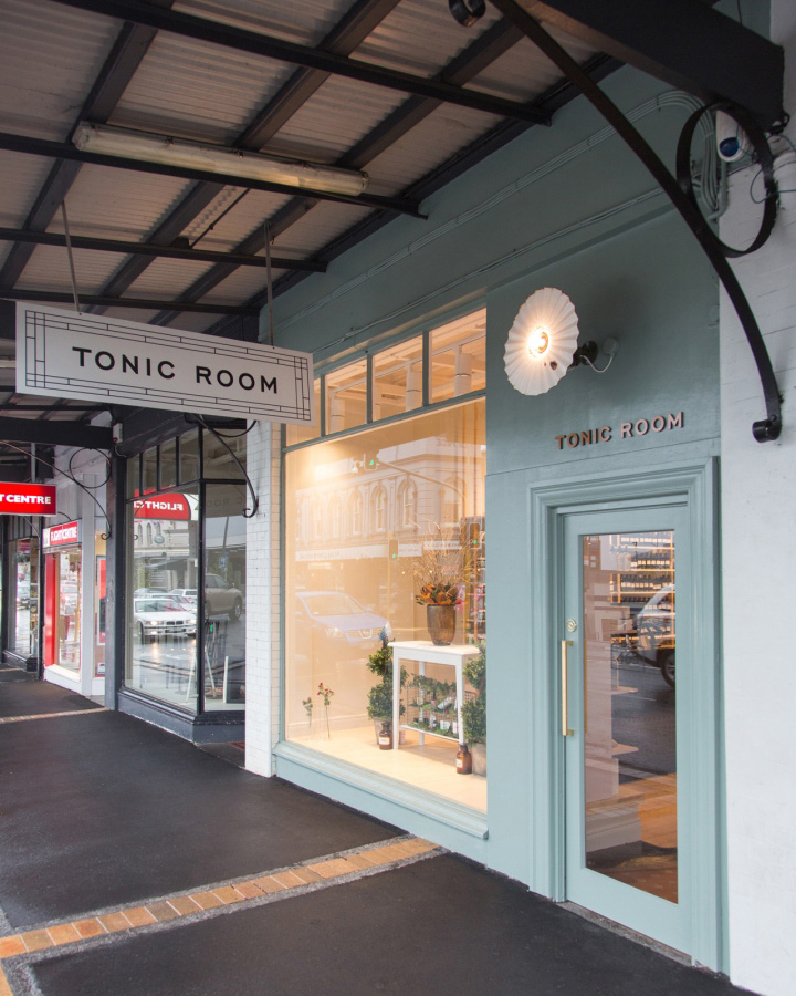
The client had a clear vision for more light within the space, so we took on the challenge to transform a dark and tired heritage space into a light, airy, warm environment for the newly rebranded Tonic Room. The branding for the store (by Hardhat) references ancient Alchemy and apothecary. So we wanted to play on the ornamental patterns that adorn apothecary jars. Also looking back to the history of pharmacies, apothecary, and chemists we found a common thread that ran throughout every store; floor to ceiling shelving displaying tonics behind the counter and a long counter with glass display running down the opposite side to the entry door. Everything in order and connected.
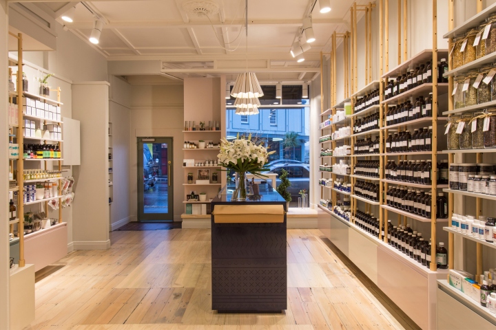
We stripped the interior of all its ad hoc additions that had accumulated over the years, replacing all lighting, bleaching the existing floor with rock salt and we added a feature brass reflective wall to bounce the light around the space and make it appear larger than it is. The floor to ceiling colour blocked shelving units add height to the already voluminous space, and reflects the brands beautiful pastel colour palette, with fine brass and timber details. Again the brand is reiterated in the detailing of the counter, where patterns are routered into the carcass and sprayed high gloss navy. The whole space now has a sense of calm, order and warmth that glows from within.
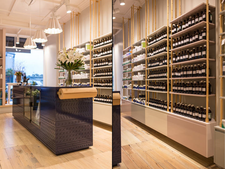
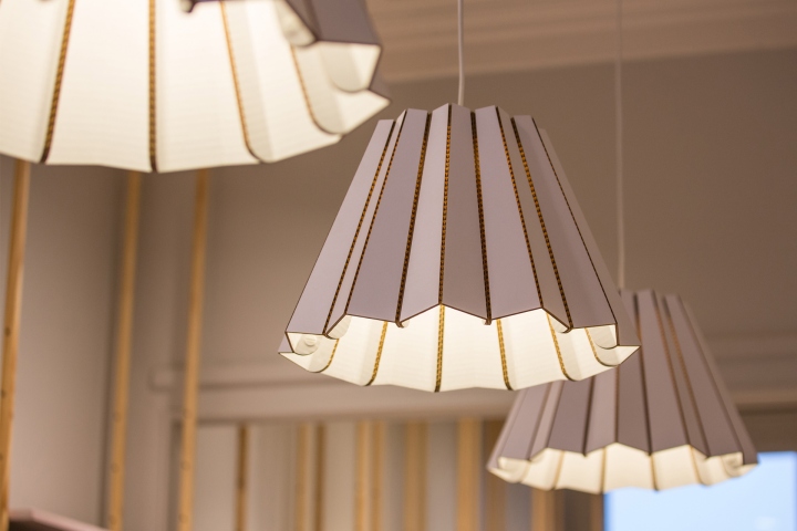
Only a limited range of colours were available to the ancient potters of the apothecary jars and all pigments were of mineral origin. Decoration was added from metallic oxides. We decided to reference the patterns, colours and materials of the apothecary jars in the store fitout in a way that is unexpected and beautiful. With the use of brass details in the pins of the shelving, the brown paper roll holder and brass wall, giving a sense of luxury. The mineral colours were toned down to pastel like hues and were used in all the shelving, creating colour-blocked strips on the light grey walls. Paired with timber a sense of nature creeps into the refined space.
As the building is heritage listed we were unable to penetrate the ceiling. We wanted cantilevered base cabinets with drawers for extra storage to the shelving to give the shop a sense of openness, so to give the shelving stability we came up with a timber plug detail at the top of the dowel runners that secures the shelving to the wall. The counter is also a feature in the store, we designed it to looks considered from all angles as it is front and centre and can be seen through the shop window. We had the joiner’s router a CAD drawn pattern we designed from the overall brand on MDF panels and sprayed it Navy. The pattern gives texture to the counter and screams to be touched.
Designer: Material Creative
Shop fitter: Stanley Joinery
Branding: Hardhat
Photography: Jeremy Toth


Add to collection