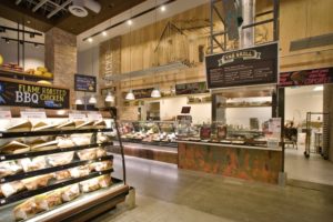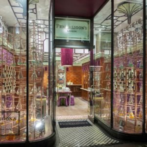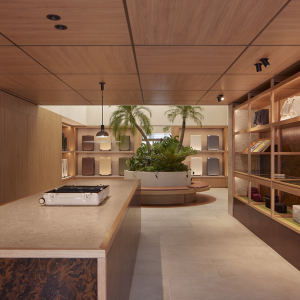
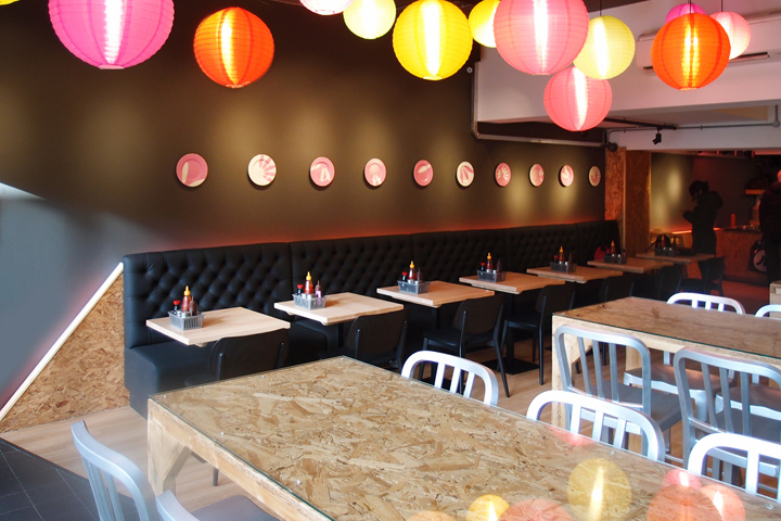

The overall look for this Southeast Asian eatery, designed by Richard Brownlie-Marshall, is a fusion of traditional meets the futuristic. The design has recently been shortlisted for a Retail Week Interiors Award, for Best Small Store.

The logo is based on grains of rice, that make up the ‘S’ formation and can be seen in abstract applications around the store, such as on the bespoke plates displayed across the wall. There is a mix of textures used, with urban chipboard slicing across into a simple deep grey. The space transforms from day to night, playing with natural light and the sweetened glow of neon in the evenings.
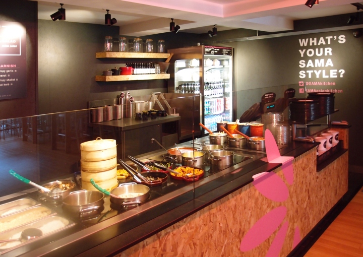
Richard says, “Having worked on many interiors for the Tossed brand, I wanted SAMA to have a very different feel, something darker and with somewhat of an edge to it. As this was the first time introducing the world to the SAMA brand, I aimed to make a statement in the store.” He has opted for a severe diagonal that cut through the wall, demonstrating the blend of traditional and contemporary. The line cuts through the logo, dividing the noise of chipboard and the smoothness of a simple deep grey.

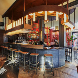
The colour palette is very muted; mainly using light wood, black, white and accents of pink. There is an industrial feel, which can be seen in the neon glow coming from behind the chipboard sections. These transform the environment from day to night, bringing a warmth in the evening and glowing through the windows, Richard says, “it’s as though a spaceship has landed in Wimbledon.” To add an element of colour and give a nod to the traditional, lanterns fly overheads to guide the guest down through the restaurant.

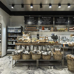
To keep an informality in the space their are elements of street food which give an opportunity for the tempting ingredients do the talking. On the main counter, the food is displayed in bright cookware, giving off wonderful aromas and being very visually pleasing to the customers. On each table, their are baskets filled with a menagerie of sauces and sprinkles, branded with their own identity, while still falling under the overarching SAMA style.


Add to collection
