
When the Italian owners of two highly successful Durban-based restaurants approached Dakota Design South Africa to help them bring their franchise to Johannesburg, we jumped at the opportunity. Remo’s Fratelli is a family run business founded on the twin values of quality and craftsmanship. No effort or expense is spared in the preparation and presentation of their authentic Italian fare and our task was to create a space which clearly communicated these values to their patrons. Careful attention to detail was the secret to the success of this design.
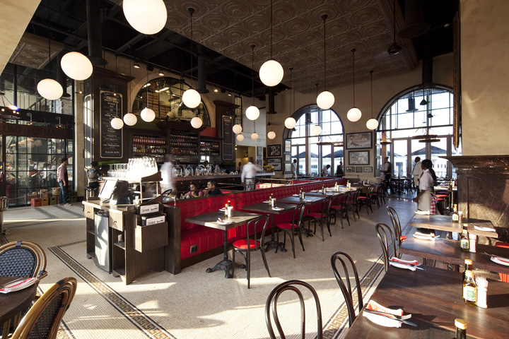
We researched and debated every element of the design from the naturally coloured mosaic tiles to the Italian leather used on the banquet seating. We studied European restaurant, bakery and deli design and combined the elements we loved best to create one space that delivered so much more than just a sum of the individual parts.
Remo’s was expanding to Johannesburg and the task fell to Dakota Design South Africa to design a restaurant which captured the strong family values of authenticity, entrepreneurship and adventure. Our approach was to create a space filled with the kind of theatre usually only encountered in the culinary style capitals of Europe.
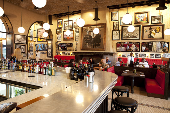
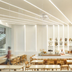
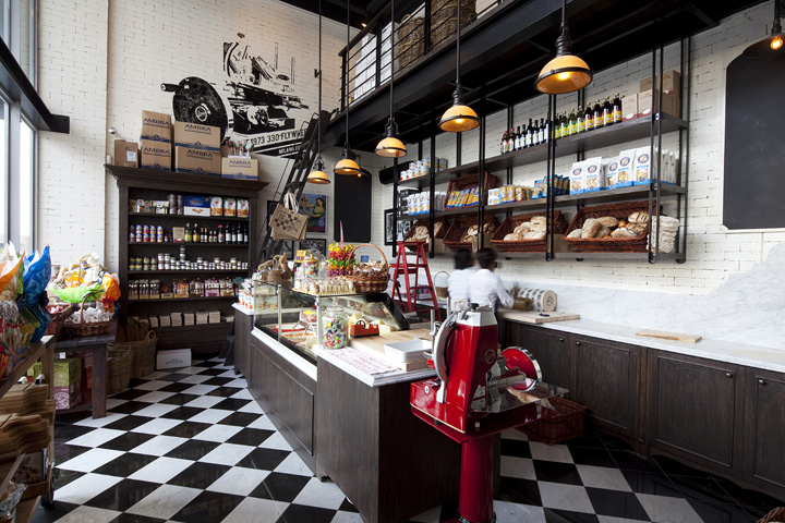
From the centrepiece bar to the immaculately clad waitrons in their full length aprons, everything about the space had to speak of a passionate commitment to gastronomic perfection. By completely re-imagining the interior of what was a thoroughly featureless space, we were able to transport patrons to the eateries of Florence, Milan, Brussels, Paris and Rome. We continued a resurgent European tradition of attaching a deli and bakery to the main restaurant. Thereby maximising the establishment’s value to its patrons i.e. not only can they sample the amazing dishes sold in the restaurant, but also take home the finest Italian ingredients for use in their own kitchens.
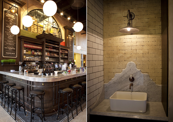
Brick built walls and arches paired with natural stone mosaic floors, speak of strength and longevity. In a world where so many establishments don’t make it beyond their first year, this is a clear signal to patrons that Remo’s Fratelli is here to stay. Not only that, but also the intention is for it to become part of their patrons’ family ritual. A place to congregate to enjoy life, food and family.
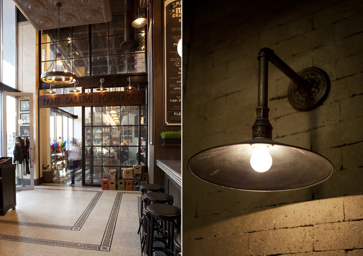
Design Elements: The Bar – without doubt the centrepiece of the design and the heart of the restaurant. It makes full use of the double height volume. The bar counter is literally a work of art. The counter mouldings were handmade and the top then fabricated from tin. There is a generous marble work surface for the preparation of drinks and patrons can stand or sit at the bar for a drink. Brass handbag hooks are provided for security. Industrial wall sconces with Edison style lamps top giant chalk boards, sign written in a retro-contemporary style.

The Bakery – The inclusion of the artisanal bakery area adds a wonderfully “European” feel to the dining experience. The smell of freshly baked bread permeates the establishment and bakers can be seen going about their business through glazed brick built arches. The use of steel window frames enhances the feeling of industry as one watches the bakers retrieve piping hot buns from the elongated ovens with their wooden bread paddles.
The Deli – from which homemade artisan bread, cakes, croissants, quiches, brownies, imported meats and cheeses, olive oils, pasta and sauces can be bought, has an old school feel whilst incorporating state of the art refrigeration and meat slicers for the preparation and display of the finest charcuterie in town. Take away treats and sandwiches are collected as espresso is drunk and conversation is made.

Family – we could think of no better counterpoint to the contemporary/retro space we had designed than the introduction of a carefully curated collection of family photos. This
is an age-old tradition as evidenced in so many continental restaurants and what better way than using authentic photos capturing the amazing exploits of this fascinating family and their love for motorsports. Layering – multiple layers of detail all contribute to the richness of the Remo’s experience. The use of modern design and manufacture techniques twinned with traditionally high quality materials such as brass, marble and Italian leather combine to give the space a tangible sense of authenticity. The use of mouldings throughout the scheme is a constant reminder of the artisanal nature of the food being served. Timber mouldings can be seen around the bar and interior arches. Marble mouldings are evident on the bar counter, in the bathrooms and around the imposing fireplace. We commissioned ceiling tiles moulded in tin from the same artist who made the bar top.
Design by Dakota


Add to collection
