Add to collection
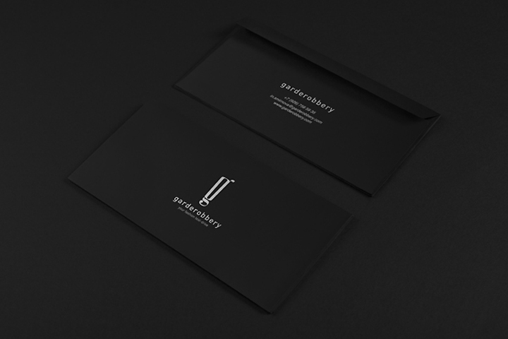

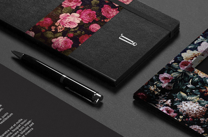
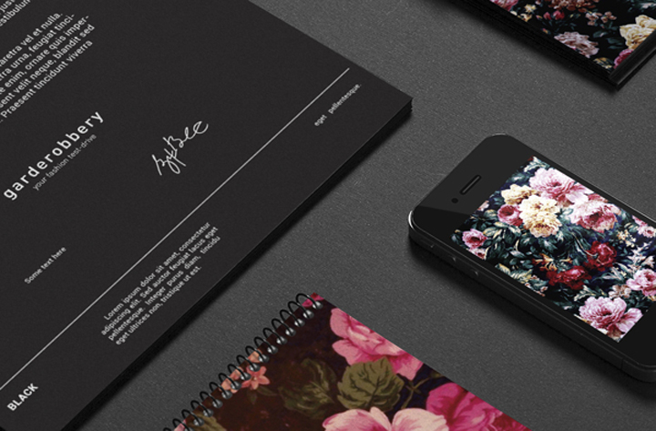
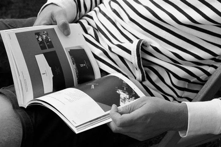
Brand development for the new format of consumption – fashion test drive . The image of the logo was found in the form of cabinets, wardrobes and Commodus as well as in bags and mounts and locks, which corresponded to the idea of the brand. Embodying and generalizing these forms, calligraphic mark was created G – from the word garderobbery. The decision to textures, combined with rich saturated black color was aimed at strengthening the effect of giving an incredible feeling emotional podema.
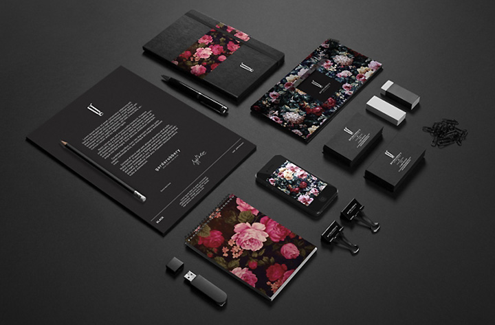
Tekstury may change during the launch of the project – it’s trendy colorful floral motifs, then they will be replaced by a more conservative geometric forms in the performance of plain font compositions, and later the texture will again play a major role, and what they will be is not certain. The important thing, the brand is easy to manage, it is convenient to use and transform it in such a way as to always be in the world trends.
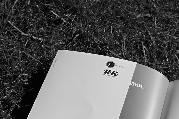
Design by AMPERSAND CREATIVE AGENCY
Designer: Pavel Ilyuk
Creative director: Natalia Tschurina


https://www.behance.net/gallery/Garderobbery/7383521


Add to collection