

Cari De Madame restaurant by TBDC, Taipei – Taiwan
posted by retail design blog on 2014-09-08
Taipei City
Add to collection

The design concept of this project came from the definition of diner in Chinese language. “Can-ting “is Chinese reading of restaurant, “can-“, which indicates the meal, is in front of “ting”, which express the eating place. Thus, an appropriated space solution that serves as a foil to the matured creative operating idea and the product position is what TBDC worked hard for.
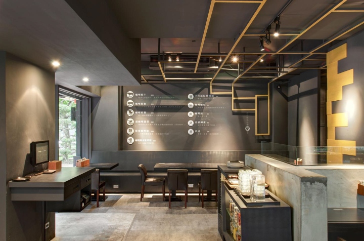
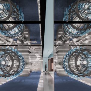
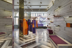
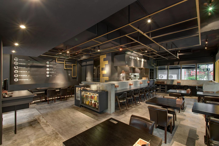
Cari De Madame is located at the first floor where the light could fully access, and faces to a park. The relationship between the indoor space and outdoor natural scenery is guided by means of window frames. Black is playing the theme color role of the overall space, and few golden lines and blocks is used to define the functional and visual partition. The inkiness not only sets the visual design of menu off quite outstanding, but has more gradation after combined with arranged lighting plan. Besides, the blackness has extends to the restaurant appearance and made the greatest difference with the house nearby.

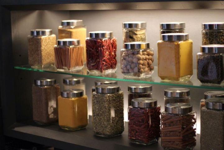
TBDC designed a single-side bar as the partition of kitchen and seating area that responds to the hanging transverse wooden strip. This one-side bar also suits for vary dining number of people. All the customers can communicate with waiters/waitress and receive the messages given by restaurant owner through the furniture and special-designed props which spread around. The show Cari De Madame would like to present is contributed by the creative business philosophy in front stage and thoughtful interior design at the same time, please enjoy!
Designers: 黃鵬霖 Janus Huang, 黃懷德 Roy Huang / TBDC
Photographer: 王基守 Black Wang


Add to collection