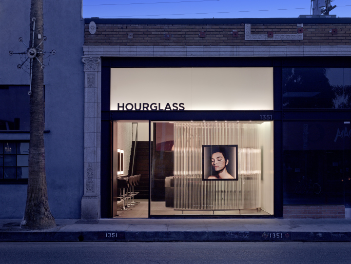

Standard, the Los Angeles-based architectural firm, is cresting a new wave of seductive retail design. When conceiving a flagship retail store for cosmetics brand Hourglass, opening today on Abbot Kinney Boulevard, partners Jeffrey Allsbrook and Silvia Kuhle looked to nearby Venice Beach for inspiration. The compelling results are light years ahead of pervasive store design. The 1400-square-foot interiors feature an arresting mix of reflective surfaces and captivating materials that suffuse the space with an exquisite radiance, as befitting a makeup brand known for its illuminating beauty products. “It’s one of the first projects we have done at the beach and it has elements of water and the reflected light of the ocean,” says Allsbrook. Adds Kuhle, “The intention was to create a sophisticated environment where you feel welcome, engaged and inspired.”

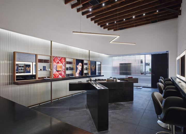
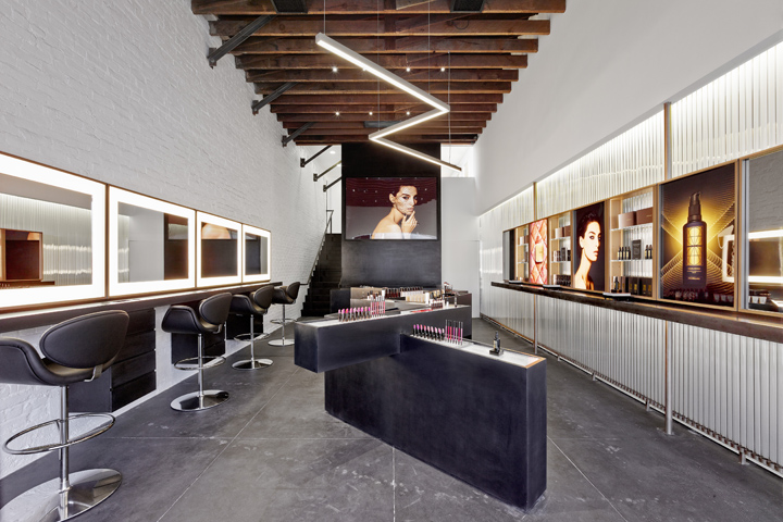
The Hourglass store takes shape in a pre-existing commercial building from the 1920s. To reanimate the space, Standard prescribed a juxtaposition of raw and refined features. Backlit glass rods form a curvilinear wall, edged mirrors extend from the storefront to the rear of the space, while a mirrored cosmetic counter and illuminated beauty images decorate the remaining walls. “There are three themes at work in this project,” says Allsbrook. “First, we have a loft-like space with raw elements, such as the original wood beams and an exposed brick wall which has been painted white. Next, to bring light into the store in a unique way, we added a series of glass rods for shimmering illumination.” By day the elongated tubes will gleam with natural light streaming in from several rectangular skylights, and by night LED lights will extend the glow. “Finally, there is the customized furniture which presents the merchandise in a novel way,” adds Allsbrook.

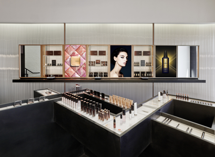
The centerpiece of the store is a zigzag-shaped display fixture, composed of onyx quartz and calacatta marble, on which the entire cosmetics collection is displayed. The unit is a nod to the French designer Jean-Michel Frank, in particular his Elephant Chair from 1939, with its angled wood frame. “We wanted to create an interesting piece of furniture that could become a brand identifier,” says Allsbrook. Indeed, Standard has already duplicated the free-flowing display for an Hourglass counter at Urban Retreat, a beauty salon at Harrods in London. Its angular, undulating design encourages clients to discover the collection at their own pace. The Hourglass flagship bucks the trend for incorporating residential touches, such as reclaimed wood and bright color, into retail design. The color scheme is resolutely neutral, the only splashes of pigment coming from the cosmetics themselves, and the visuals. “It’s not a residential feel,” says Kuhle. “But the materials we selected have depth and visual interest.”

Standard is known for have designed scintillating retail spaces for Maxfield, James Perse and Jenni Kayne among others, and has also worked with James Turrell, the artist known for his groundbreaking explorations of light and space. “Standard’s work is strong, clean and with an element of femininity,” says Hourglass Founder & CEO Carisa Janes. “For Hourglass they have created a state-of-the-art environment that underscores the innovation message on which our brand is predicated.” The retail space is equipped with seven makeup stations, some of which are located on a mezzanine floor. Hourglass artists will be furnished with Google Glass, so that customers can request a video of their makeup application. “When we design a debut store we aim to reflect the essence of a brand,” says Kuhle. “The Hourglass flagship represents a modern take on beauty, it’s minimal yet still playful and inviting.”
Photography by Benny Chan
