

British architect David Chipperfield has completed his first project for Swiss accessories brand Bally – the interior of a flagship boutique on London’s New Bond Street. David Chipperfield Architects based elements of the 400-square-metre store on an interior that Modernist architect Marcel Breuer designed in the 1920s for the brand, which was founded in 1851. “It’s a brand that has incredible heritage and it’s one of the oldest companies to be in continuous trading as well,” Chipperfield told Dezeen. “It was interesting to try and understand what the heritage of Bally was and how that could be included going forward.”

Bally’s previous collaborations with architects include Robert Mallet-Stevens, Andrée Putman, Le Corbusier and Karl Moser. “The graphic tradition of Bally is amazing,” said Chipperfield. “They were very design conscious and one of the first stores that really engaged good designers.” An archive photograph showing shoe boxes stacked up the walls of Breur’s store prompted Chipperfield to recreate this feature, aiming to steer Bally’s retail focus back towards footwear. “The shoe store is a very particular typology,” said Chipperfield, who completed the New York flagship for fashion house Valentino last month. “It’s different to other stores. And when you looked at those there were hundreds of boxes on the walls, and there were lots of chairs where people would be sat down, and there were lots of shoes.”

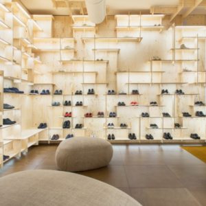
The store – Bally’s first flagship in over 20 years – is spilt over three levels in a corner building on New Bond Street, one of London’s most famous luxury shopping destinations. Menswear is located in the basement, the ground floor is dedicated to womenswear and the first floor features Made to Order, Made to Colour and Shoe Caring services. On all levels, burgundy-coloured boxes are stacked in columns across sections of the walls. This allows customers to pick out the shoes themselves rather than waiting for a shop assistant to disappear into the bowels of the building and fetch the right pair. Walnut panels with grids of vertical slots surround the interiors on each floor. These curve around corners to link the small pockets of space, providing a screen across the many windows facing onto neighbouring streets.

To prominently display the shoes out of their boxes, Chipperfield designed shelves made from bent sections of aluminium, which hook into the slots in the walls with wooden brackets. “This was a project of designing a shelf because without the shelf, the shoe shop can’t work,” Chipperfield said. To illuminate the products, the shelves are backlit using a low voltage transferred directly from the walls into the frames. This means that the shelves can be clipped in and out, and relocated when necessary without having to rewire.

Other accessories are displayed either on or inside freestanding vitrines, with bent brass frames based on Breur’s furniture designs. The staircase in the centre of the building is clad in grey Swiss marble, while grey carpet is laid on all of the shop floors. Following a soft launch over the weekend, the shop is now open for trading. Chipperfield’s Milan office will continue to work with the brand on subsequent store designs, the next of which is due to open on Los Angeles’ Rodeo Drive next year.
Design by David Chipperfield Architects


Add to collection
