Charme shop by Andrzej Niegrzybowski, Gdynia – Poland
posted by retail design blog on 2014-11-17
Gdynia
Add to collection
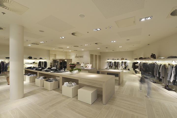

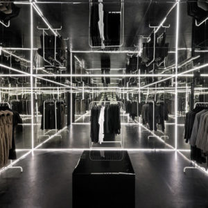
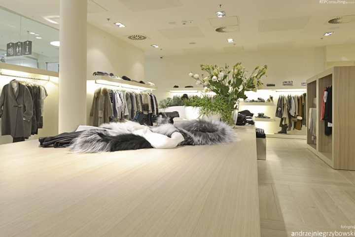
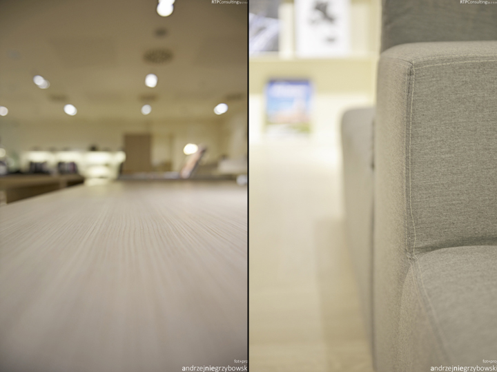
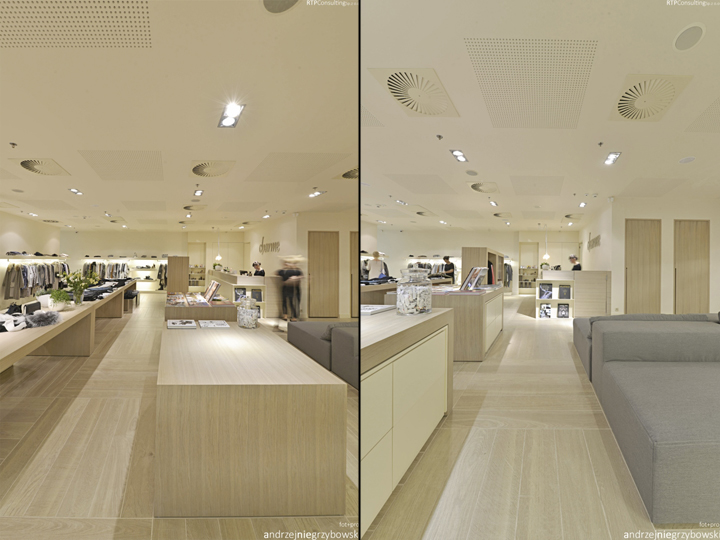
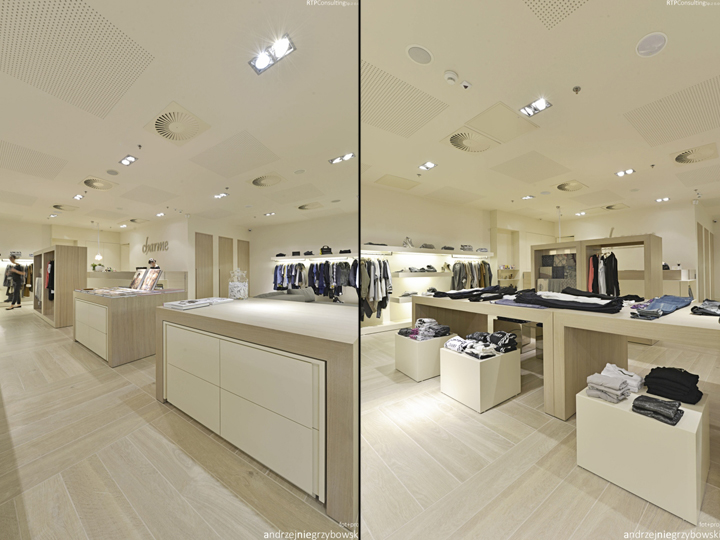
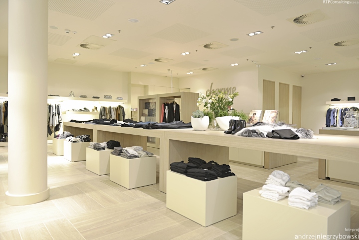
The architect was supposed to design and arrange the space for a retail outlet, previously used by another tenant, employing characteristic features of another establishment owned by the same investor. Due to the fact that the shop sells a variety of brands, a neutral, bright beige was chosen for the background colour, just as it was the case in the shop’s previous location. This time, however, a matte paint was used, giving the colour a more noble look. In addition, the background’s colour composition was diversified with a natural whitewashed oak veneer together with milled rock tiles in a like colour, as well as grey and steel features.

The element that imparts both coherence and tranquillity to a seemingly lax arrangement of furniture, both free-standing pieces and wall units, is its geometrical features and a module discernible in its proportions, in the floor mosaic, and in the intervals of components placed in and on the suspended ceiling. These modular features make it possible for the seller to freely re-arrange the main shopping hall and the shopping display according to current needs.

The design is governed by a minimalistic approach characterized by great attention to details and economy of the form. Details are inspired by forms and architectural features typical for the city of Gdynia. The floor design was inspired by parquet floors and floor mosaics characteristic for the period before WWII, while the front entrance with its portal alludes to historic buildings of the city centre. Artwork hanging above the counter and sofas edged with decorative thread complete the design, adding a kind of industrial, maritime flavour.

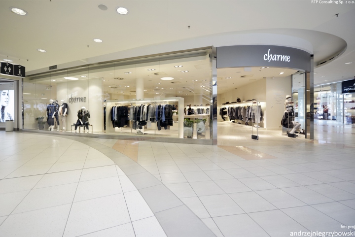
The shop is separated from the arcade with a large number of shopping windows which allows for a variety of displays. Thus, one can discern open displays, inviting customers to enter; semi-open displays, with products placed intriguingly in narrow frames; closed displays, in the form of glass cases or cabinets.

Service area, fitting rooms and staff rooms are located far from the entrance. This layout was chosen because it gives a sense of privacy and comfort to clients – whether they are paying, using the fitting rooms, or just looking at themselves in the mirror. At the same time, staff rooms situated right behind the counter and large lockers located within the service area made it all more convenient for the staff, improving the quality of service.
Furniture placed in such a way that it makes an integral part of the service area constitute a screen of sorts for the customers while at the same time providing additional space for displaying small products, accessories, and promotional kits. All of the above-mentioned enhancements place the items offered by the shop in the most visible places with highlights their luxurious character and high quality.
Designed by Andrzej Niegrzybowski / RTP Consulting
Photography by Andrzej Niegrzybowski


Add to collection