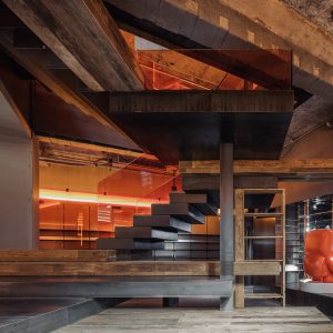
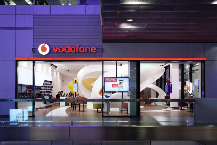

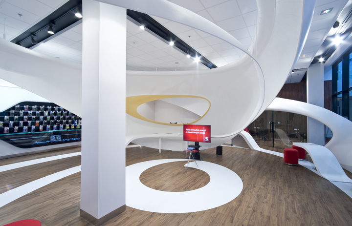
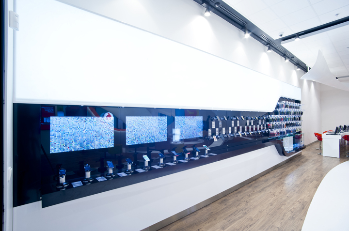
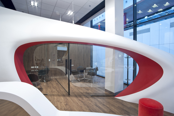
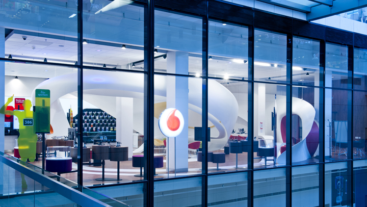
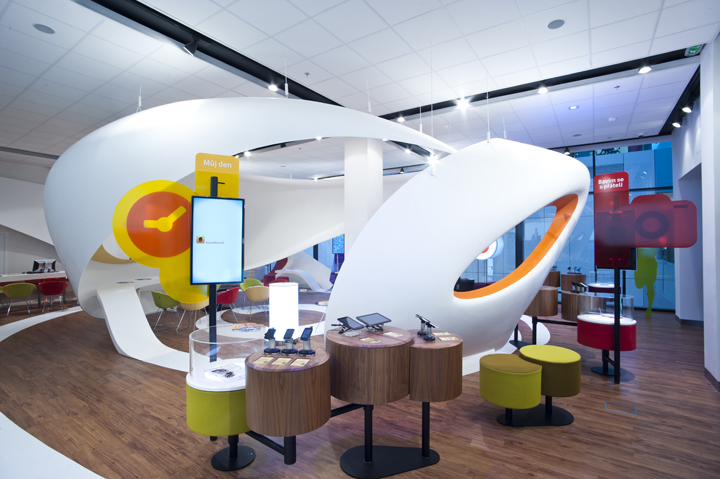
In the year 2012 futuristic Vodafone flagship was opened in Ostrava. Fully completed in beginning of 2013 with all interactive elements, digital content and atypical furniture. Shop with its design intentionally builds on previously realized interiors that we have created for this company. In this interior we repeated attempt to create a non-traditional space, which should determine the future direction that Vodafone will take in shop design. We used new materials and technology that is completely beyond the classical concept of stores. Well-known corporate logo “drop in the circular pattern” was developed from a 2D graphic display in the 3D irregular helix forming organic walls and ceiling.
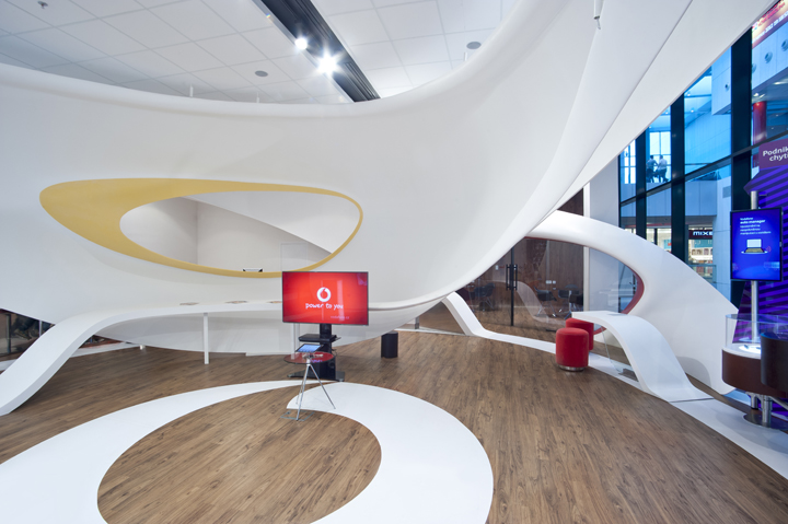
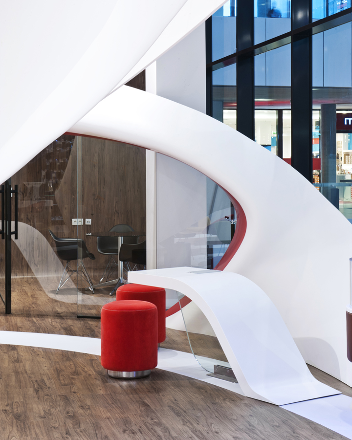
Logo dynamically surrounds and defines the layout of space to differect zones. Customer comes into the store without an open layout filled with a set of furniture shelves, but can get ready for adventure and discovery tour, during which he has the opportunity to experience the extraordinary experience and learn interactively about the latest technology in telecommunications. Thanks to construction shape and complexity, and especially the generous dimensions of the designed corian object makes this unique of its kind. When working on the design, we therefore work closely with specialists for compact materials DCH-Sincolor.

In the initial design concept, we started from the company brief and we have worked closely with the selected marketing specialist team at Vodafone. It was a very intense process, during which we managed to design a completely new and for local conditions quite unique sales process and customer service. The task was to prepare an entirely new concept of business units called data -oriented services. The store offers a wide range of technology, which can visitors try themselves. No maquettes, but only real products. It has systematic way where the customer has from the beginenig the possibility of shop assistance. At the entrance is greeted at the front desk and offered a personalized way according to its own needs.
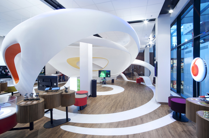
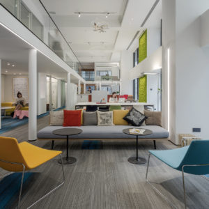
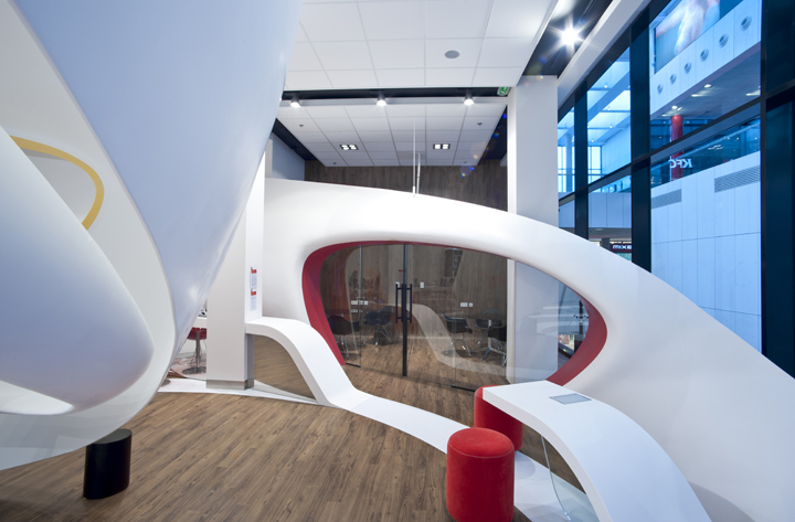
The store, against the usual standard has the approximately three times bigger the area, which is 240 m2. In this case, it is not common, but rather a showcase of Vodafone. The interior should attract customer and create inspiring environment. The layout is not done with the classic bookshelfs with phones, but the products are categorized for a particular client from teenager to the manager. This is always adapted into the specific part of the store space. The area features two meeting rooms, central space can accomodate more people for presentations and workshops, a quiet zone is for individual computer settings. There is fun zone, where people can play with playstation. Last, but not least, the visitor is served with above the standart number of shop assistants.
Photography: Alexander Dobrovodský
Design by Luka Križek and Radek Blaha at IO Studio


Add to collection

