

The new STREET BEAT brand and store project was developed by LINII Group and Shopworks. The strategy of the brand was developed with the active participation of the target audience that took part in workshops and idea discussions. The idea of a democratic, convenient, modern and enjoyable sneakers store that lives in the rhythm of the big city in fact belongs to its future customers. The name Street Beat was developed by the LEXICA naming agency which is the part of LINII Group. The name STREET BEAT reflects the brand’s key idea — urban rhythm of life, energy and power of modern megacities.

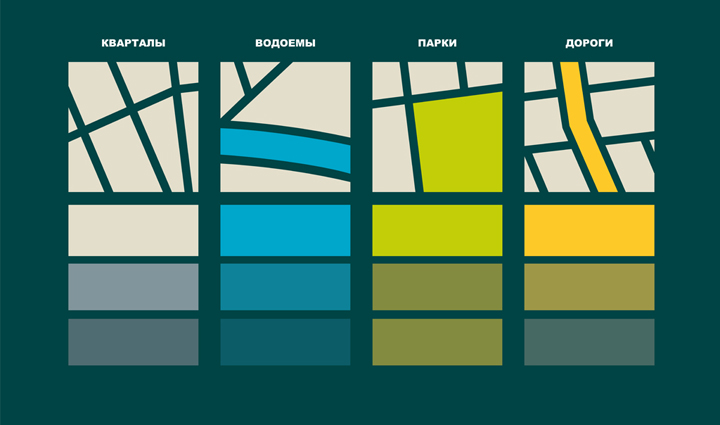
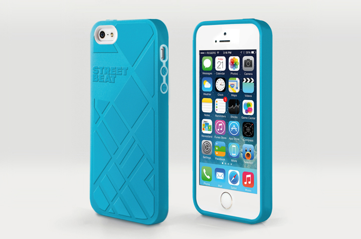
“The brand’s idea was visually reflected in the form of the main graphic symbol — a stylized map of the “ideal” city, which streets, quarters and roads resemble a trainer sole imprint. Dark emerald colour which is unusual for retailers was selected as the corporate colour of the brand. It was combined with 4 complementary colours corresponding to the basic elements of maps: quarters, rivers, parks and roads,” says Mikhail Gubergrits, Creative Director of LINII Group. The graphic element forms the basis of the corporate identity. It passes through the entire visual communication of the brand and finds its expression in the form of the large brand wall in the cash zone of the store. The cash module is supplemented with a light equalizer on the front and connects the store design with the atmosphere of movement and rhythm.

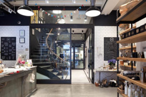
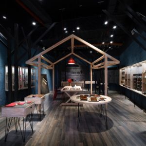
The store’s interior is also associated with big cities. Basic materials are concrete and wood. This combination has a great potential — both materials are diverse but naturally supplement each other and cause a persistent association with the city forms.
Designed by LINII Group







Add to collection
