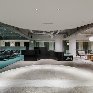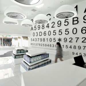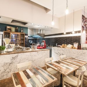
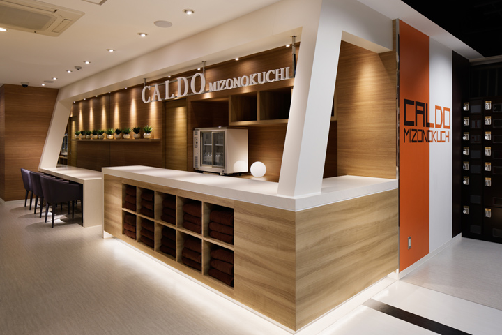

CALDO is a national chain fitness facility where customers casually enjoy Hot Yoga, Fitness, Pilates and Pressurizing Training. There are mixtures of “stillness” and “motion” in the programs. One of our challenges was how to design the individual space with the surrounding relations. As principle axis, we decided to use “COLORS” that will associate psychologically when customers enter the facility.
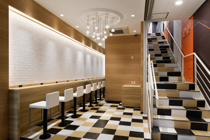
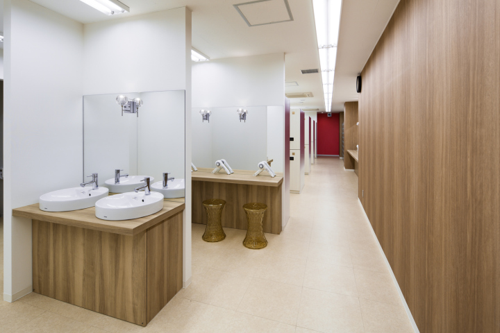
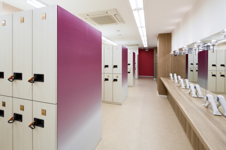
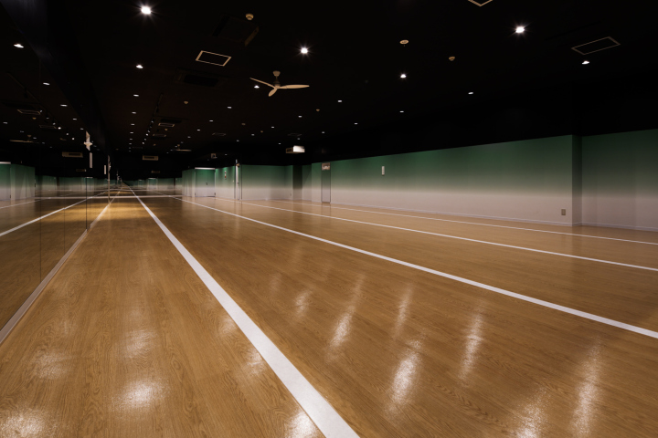
Firstly, around the front desk and locker areas will become a characteristic buffer zone. We were aware of making this place with a sense of cleanliness. Using PURPLE color, we created comfort along with wooden tone which will bring warm expression. Stepping into the Hot Yoga Studio, there lies the “stillness” area. We chose neutral colors such as GREEN and ACHROMATIC colors to create magical atmosphere to switch the psychological aspects of “concentration” vs “openness” and “reality” vs “unreality”.
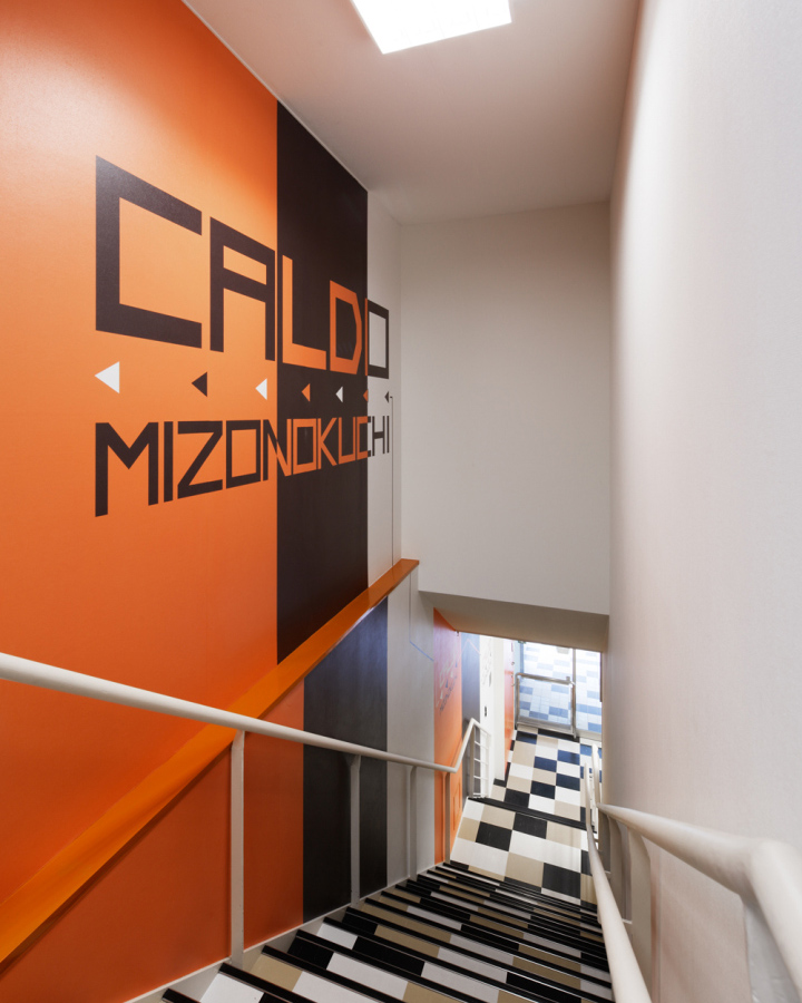
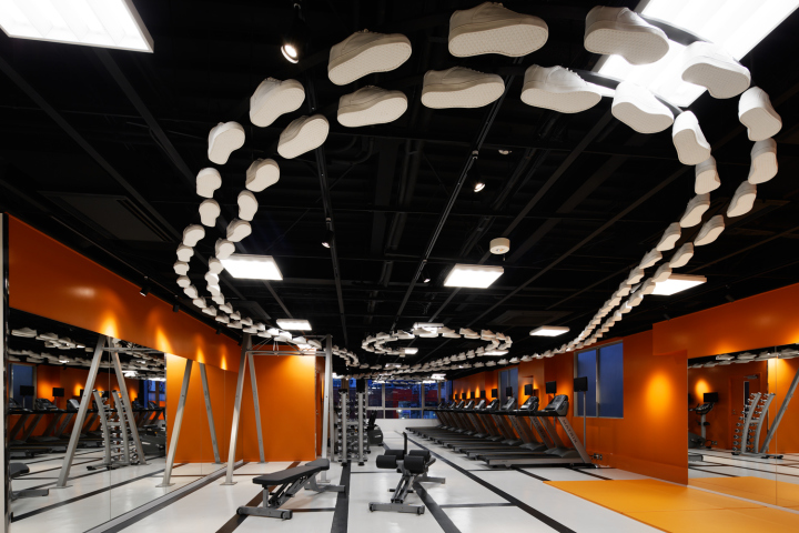
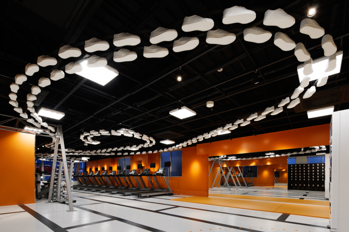
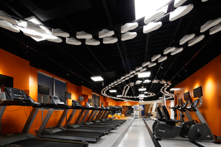
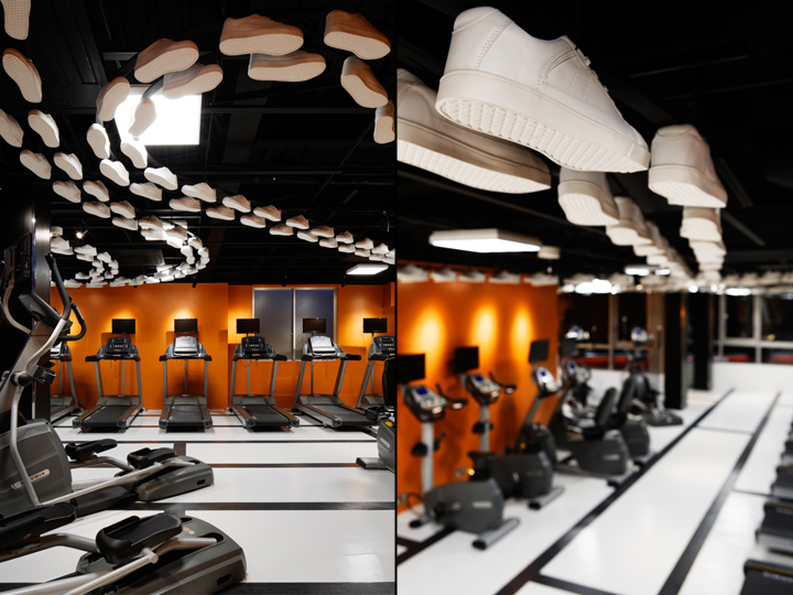
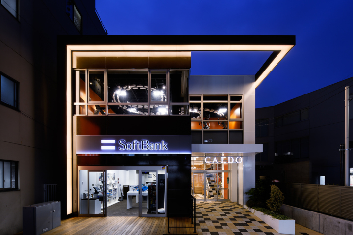
Secondly, for the “motion” area in the gym, we selected warm color ORANGE with over 300 pairs of sneakers displaying on the ceiling. In this way, we created an organic and dynamic atmosphere by eliminating inorganic and solid impression. Using too many colors will sometimes bring childish or pop impression. Nevertheless, utilizing these colors partially, gradationally or combining neutral colors will give inflection. We used one darker color tone for the façade to make a sharp looking impression, compared with the inner facility. In this way, we were able to create a sophisticated facility along with an upgraded atmosphere.
Shop’s name: Hot & Shape CALDO Mizonokuchi
Place:Kanagawa-ken Kawasaki-shi Takatsu-ku Mizonokuchi1-14-5
Designer: Doyle Collection co.ltd. , Aiji Inoue
Photographer: Nacasa & Partners


Add to collection
