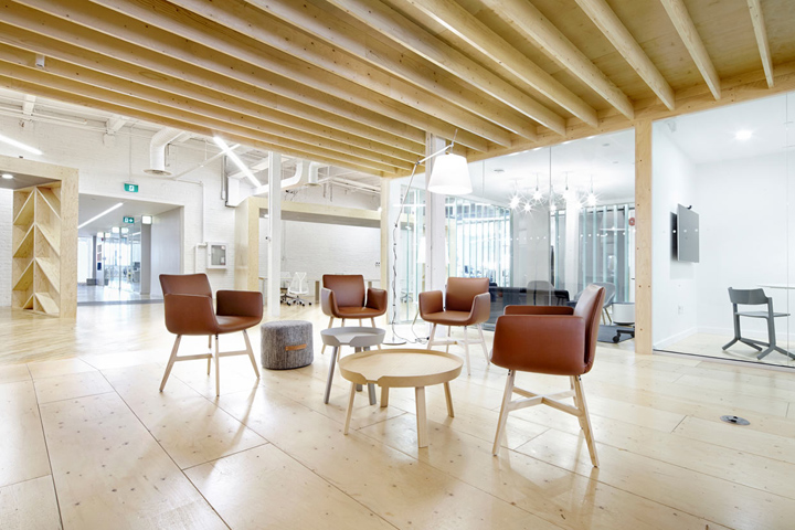

I’m a big believer in the importance of fun and creative workspaces. I think it inspires employees to do a better job and it sure makes coming to work a whole lot more fun, am I right? MSDS Studio gets that and you can see it in their design for the new offices of Shopify Toronto.
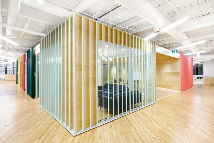
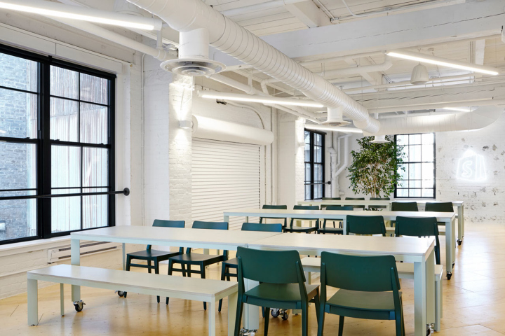
The company required 90 workstations, reception & a retail shop, a boardroom, 3 large meeting rooms, 6 small meeting rooms, 2 phone booths, a cafeteria, a kitchen & cafe, gallery, game room, break-out space, and informal work areas within an 18,000 square foot space in a 100 year old brick warehouse. Wanting to keep the idea of an open exchange of information, they designed a floor plan that separates the work areas and functions but without solid partitions.

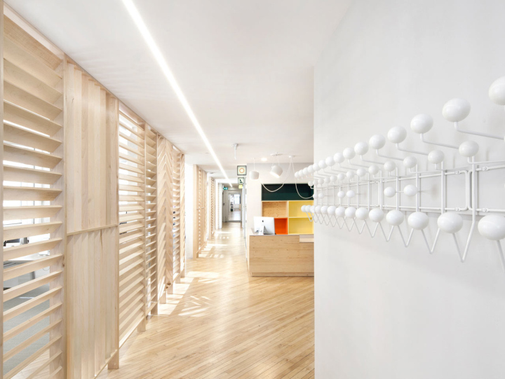
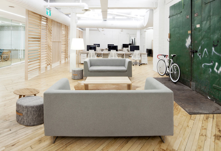
Louvers were used instead of solid partitions so sight lines are kept open, as well as allowing light to pass. With glass around the perimeter of the building, it allows the sunlight to penetrate each of the spaces. To help with sound, they used fabric, soundproof glazing, and strategic placement of departments.
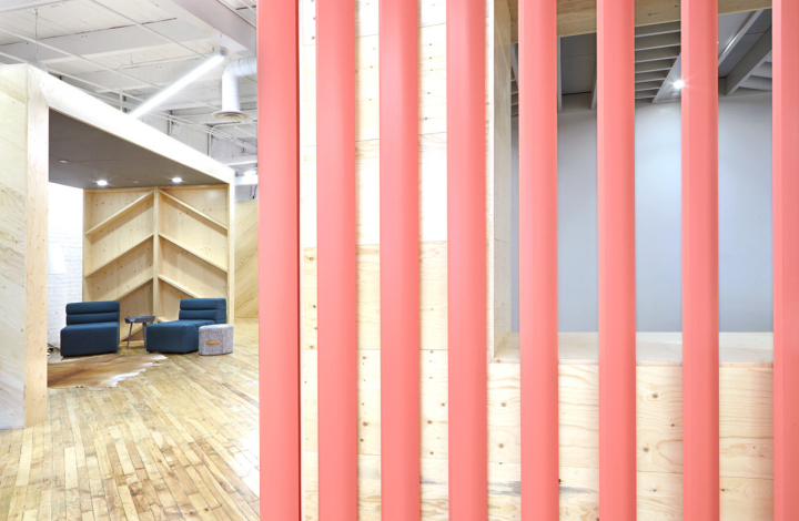
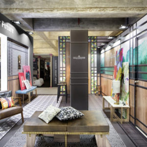
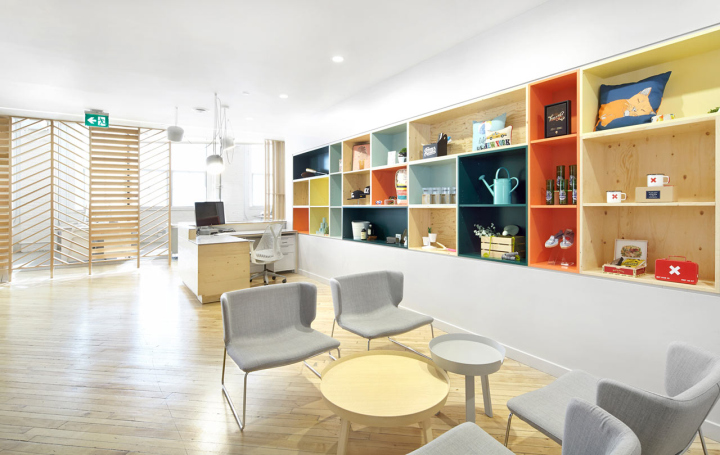
The concept for the design is based on the “mechanisms of contemporary commerce”. So, the block of conference and meeting rooms is set up like a market street with signage. The louvered wall is broken up and patterned to reference the vitality of a marketplace. The reception area is meant to feel like a pop-up shop where the company sells it’s main product, e-commerce software.

http://design-milk.com/100-year-old-brick-warehouse-becomes-shopify-toronto/


Add to collection
