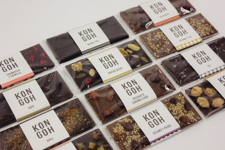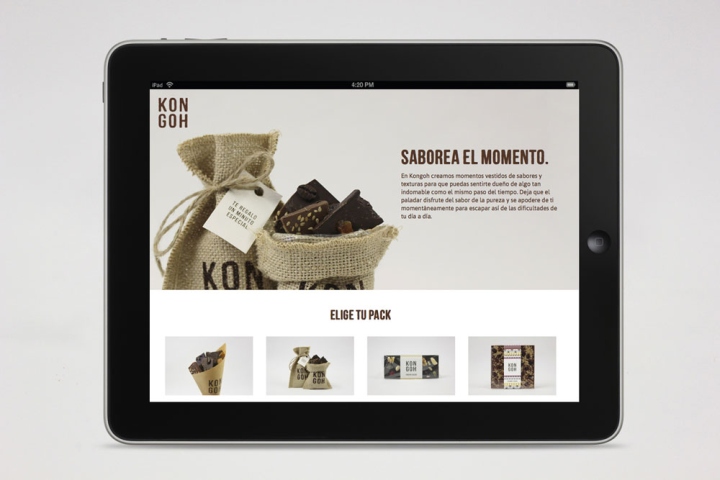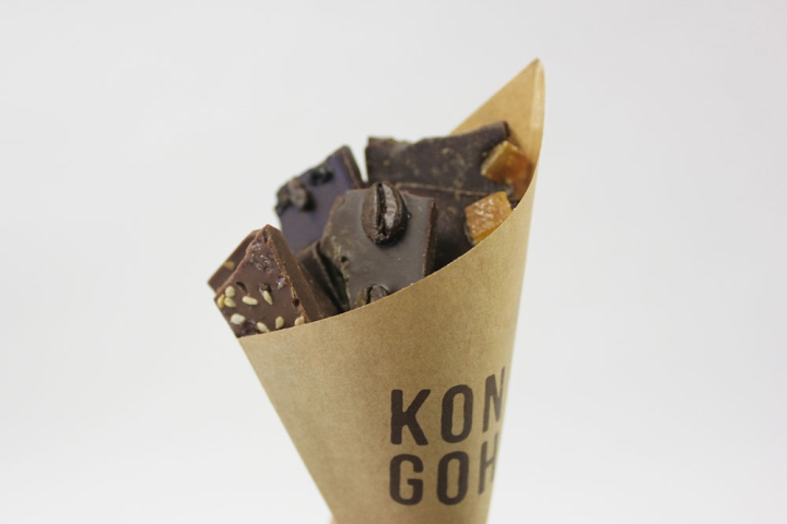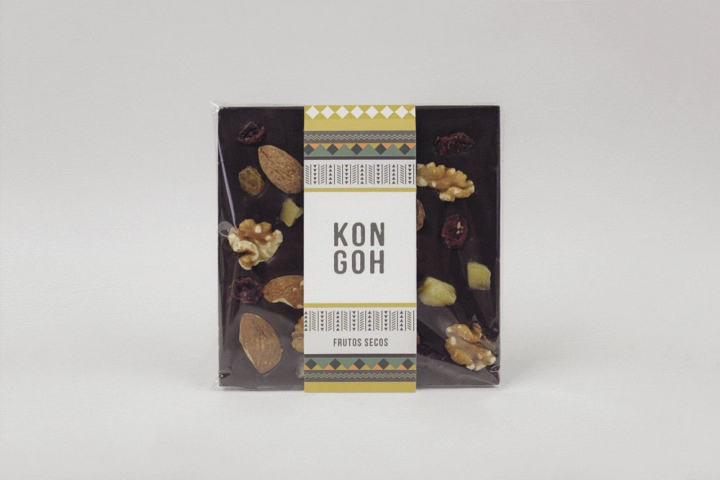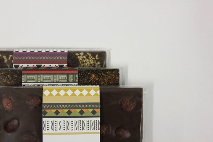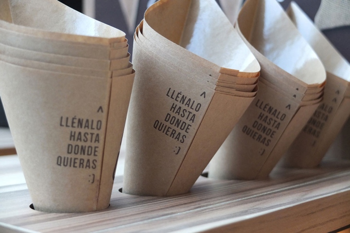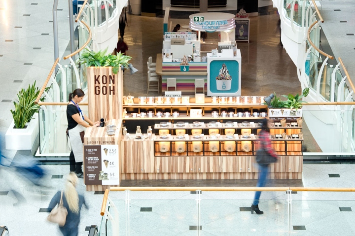
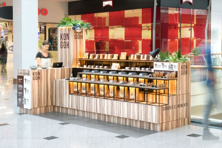

The pilot Pop-up store designed for Kongoh aims to adapt traditional display strategies employed by typical African market stalls to modern and western retail design trends and needs.

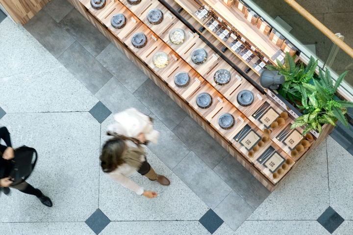
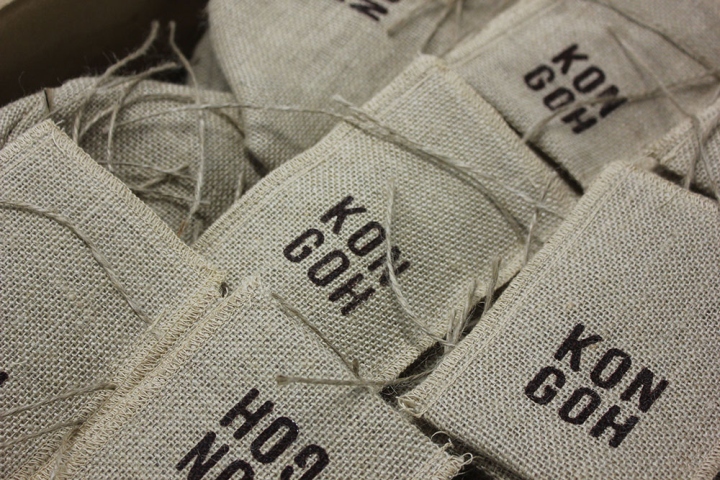
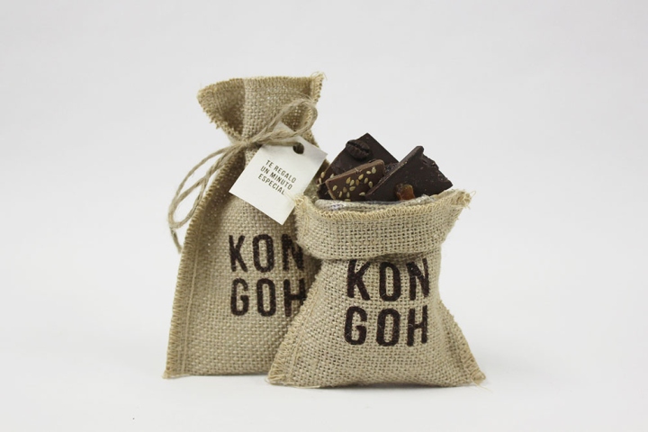
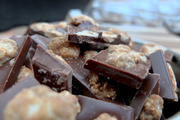
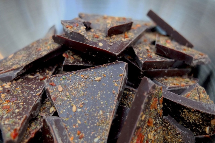
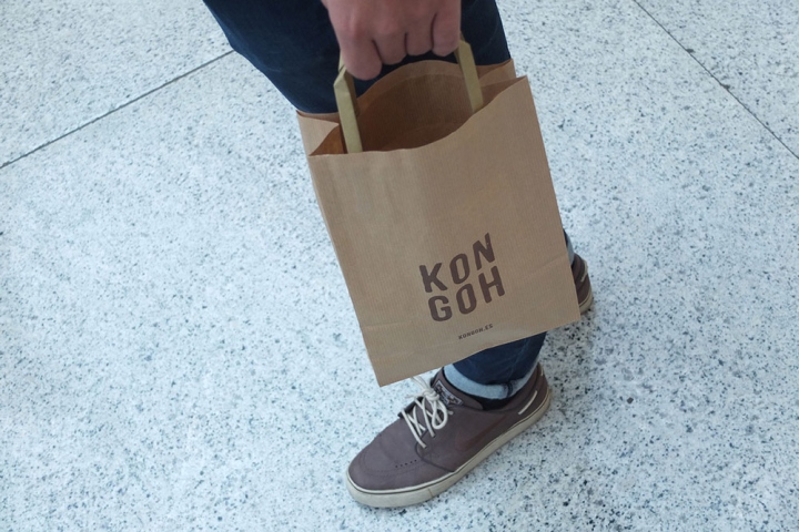
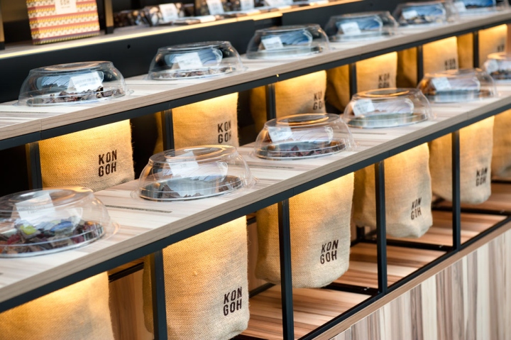
Their typical staggered display counters and its fiber sacks exhibit in this shop the chocolate cut into pieces instead of grains or species. And even though the silkscreened brand logo and the interior metallic bowl meet hygienic and branding requirements associated with more European standards and tastes, the nod towards the original culture is unmistakable while it provides a strong feeling of freshness and authenticity.

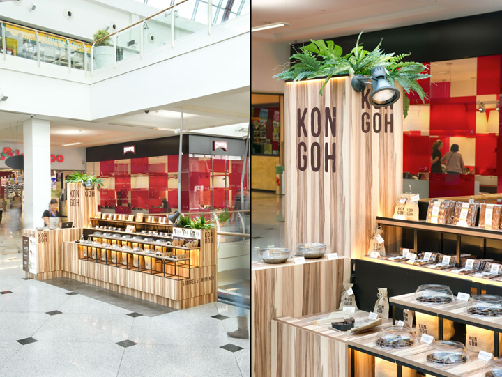
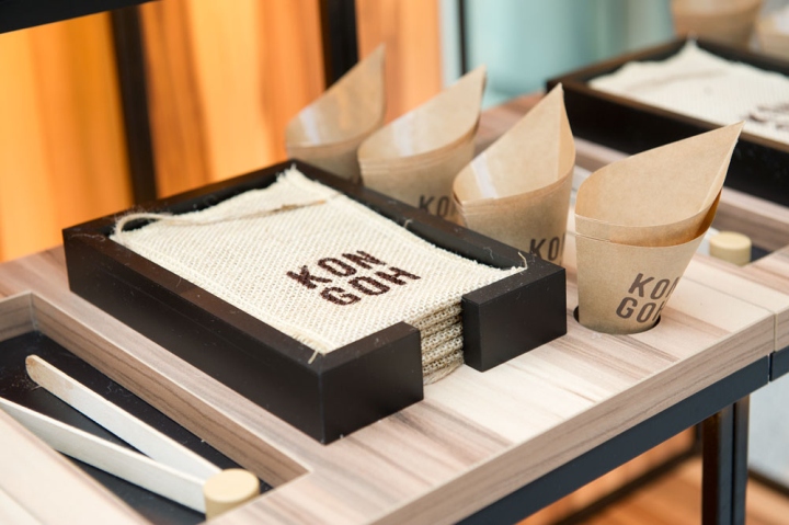
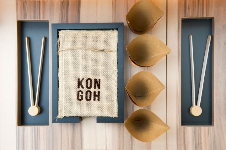
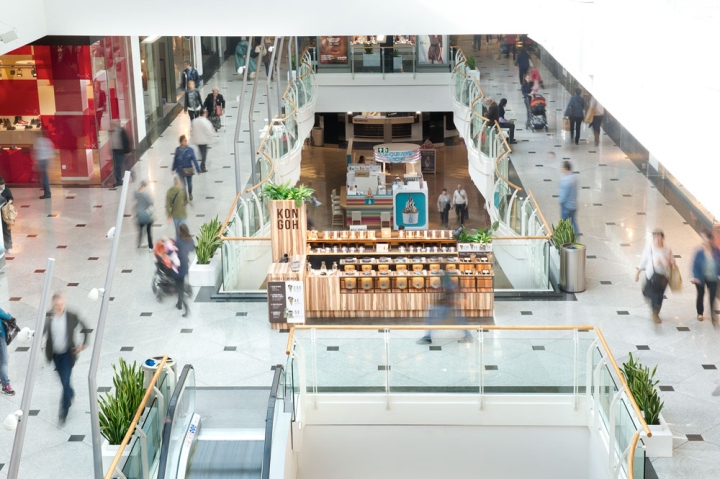
The stand shows the product in levels, which attempts to organize the wide range of flavors and packaging sizes in which it is possible to consume the product. Vertically the product can be grouped by flavor, while horizontal rows display products of the same format. This way the store poses a sequential linear path that guides customers from the self service station, where cones and tweezers are collected, up until the cashier, along a short but intense journey to the African cocoa fields.

The high totems in both ends of the store are at varying heights were included to fulfill diverse aesthetic and practical functions: They claim customer attention from afar working as the main store sign; They also provide accessible and comfortable storage space for the staff, while hosting, in the very top, tropical plants, which exuberance and greenery take customers again to the place of origin of the raw material used in the manufacture of these chocolates.

The more practical needs derived from correct product display and sale are finally met by an indirect lighting system based on linear LED and energy saving light bulbs, that leave the product floating on a faint halo of warm light.
Also, the bottom section of each and every one of the modular and mobile parts of this Pop-up store, have sufficient storage space, especially dimensioned according to the supply cycles described by the customer.
Design: Egue y Seta / Daniel Pérez + Felipe Araujo
Photography: Víctor Hugo
