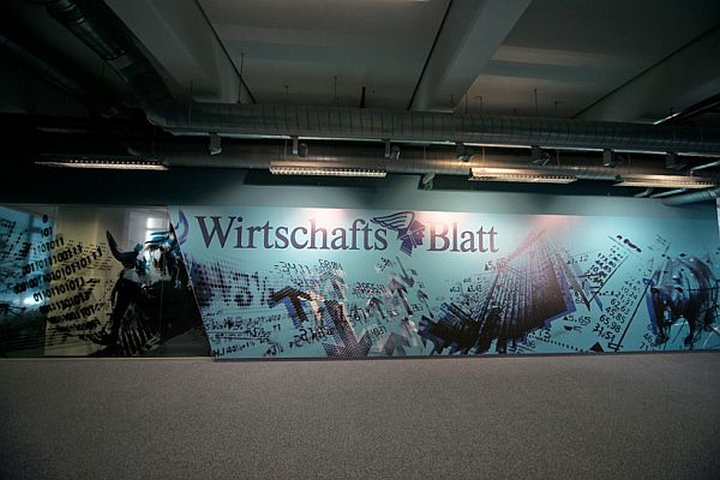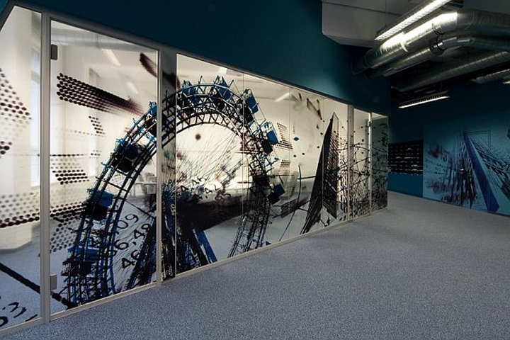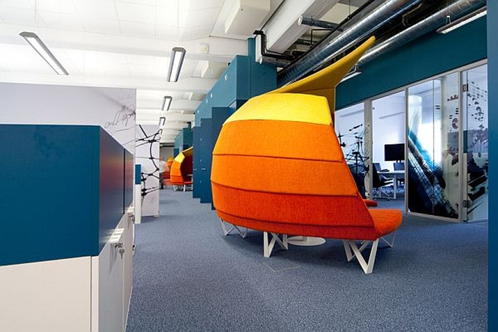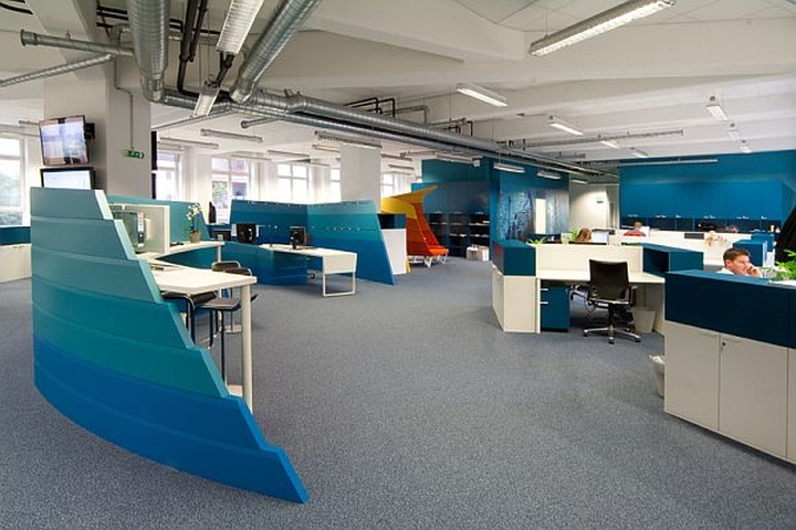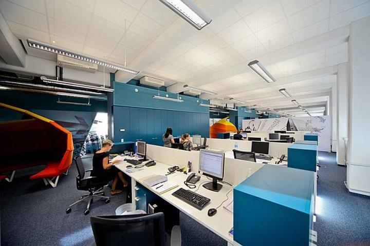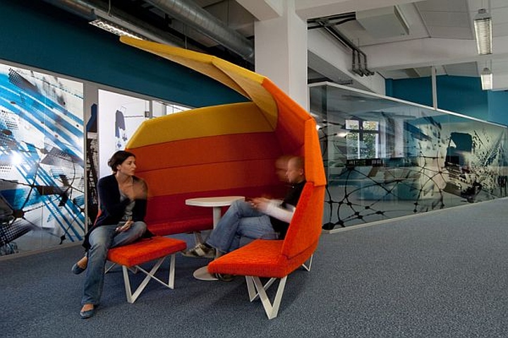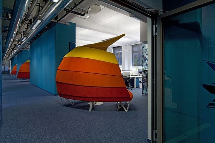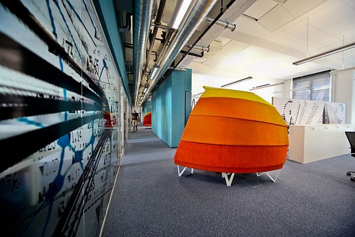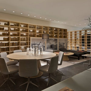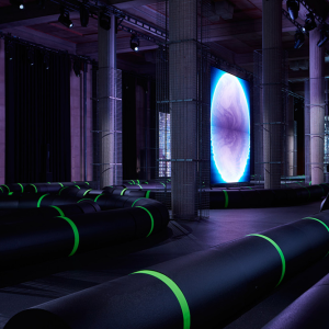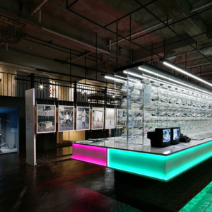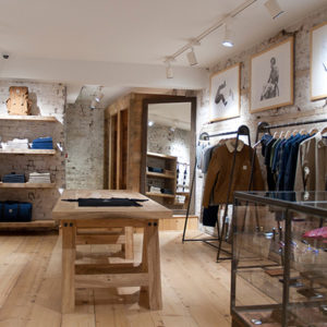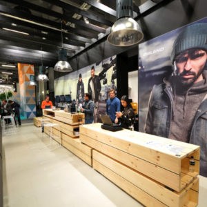


This is the WirtschaftBlatt Newsroom. It’s an unusual concept that attempts to bring something new into the equation. WirtschaftsBlatt is Austria’s leading newspaper. It offers latest economic and financial market news. This is their newsroom. It was a project by IDFL. It’s a sort of office based on a functional concept. The design of this space was mainly dictated by the space available and the structure it already had.The newsroom is basically divided into three main areas. The first one is the central entrance area. Then there’s the administration volume and the editorial office and production area.

The overall design is very graphic and unconventional. It’s a very creative design that also encourages creativity and team work. The space has been functionally divided and the barriers and differences between the three different areas that have been created are very visible.

Moreover, the overall design is rather contrasting. Still, there’s a certain continuity that keeps everything together. Functionality has been one of the main elements that dictated the design of this room. The internal cohesion is not following the same lines as most similar spaces. However, it’s present, even though it functions on a different level. The main idea behind this concept was to create a functional space with a graphical interior design and inspiring elements. The results were exactly as expected.


http://www.homedit.com/the-wirtschaftblatt-newsroom-office-interior-design/
