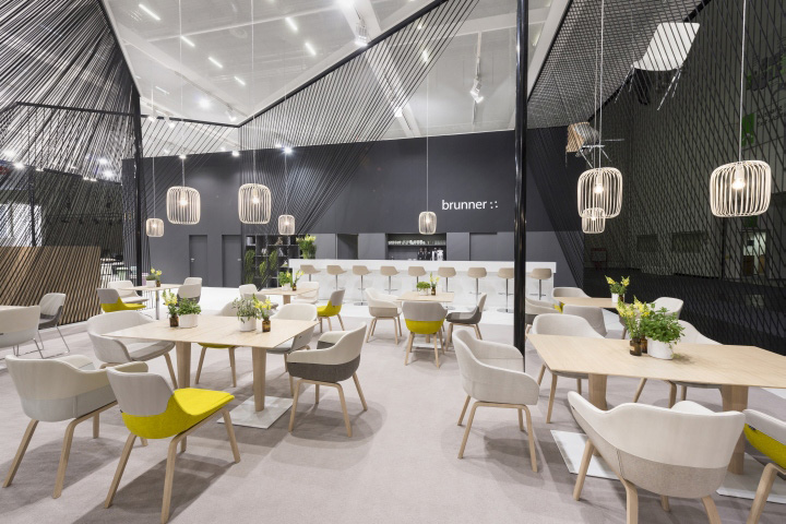

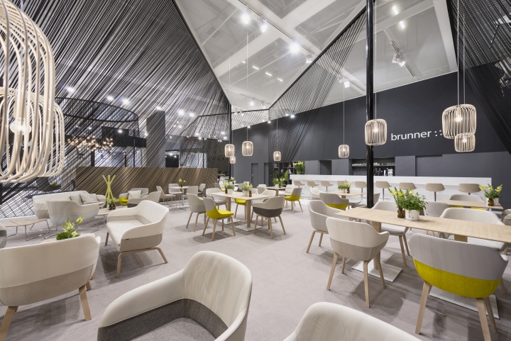
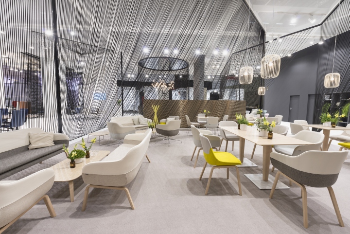
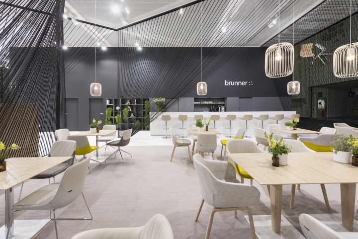
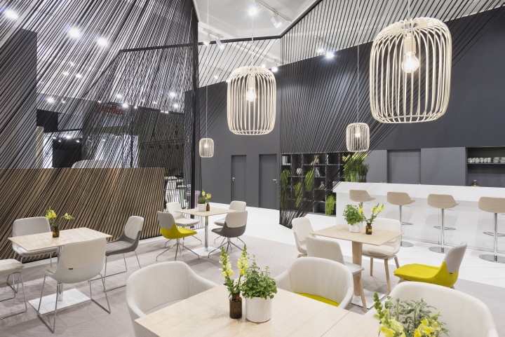
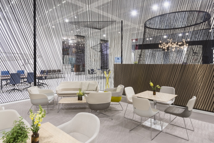
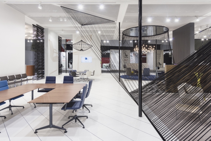
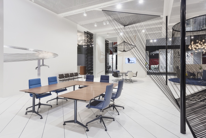
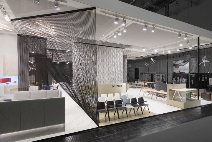
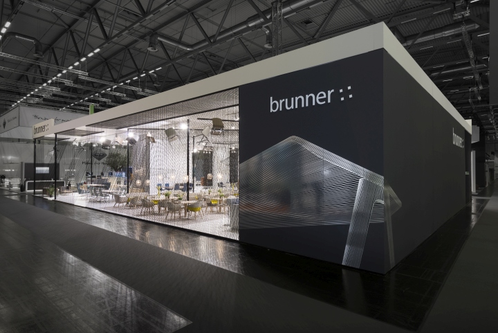
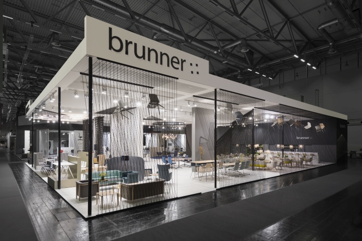
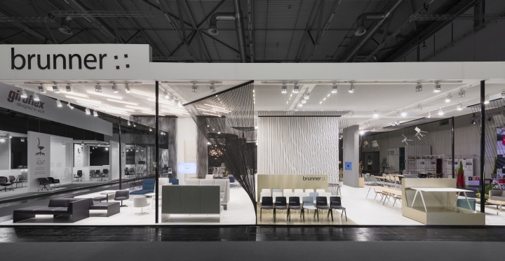
At this year’s Orgatec, Brunner presents new product innovations and its portfolio of chairs and tables designed for office use. The goal was to use its innovations to present Brunner as a dynamic, transparent company, while placing the products on a comprehensible and suitable platform. The graphic concept from the latest Brunner print publications, which illustrates the products in minimalist lines, served as the starting point for the exhibition design. This idea was transformed into a spatial concept as part of an integrated brand presentation. Lengths of black cord were deployed as a three-dimensional element. In more or less dense curtains and forming geometric shapes, they effectively divide the stand into zones.
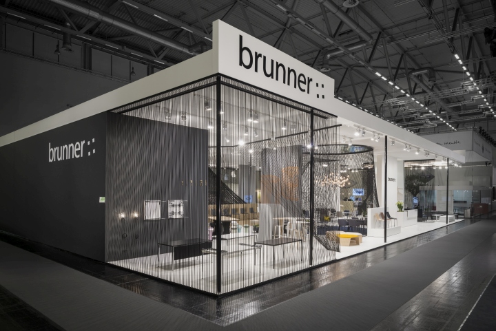
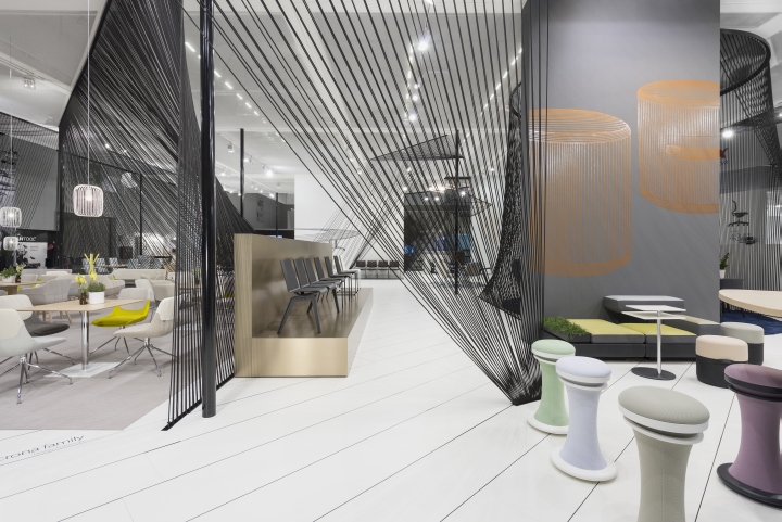
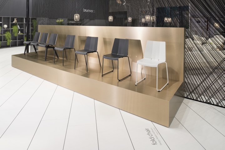
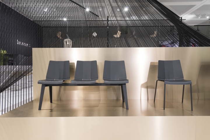
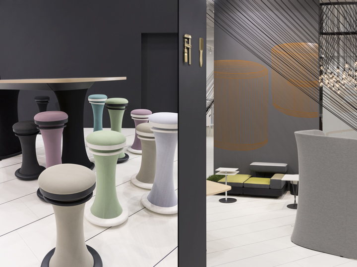
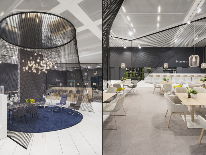
The colouring of all spatial elements has been kept deliberately subtle in favour of the colours of the products themselves. Floor and ceiling gauzes are white, serving as a neutral backdrop for the black cord. The wall colour moves from shades of grey into black as you progress further into the space. Podiums and large-scale wall diagrams reflect the print theme and are executed in metallic shades. The cord filters formulate different spatial situations: A truncated cone creates an intimate setting, a candelabra-styled ceiling element awakens connotations of the domestic dining table and the diagonal sails around the cafeteria give the space a lounge-like ambience. The density of the cord curtain decreases along the longitudinal axis of the main entrance side, creating a gradient effect. The stand receives additional dynamic energy through neon lighting strips on the ceiling and a hatched floor.
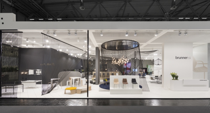
The latter supports the zoning by changes in the direction of the hatching. The theme of filigree lines that runs throughout the exhibition presence is synonymous with the precision and quality of Brunner products. A workshop corner is also dedicated to the manufactory concept behind the products. Using a total of 18 kilometres of polypropylene cord, an open and transparent exhibition stand was created, where subtle colours and almost graphical wall filters form the perfect platform for Brunner’s products.
Photography by Andreas Körner / Brunner GmbH


Add to collection

