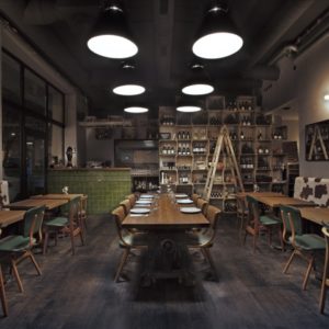
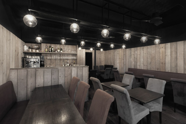

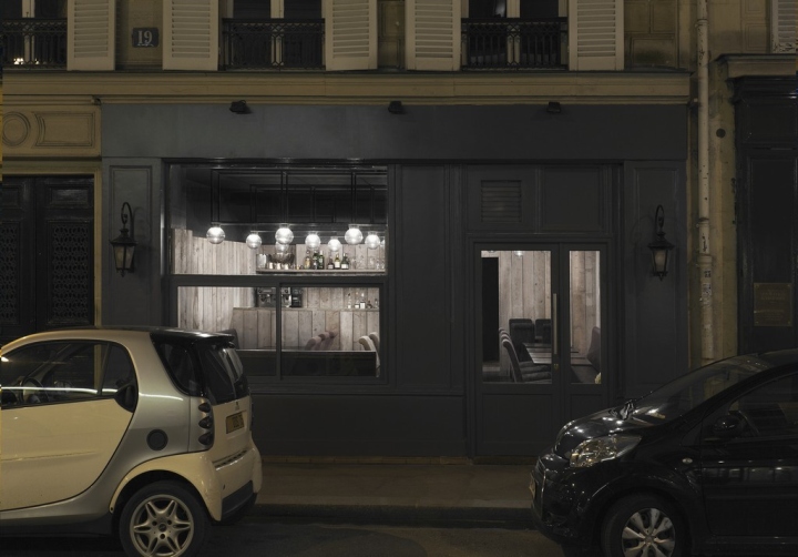
This project is the renovation of a restaurant located within a late 19th century building, close to the Avenue des Champs-Élysées in Paris. The restaurant was opened in 2006 by Japanese chef, who provides an inventive take on traditional French cuisine. The restaurant’s interior was originally a provincial, affair which was completely disjointed from his creations. Nowadays, as the food service industry becomes increasingly competitive, it’s not enough to simply serve great dishes; spatial presentation is also under scrutiny. Thus, this project began as an exploration of the relationship between space and food.
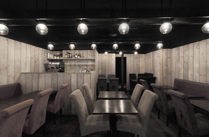
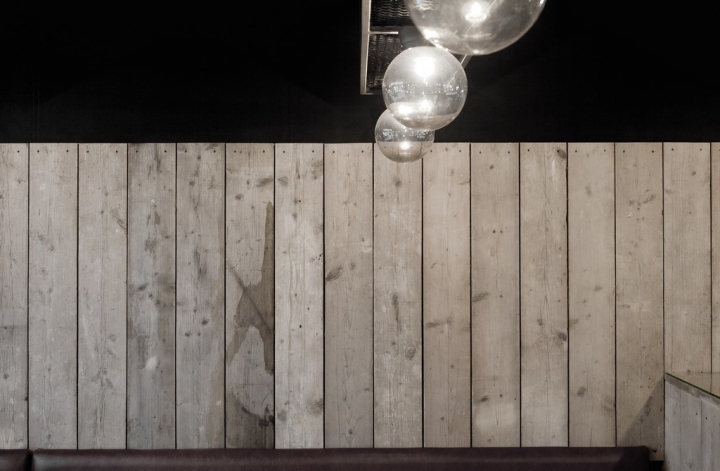
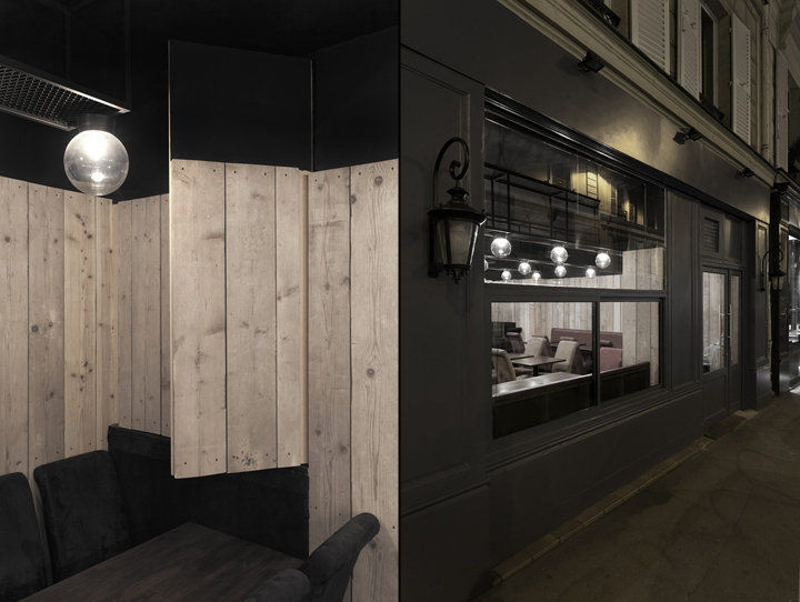
Finally we were fascinated in the idea of a hybrid between French mannerism; visual beauty with physical decoration, and Japanese mannerism; conscious beauty by simple representation. That is to say, the mode of representation that uses the natural properties of a material to create ornamental compositions. In the renovation of this interior we have chosen to use re-claimed hemlock wood as the main ornamental element, the finishes, fixtures, doors and storage spaces become arranged with this material. It becomes an intentionally undecorated quaint space. Bespoke, chandelier -like frameworks made of exposed hot-rolled steel are installed as combined lighting system and showcase, whilst dissolving in the dark upper part of the space.
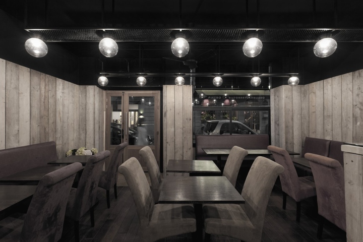
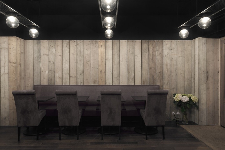
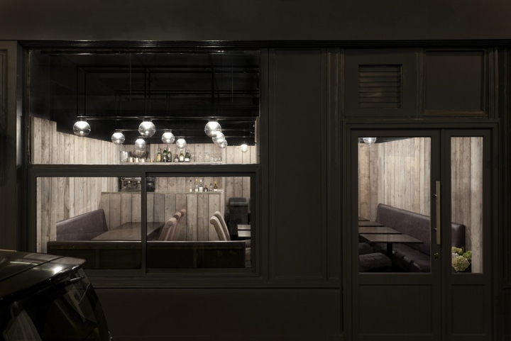
The restaurant is a place to spend quality time. The space is organised around the action of sitting. Through this action the vertical composition of the space becomes evident. The space is divided into three parts. The delicate lower section, a bright middle layer and then an infinitely extended upper section. The bottom part which is composed of re-claimed wood is designed for the person who is sitting. The space becomes intimate, the material which frames this space was chosen for its profound textural quality and its ability to measure time. The middle layer of light is at the unfamiliar height of 2.2m. It is chosen at this level to relate the person sitting. All of the aligned light balls are regulated in such a grid so as to light the space flexibly but also reinforces the impression of an invisible light ceiling layer. The top part of the space is painted black and the steel framework of the lighting system is delicately fixed to seemingly float there silently.
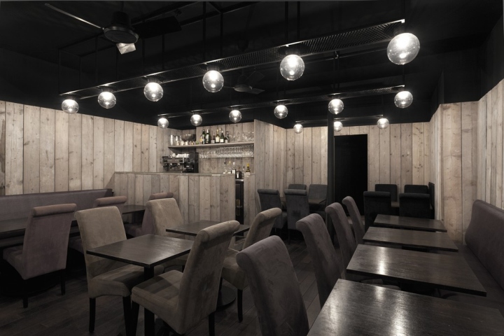
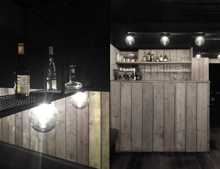
The framework of the lighting system is used to showcase the ingredients of the food and bottles and dish. Anyone sitting at the tables who ventures their gaze upwards will see the illuminated objects and be aware of a void which is implied behind them; giving one the feeling that the space is continuing infinitely upward.
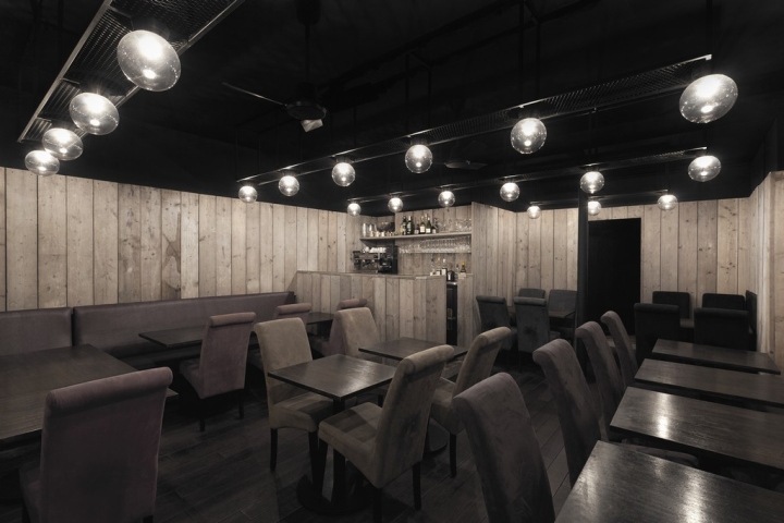
A concept of traditional Japanese architecture is to expand the space in the conscious of the person. This is achieved in this space by creating an edge with the re-claimed timber and creating the illusion of a limitless black void behind the lighting system. Generally only structural elements would inhabit this void space but in this project we have integrated chandelier-like ornaments as aesthetic luxury to the space.
Design: ARCHIEE / Yusuke Kinoshita / Daisuke Sekine
Photography: Ryo Suzuki
via Arthitectura


Add to collection


