
M-S-D-S Studio has developed a new office space for e-commerce software company Shopify located in Toronto, Canada.

Program – 90 workstations, Reception & retail shop, Boardroom, 3 large meeting rooms, 6 small meeting rooms, 2 phone booths, cafeteria, kitchen & cafe, gallery, games room, break-out and informal work areas.

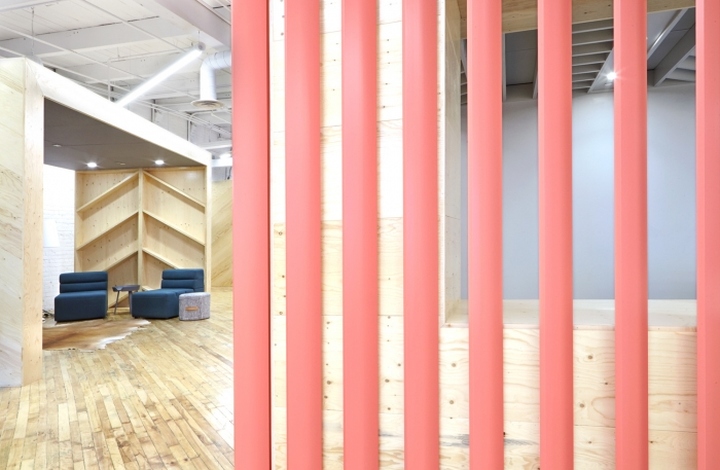
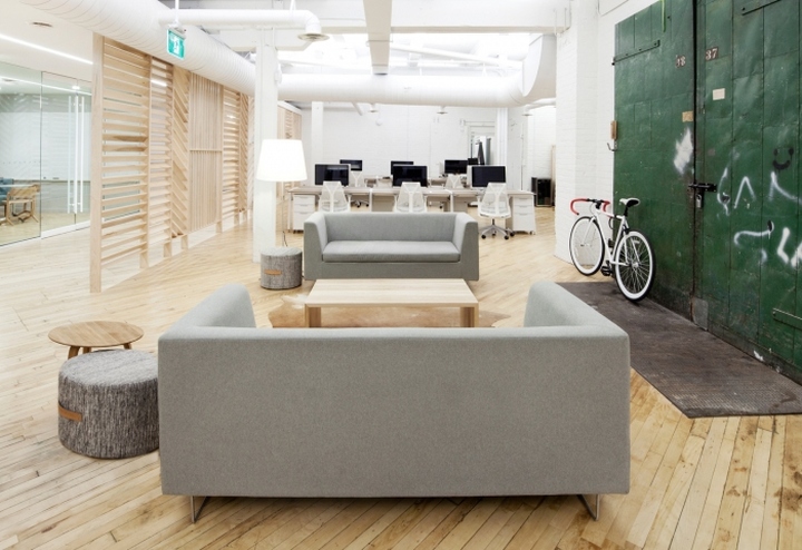
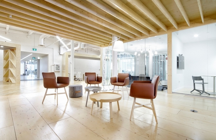
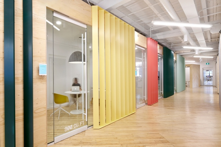
This project was designed around the clients core values of transparency and the open exchange of information. To this end, a floorplan was designed that separates work areas and functions effectively while making limited use of solid partitions. Louvers were employed in many cases where partitions were needed because of their porosity to visual and auditory information. This open plan approach additionally allows light from the glazing running nearly the entire perimeter of the space to penetrate deeply into it. Fabric, soundproof glazing, louvers custom furniture, and the strategic placement of departments have been employed throughout to attenuate any excess of noise created by the open plan.

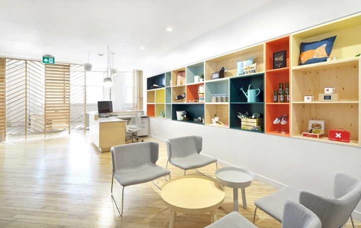
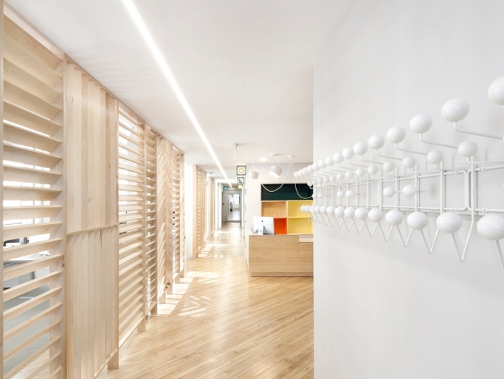
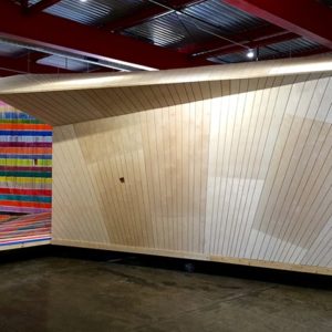
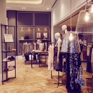
The clients main product is e-commerce software that allows many producers & retailers to sell their wares online. As a reminder of these people and companies that contribute to Shopify‘s success, the reception area was conceived as a pop-up shop that promotes their wares in the space itself. The design of the office is built on the metaphor of the mechanisms of contemporary commerce: the front office block and reception area are the Market, the rear office is shipping and transport, while the 3rd floor, currently under development, will be production/fabrication. The front block of conference and meeting rooms are conceived as a market street with store front signage. The louvre wall running the length of the main corridors in the front office are broken up and patterned to symbolize the vitality of the marketplace. The metaphor is carried into the subtly themed rooms – bookstore, outdoors store, and sneaker shop.

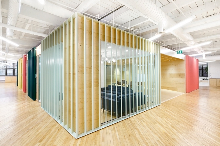
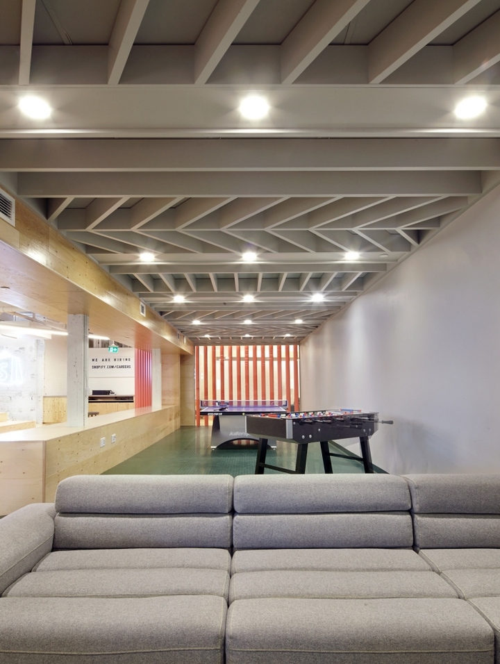
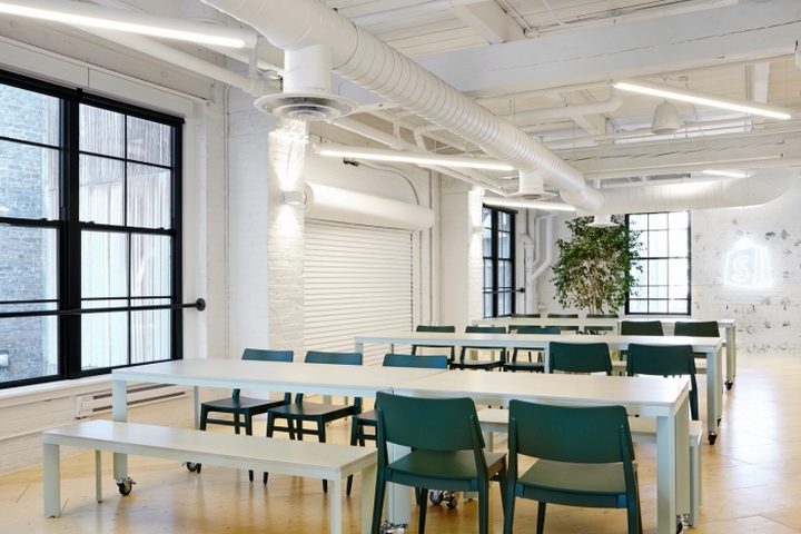
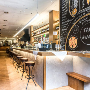
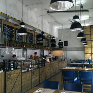
A large block housing meeting rooms, an informal work gallery, and a games room occupies the centre of the rear office. Aluminum louvres cladding much of the block, painted in a palette derived from the shipping containers, imply the corrugate material used in their construction. In the same open room, two large crate-like, rectangular enclosures for casual work, sit off-grid, while a series of outsize sliding doors separate the PR department from the rest of the space. These elements serve to reinforce the shipping/transport metaphor. The kitchen accommodates the staff’s needs throughout the day, and easily doubles as a bar/event space in the evenings for meetups, industry events, and parties that the client regularly hosts. Similarly, the raised cafeteria converts easily into stepped seating around a presentation area and retractable projection screen.
Design: M-S-D-S Studio
Photography: Paula Wilson
