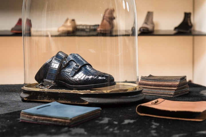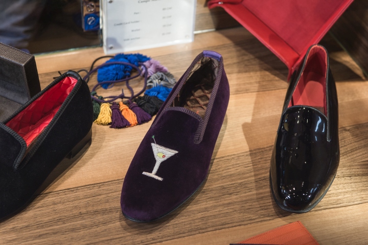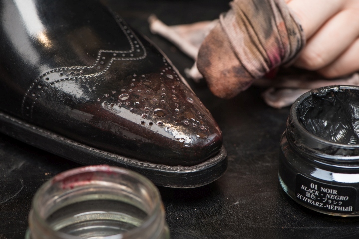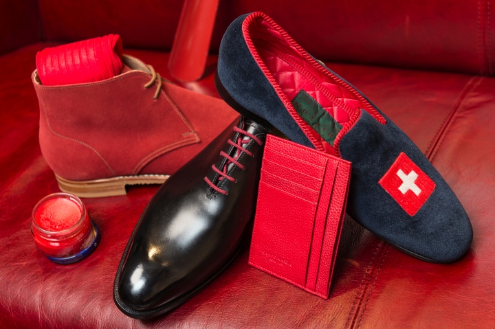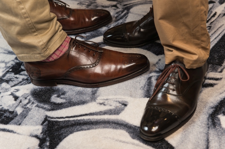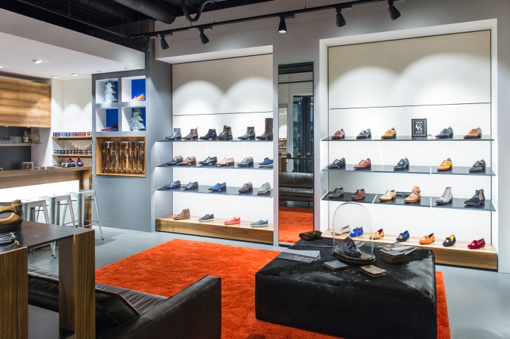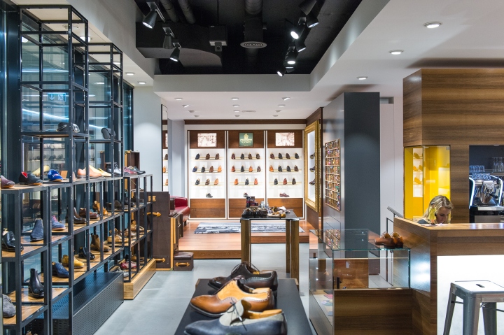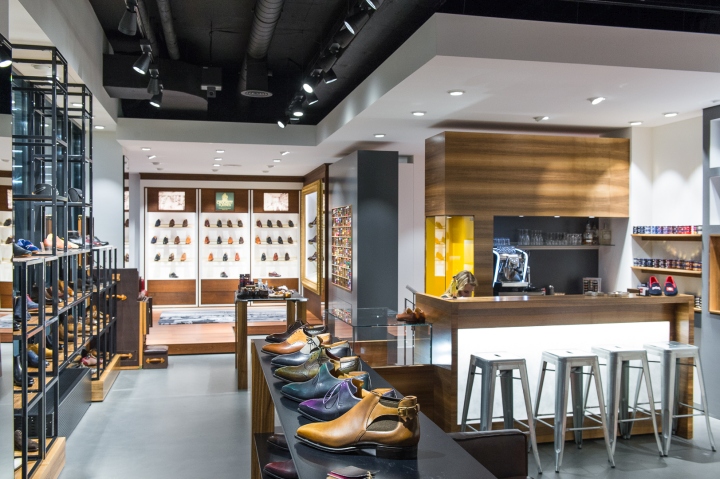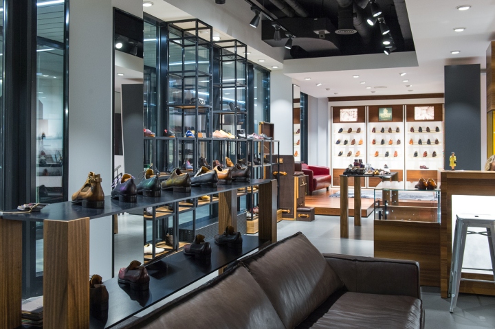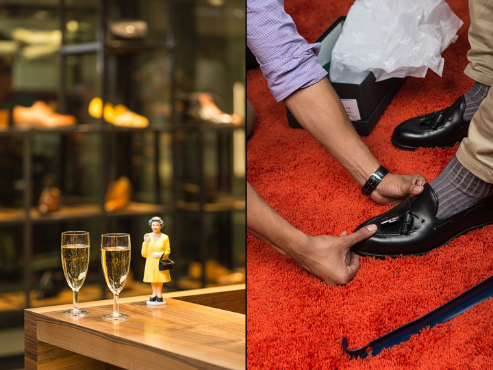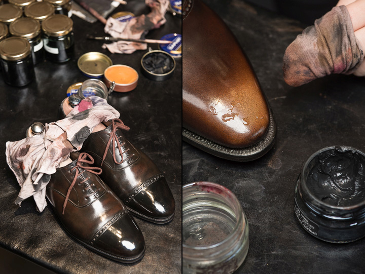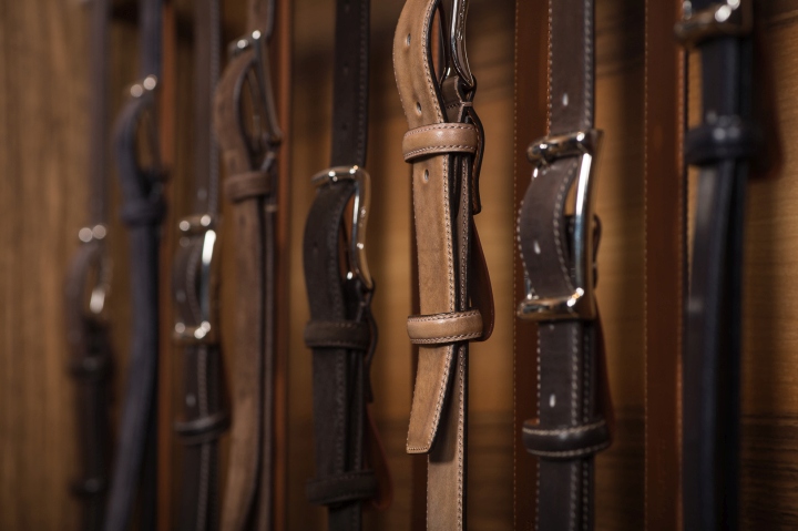
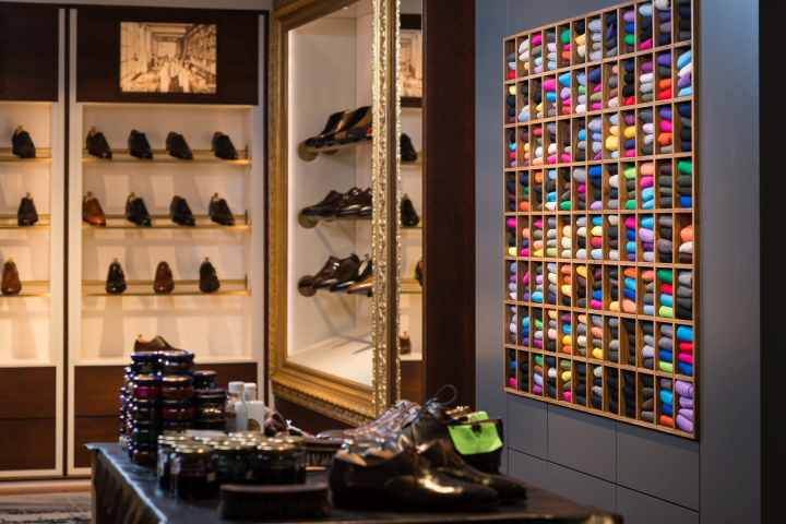

BACKGROUND: Located in the center of Geneva since 1995, the business was initially launched as Shipton & Heneage but became an independent multi-brand retailer, reincarnated as Brogue, in 2007. BROGUE offers the discerning gentleman a wide selection of footwear and accessories from the World’s finest shoe manufacturers supported by a high level of personal service. Specialist shoe repairs and a personalized shoe-shine department are amongst the services that set them apart and contribute towards creating a personal and unique shopping experience.

CLIENT BRIEF: The shop location changed to a new, bigger space. The client was seeking a design that created a relaxed and welcoming atmosphere integrated within a contemporary design.
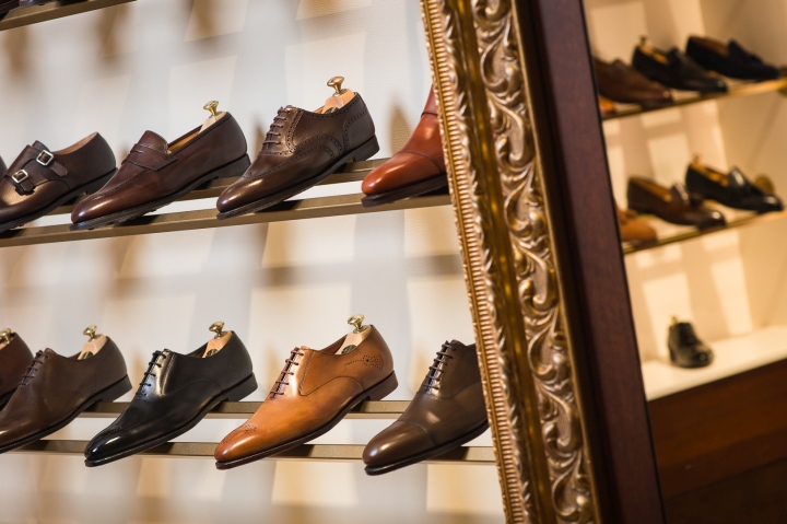
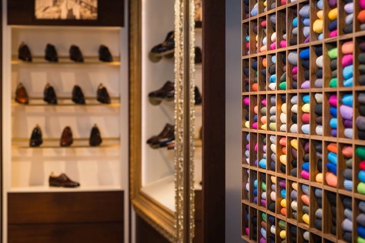
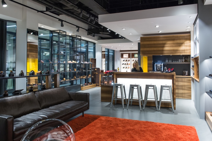
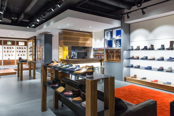
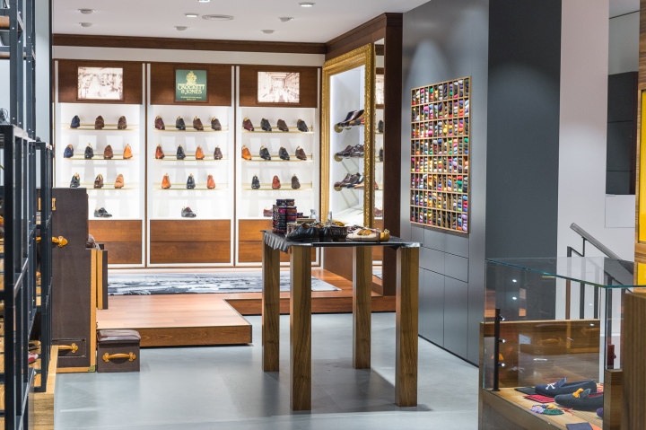
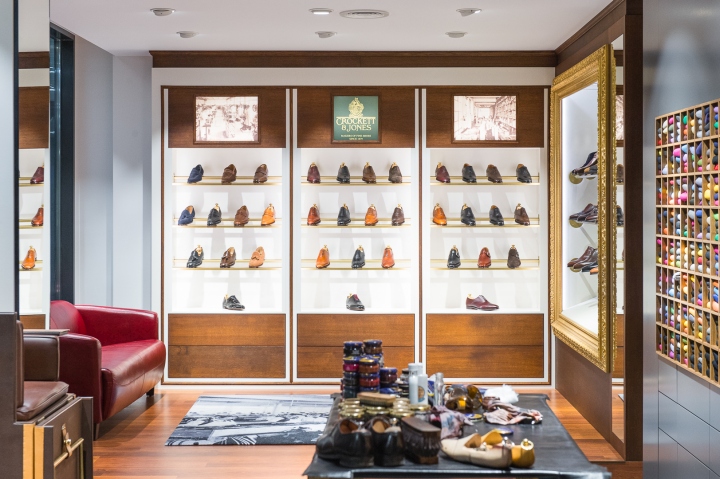
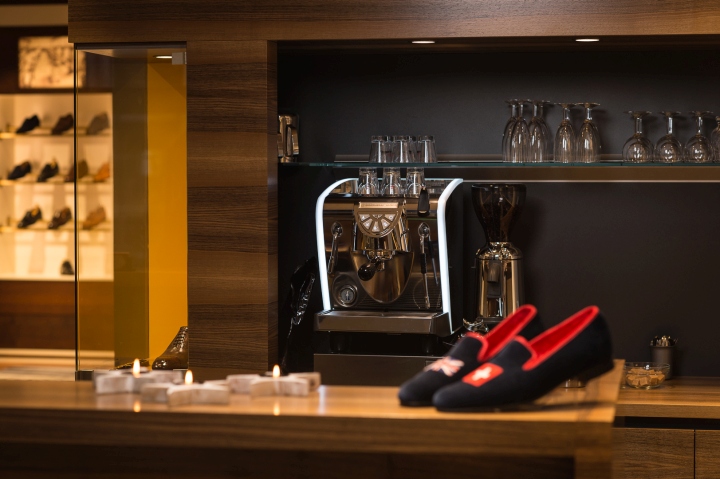
However, a few elements from the old shop such as the gilded frame display were to be reintegrated in the new space to create an element of continuity. A corner dedicated to their most important English brand, Crockett & Jones, was designed according to the brand’s own guidelines. Special attention was given to the customers’ wellbeing and overall comfort with a bar serving as a cashier and reception area and of course as a space to enjoy a drink. A great emphasis was placed on technical requirements such as versatile and flexible merchandising display modern lighting solutions.

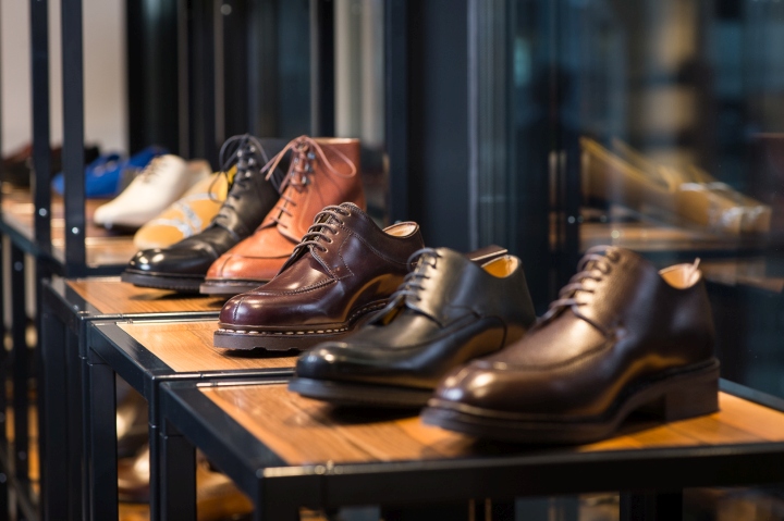
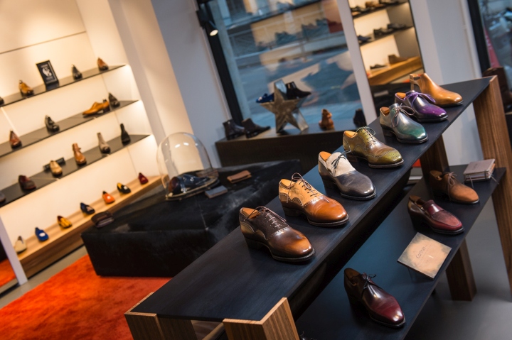
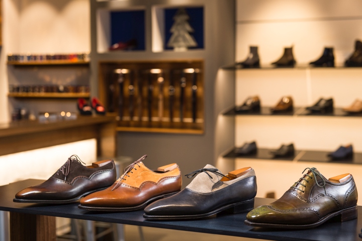
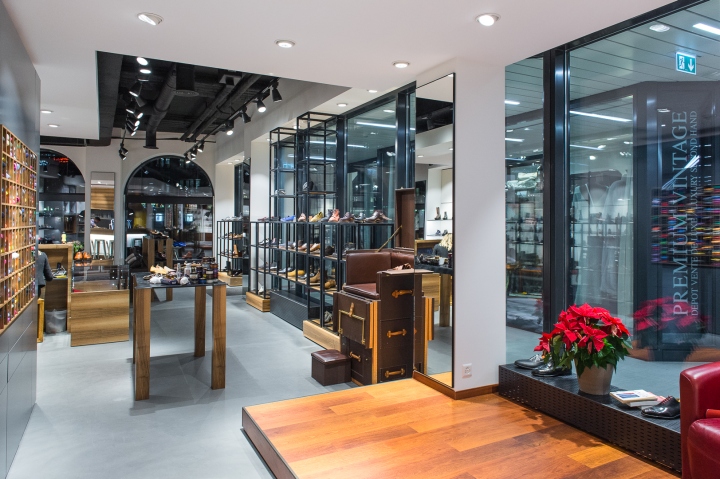
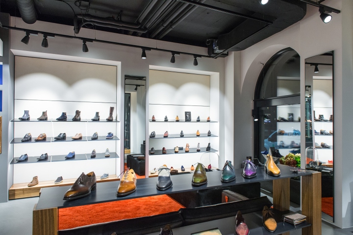
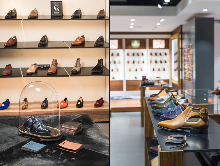
MY VISION: The generous space with its high ceiling and arched show-windows facing the River Rhone was Inspiring. By analyzing Brogue’s existing shop design and taking into consideration their clients’ requirements I recognized the need to update the image. I therefore looked for inspiration from traditional Men’s’ shoe manufacturing where quality, precision and respect of tradition are indispensable parameters. I envisaged the overall look and feel justified an upmarket design. However, to allow attention to remain focused on the shoes, an emphasis was placed on using raw materials such as wood, black steel for the display and a polished concrete floor. To complete the semi-industrial feel, the ceiling was left ‘open’ to leave pipe work exposed for the majority of the space. However, the shop-in-shop “English club style” had to respect existing Crockett & Jones branded shops and here a suspended ceiling design was implemented.

THE DESIGN: The program for the space includes three zones – the main sales space, the “Crockett & Jones” corner and a central reception and bar area. The zones are accentuated with vertical and horizontal space separations, different floor finishing and ceiling levels that emphasize these different functions. The space projects a contemporary workshop style through its concrete floor finishing, visible technical black painted ceiling with exposed lighting fittings. A shoe-shining table placed in the transition zone completes the look.
Design: MAGMA Vision d’Espace & Design / Ruth Falise-Grauer
Photography: François Wavre


