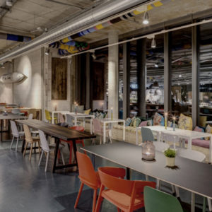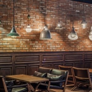
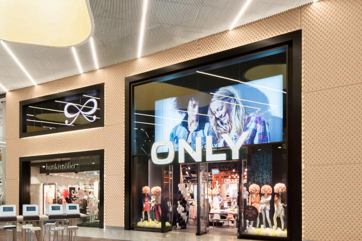

Back to the City: With the opening of the new shopping mall on 26 March in Mönchengladbach, a landmark for better quality of life in the City was set. With its 4 star shopping concept The Minto presents a futuristic shopping experience and an outstanding quality of habitat; urban design, comfortable, inviting, enjoyable, sensuous and magical, coupled with premium services and convenience in all public areas. In short, a customer trip for all the senses. kplus konzept designed and implemented the complete interior design of the mall: from the multi-sensory ‘Highlight Facades’, the rest areas in the boulevards, the Food court (Minto’s Deli), to the signage in the mall and the car parks as well as for the lift lobbies and toilets.
“The Minto sets new standards, also for the retailers in the pedestrian zone,” said the Lord Mayor of Mönchengladbach Hans Wilhelm Reiner in an interview with kplus konzept at the opening ceremony. He especially liked the attention to detail, the design for all the senses, evident in the colours and shapes of the interior design. “It’s nothing artificial, not like a spaceship has landed, but a new living space to feel good has emerged”. Star chef Nelson Müller, culinary host for the pre-opening in the Food court, was also impressed: “Here were specialists at work, great! An exciting mix of materials, an open design in which one can see the chefs in action. Very well done!”. kplus konzept Managing Directors Bettina and Markus Kratz summarize: “For three years we have put all our expertise and passion into the development of this extraordinary and pioneering project. We are grateful to the developers mfi AG for their courage to forge these new paths into Mall Interior design.”
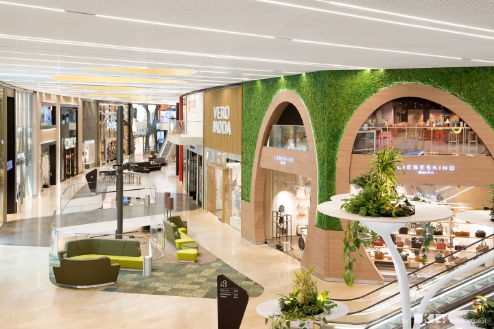
The Concept
The connection of nature and architecture is not only reflected in the Mall’s exterior design with its horizontally oscillating belts and vertically arranged lamellae, but is continued through its interior in a total of 42,000 square meters across four floors. Natural materials, organic shapes and nature soundscapes characterize the interior, designed entirely by kplus konzept. The “Home of 5 Senses” however makes aware the holistic experience more comprehensively and presents itself consistently as a multi-sensory approach under the aspects “see, feel, hear, taste and smell”, culminating in the five “Highlight Facades”. The guiding theme of the mall, “Feel at Home”, is about creating a complete feeling of well-being through the stimulation of all the senses. For example, by the haptic qualities of the materials, by the individuality, by the high quality and variety of the interior design related to that of private dwellings.
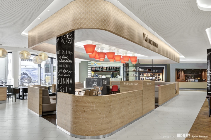
The Food Court – Meet & Eat
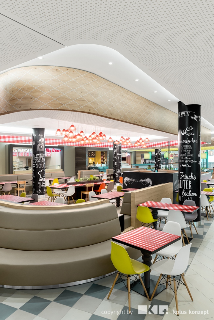
Just like at home, this feeling evokes also a completely new type of food court (Minto’s Deli), where hungry guests can make themselves comfortable in the kitchen, the living room, the conservatory or the library. Individually designed “rooms” become the community dining areas for the eleven different restaurateurs. A roof terrace completes the equally so inviting, as important, gastronomic area of the mall.
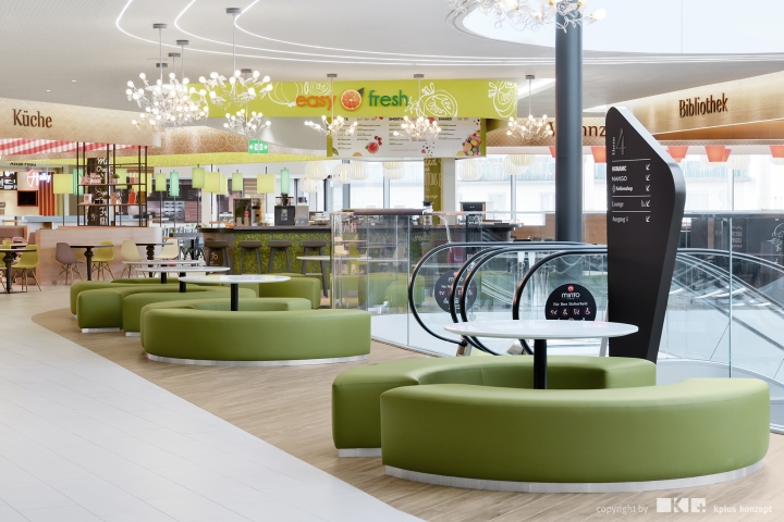
Focus Highlight Facades
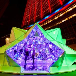
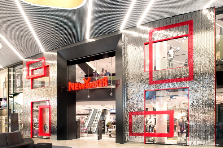
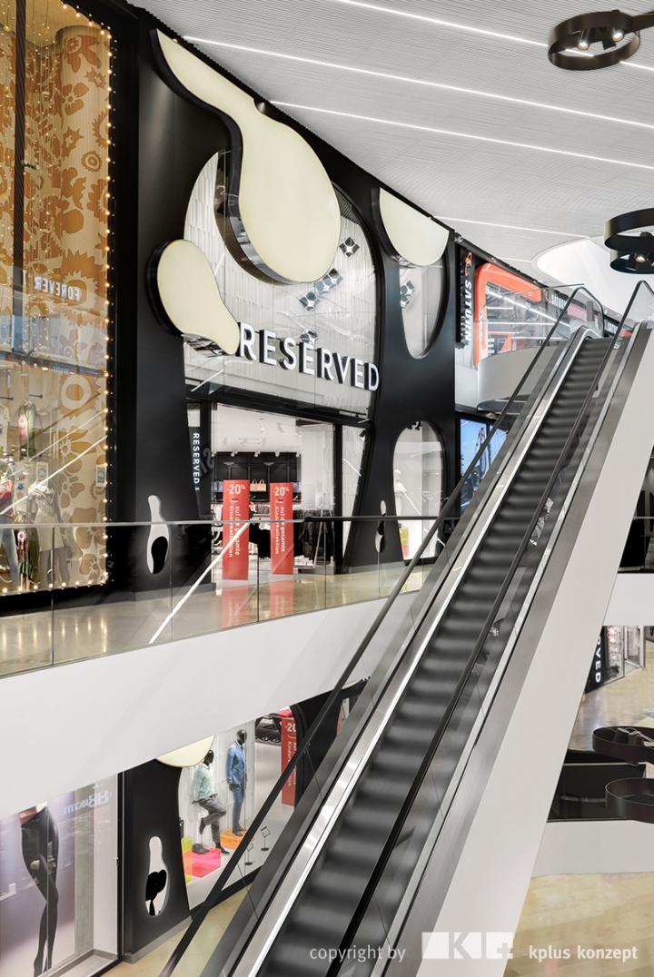
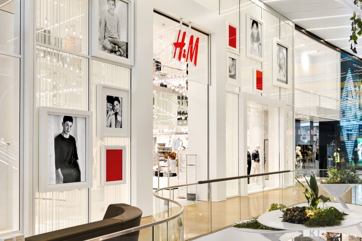
The perfect synthesis of all sensual and awe effects in the interior design are the “Highlight Facades” which stretch over several floors. The characteristic spatial and atmospheric elements lure through material and shape an interaction and are both eye-catching and an attraction for the adjacent shops. The five Facades take the visitor through different moods by a synesthetic combination of materials, sound and scent design. Sometimes the metal sequins of the Facade “Glamour Walk” sparkle just by passing by, symbolizing the modern, fashion-conscious lifestyle, while next to it the “Green Point” with wall vegetation of real plants embody energy and spirituality. The “Fluid Flow” Facade flows, like a lava lamp, colourful organic forms that exude peace and relaxation. The fine leather of the “Noble Sensation” Facade stands in turn for nobility. The Facade “Frame Yourself” stimulates, by the flexible push and pull elements, the impulse to be played with.
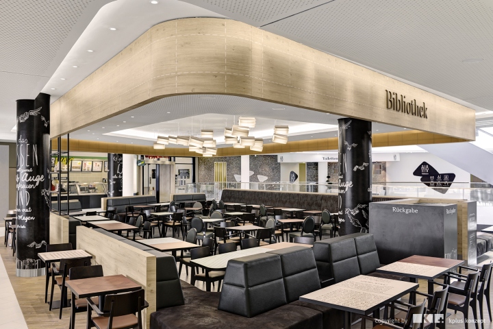
The Art of Fragrance
“Scents interact directly with our emotional state”, says our partner Air Creative. “We wanted to create scents that invite you to linger.” Issues such as vitality, peace and creativity were first colour-coded and then connected to an appropriate scent. The Facade “Glamour Walk” for example exudes a red scent. Red is cheerful, extroverted, even slightly aphrodisiac. Therefore, the colour emotionally matches clothing and shoes. The fragrance reflects the shopping experience. So the air enhancement for the “Green Point” is, as expected, green. Here, spicy, fresh flavours such as mint or lime result in a healthy and green fragrance combination. Contrary to that, the ”Noble Sensation” Facade spreads a fine, exclusive fragrance, based on a potpourri of dark colours like red, brown, turquoise, mustard yellow, purple.
The Fragrance fits the Music
Together with Julian Treasure, owner of the British Sound Agency, an audio background was created which accompanies the respective scent sensations. Again, the Highlight Facades serve as a platform for a sensory stimulating Soundscape: nature sounds such as the rustling of leaves or birds chirping for the “Green Point” sound, switch to spherical sounds surrounding the “Frame Yourself” Facade, to a symphony of glass sounds from the direction of “Glamour Walk”. The “Noble Facade” is silent, on purpose, with the objective of getting the sensation of touching and silence.
Be it design, scent or sound; the issue of multi-sensory brand and shopping experience in the Minto sets new standards.
The Customer Journey: aesthetic, relaxed, eventful
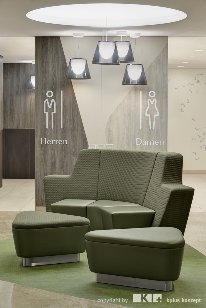
From the pioneering design of the intuitive Parking Guidance System leading to one of the 110 stores, to the exclusive service Welcome Desk and the luxurious family washrooms, onto the noble lift lobbies and the many uniquely designed rest islands – the stay at the Home of 5 Senses becomes a relaxed as well as exciting customer journey. All thanks to a clear and structured signage, full of creative highlights. Organic shapes pleasing to the eyes, be it on the ceiling signs and steles or the welcome boards in front of lifts and escalators. Colour codes, for such as the assignment of the stories, do not only facilitate orientation but also display imaginatively on the walls in large graphics and are reflected in the pictograms.
Visitors can surf the web in the free Pad-Lounge, refresh their make-up in the feathery white Ladies Rooms, and nurse in a nursery corner on designer chairs. A Shopping Mall for all the senses!
Design: kplus konzept
Photography: kratz photographie


Add to collection
