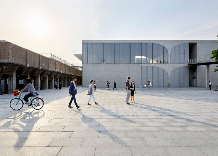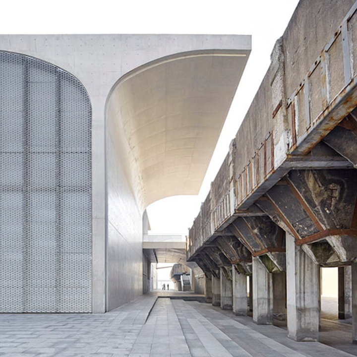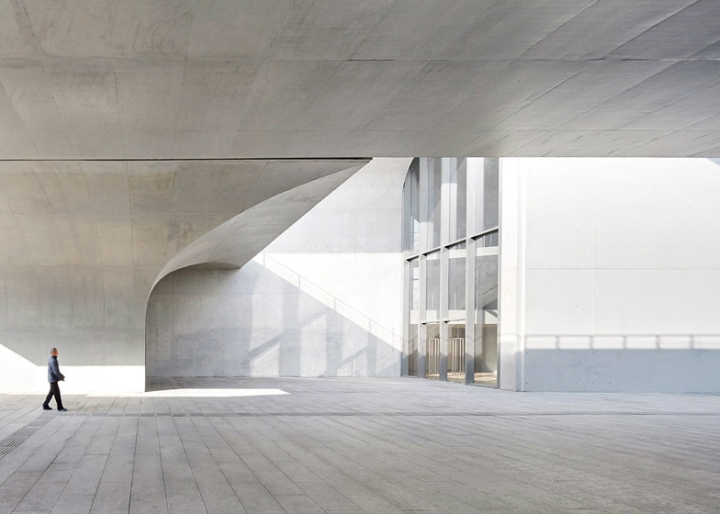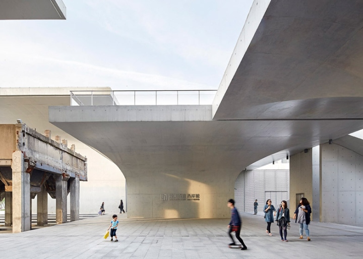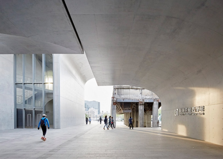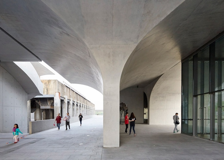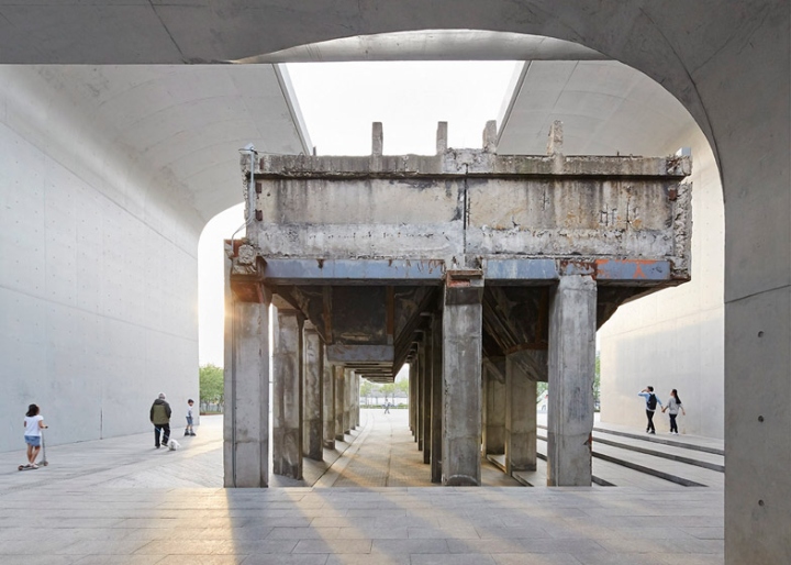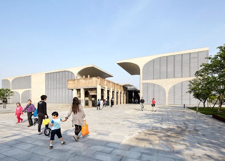

Shanghai art museum by Atelier Deshaus brings together vaulted columns and an industrial relic.

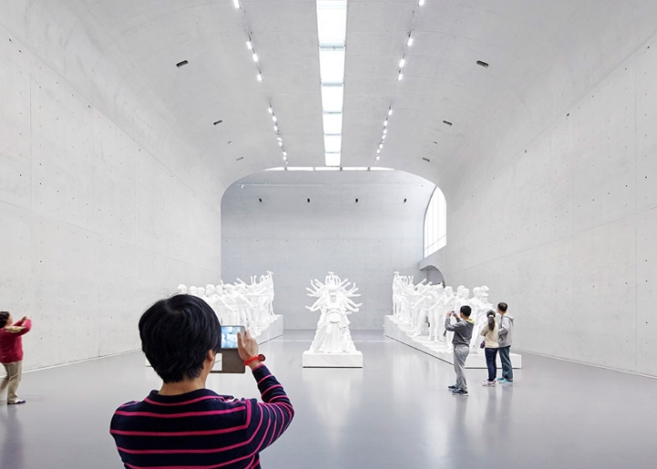
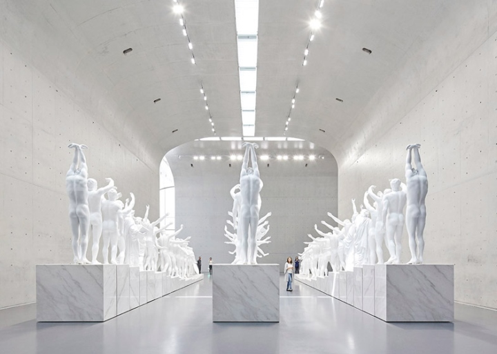
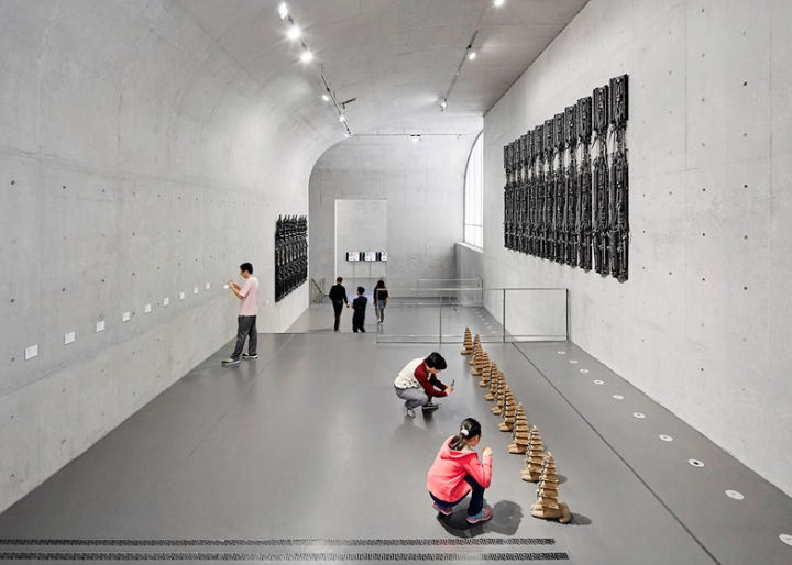
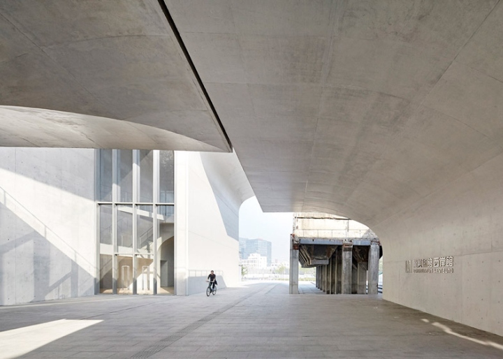
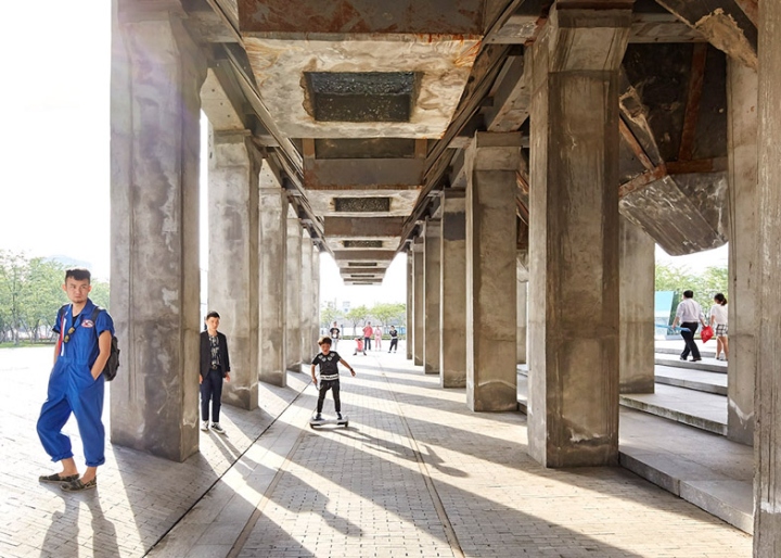
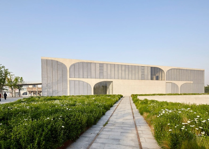
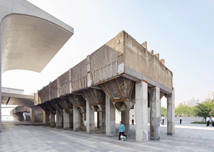
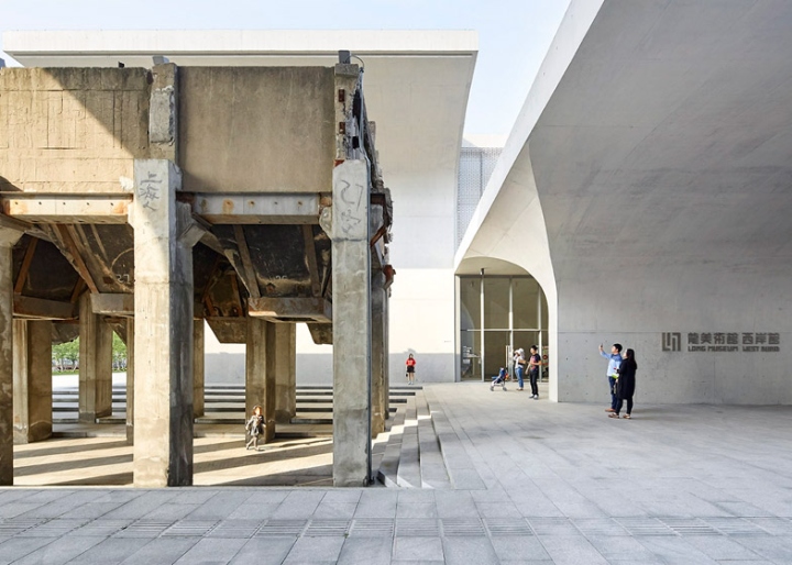
These new shots by photography duo Hufton + Crow depict the Long Museum West Bund – a contemporary art gallery in Shanghai built around an industrial structure once used for unloading huge quantities of coal. The museum – one of 15 architecture projects shortlisted for the Design Museum’s 2015 Designs of the Year awards – was designed by Shanghai firm Atelier Deshaus, led by architect Liu Yichun. Liu’s strategy for the project was to create a contemporary building that also referenced the history of its site, which became a wharf for coal transportation in the 1950s but had most recently housed an underground car park.

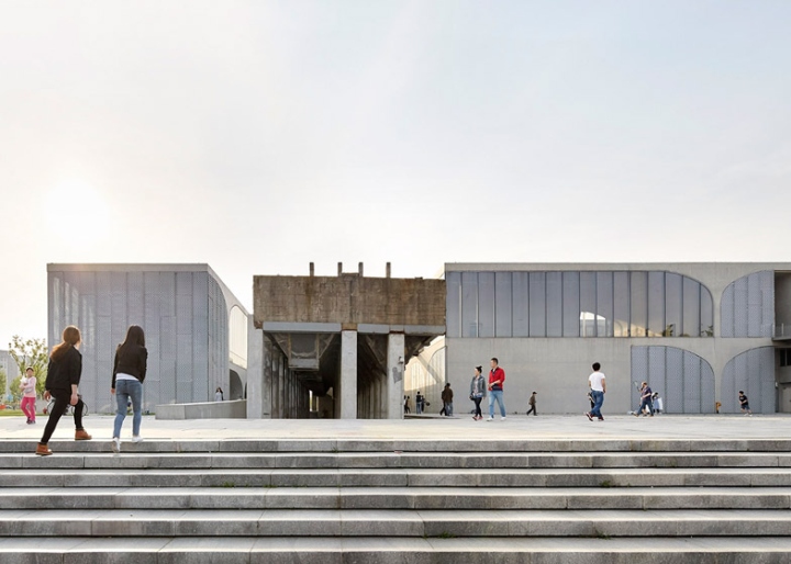
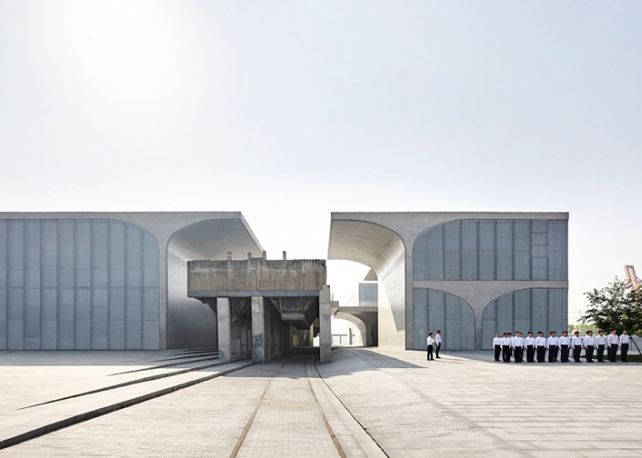
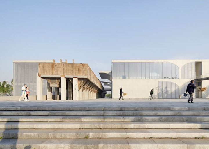
The most prominent remnant of the site’s industrial heritage was the coal-hopper unloading bridge. Measuring 110 metres long, 10 metres wide and eight metres high, it spanned the site on a north-west to south-west trajectory. Rather than demolishing this, or even building alongside it, Liu chose to make the structure the centre of his building. Not only does it frame the museum’s entrance, it accommodates a temporary exhibition space. “Against the charmless basement slab, the conveyer loading bridge built in the 50s, a relic of Shanghai’s industrial culture, increasingly displayed a loneliness and solitude,” explained the architect.

“I do not believe that the engineers when they designed this platform ever had thought about the aesthetic aspect,” he said. “However, a few decades later, this platform became a pure visual and spatial landscape construct, a beautiful object, when it lost its original function.” The existing basement car park dictated a structural grid of 8.4-metre intervals, providing the project with its largest constraint. To get around this, Liu developed a “free-wall plan”, allowing rooms to flow into one another. “Nowadays, for most people, visiting a museum no longer means a sequential contemplation of one room after another,” he said.

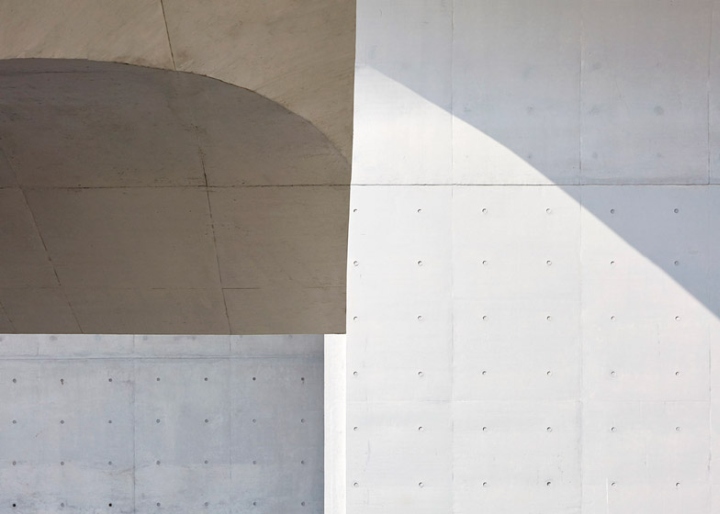
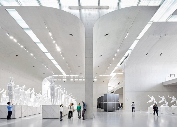
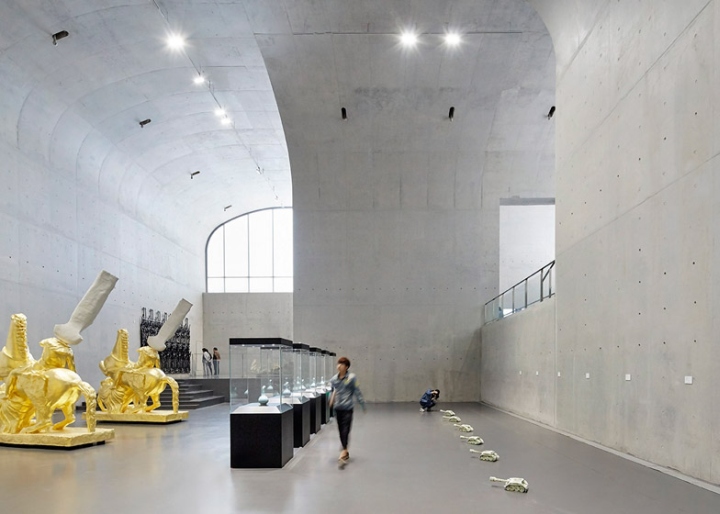
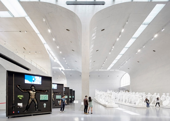
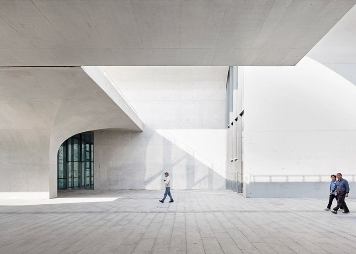
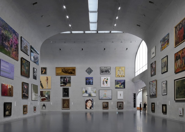
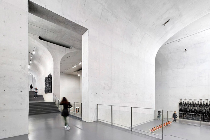
“Especially for contemporary art, its exhibition, its being viewed, even its process of being created; all of them anticipate an uncertainty,” he continued. “Viewing an art piece then is to allow the body move with a consciousness, to realise a sense of freedom, which is the critical reason why we choose the free wall plan.” Architecturally the building’s form was created by the repetition of one element, referred to as the “vault umbrella”. It comprises a concrete column that curves out towards the top, so that it looks like separated halves of an arch. These are dozens of these elements throughout the building. Some stretch all the way to the roof, while others frame exhibition spaces on the ground floor. But they all line up with the existing structural grid.

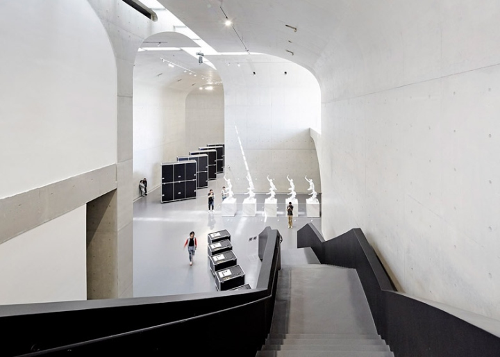
“In this structural transition, the freedom of wall positioning is critical,” said Liu. “This freedom is not only about location, but also about direction, so this umbrella-shaped cantilever extending from the wall became the undoubted choice. It was like completing a puzzle – we wanted the roof to be a full cover, the lobby to be a long span space, B1 gallery to be a spirally downward space, second floor to be an open courtyard, and also have to take into account the possibility of multiple and single routes of exhibition,” he added.

There are three main storeys defined within the building – a ground floor, a first floor and a basement. Contemporary art galleries are located on all three levels, but the basement also includes exhibition spaces for more historic collections. The archive also occupies the basement, while the upper level accommodates an auditorium and a restaurant overlooking the river.
Design: Atelier Deshaus // Architect in charge: Liu Yichun / Chen Yifeng // Design team: Liu Yichun / Chen Yifeng, Wang Longhai / Wang Weishi / Wu Zhenghui / Wang Xuepei / Chen Kun
Photography: Hufton + Crow


via Dezeen
