

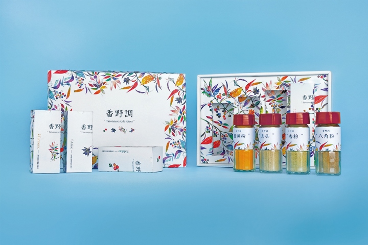
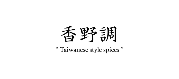
Xiang Ye Diao – Taiwanese Style Spices Packaging by Shang-Chun Tai
posted by retail design blog on 2015-07-08
Add to collection
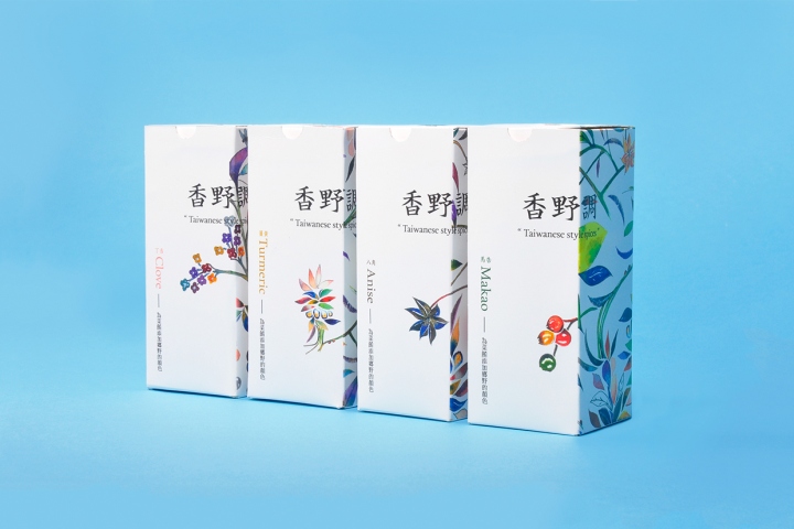

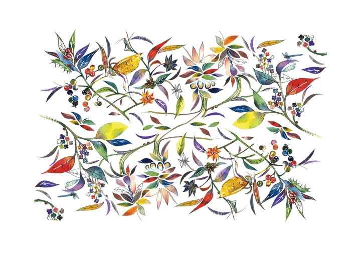
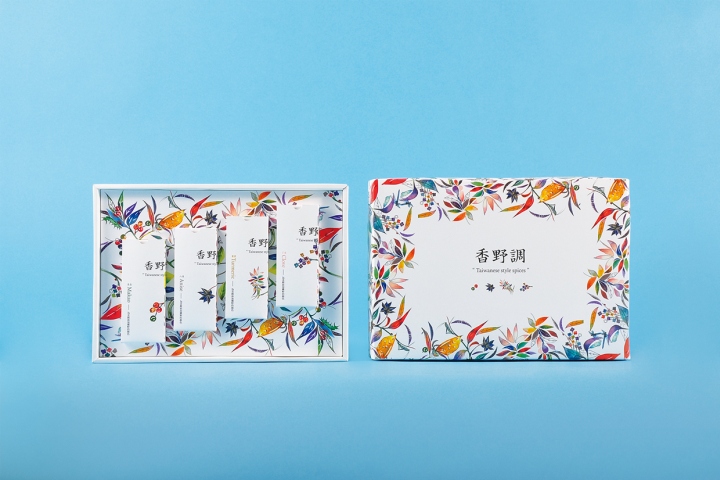
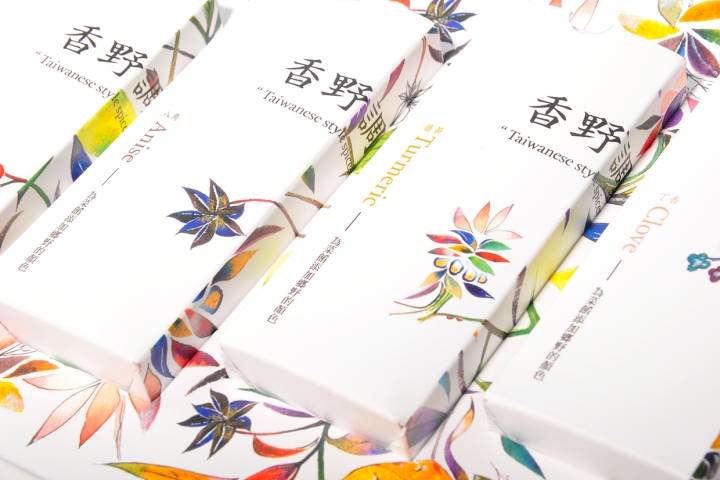
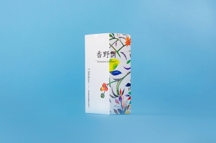
With realistic watercolor style, 香野調 represents the spirit of modern women lifestyle. Give the food more flavor, and give your life more color.
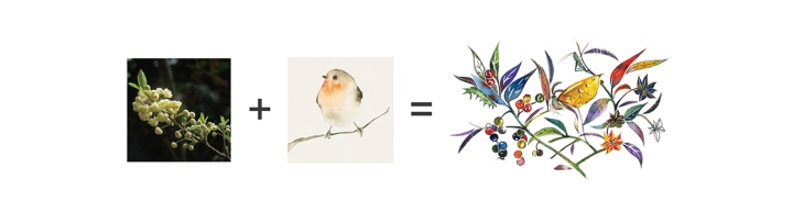
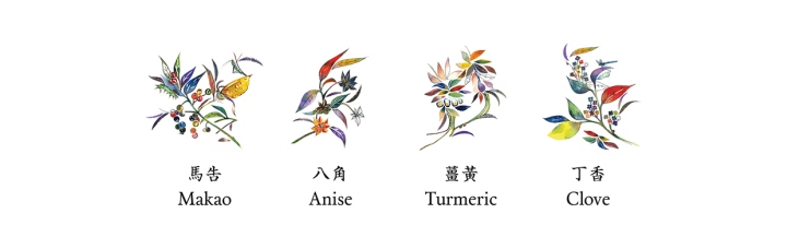
This is a brand which has four traditional Taiwan flavors, Makao, Anise, Turmeric and clove. In order to distinctive from most of spices packaging on the market, I have used “Chinese style”calligraphy and “warm colors” flowers painting to represent the visual of the packaging. And I hope this packaging design will make Taiwanese spices a fire.
Design: Shang-Chun Tai


Add to collection