Ore-No Kappa Restaurant by YO Co., Hong Kong – China
posted by retail design blog on 2015-07-09
Hong Kong Island
Add to collection

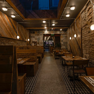
Ore-no group (“Ore-no”, means “My”)own many restaurants in Japan they are very famous and popular among Japanese. They have restaurants such as “Ore-no French“, “Ore-no Italian“ and “Ore-no Kappou“.
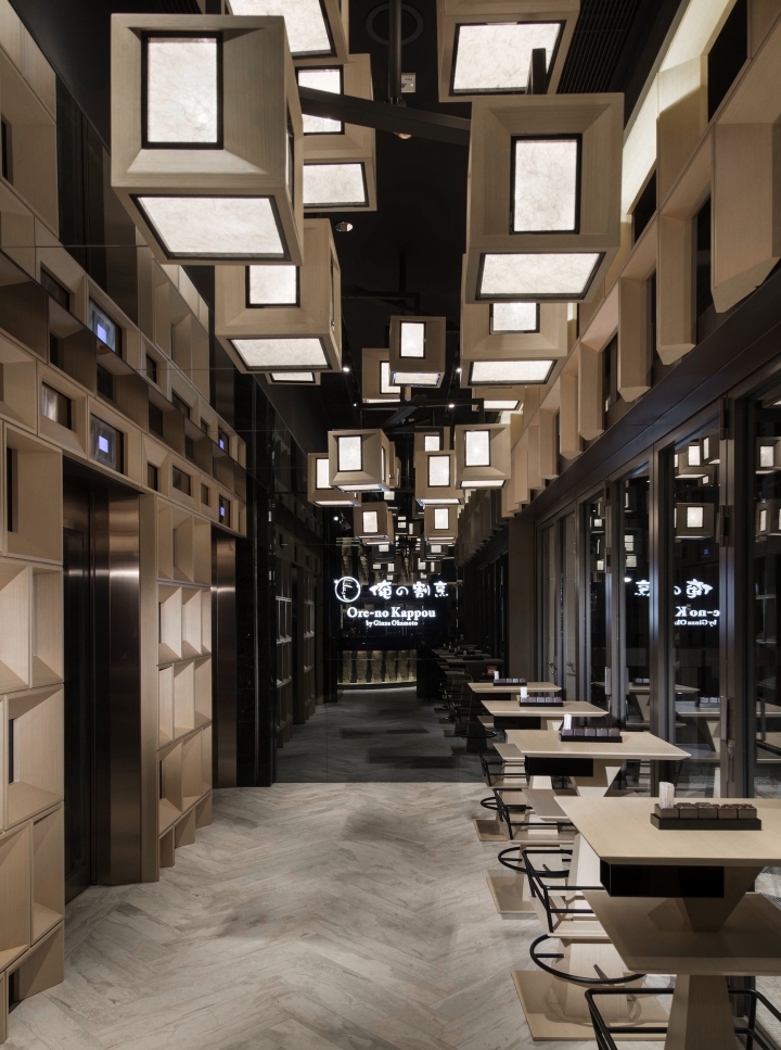
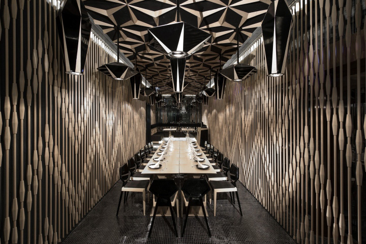
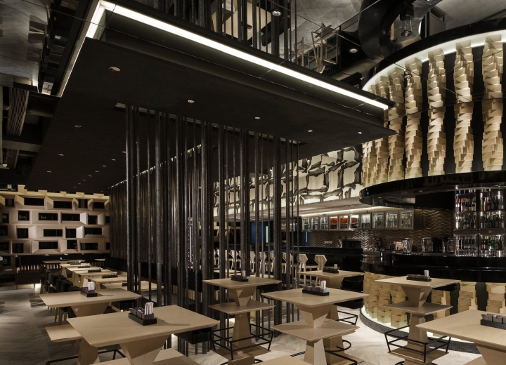
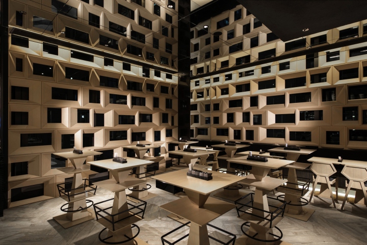
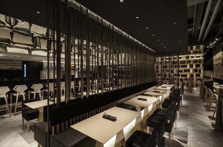
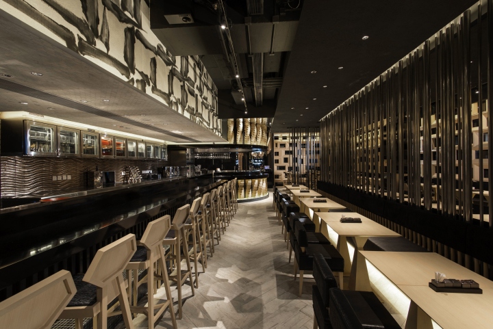
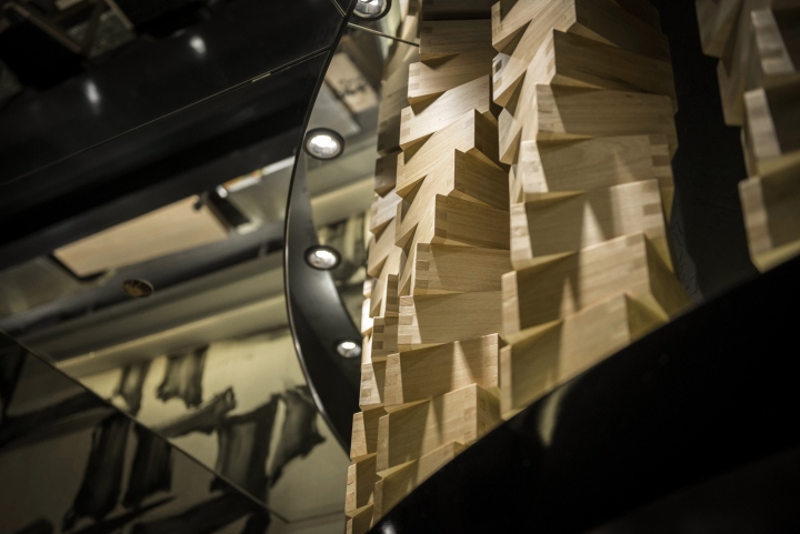
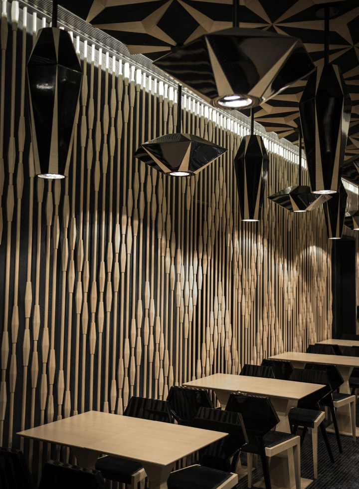
They chose Hong Kong to set up their first restaurant outside Japan, this is their first time to expand business outside Japan. In order to establish the brand image of “Ore-no”, I always think that the most important point is to express a new generation of Japanese “Wa” style that are stepping forward into the world. To make the concept into real, I tried to create a new Japanese style space with new pattern and shape. The overall design including 5 traditional Japanese materials, including “檜 Hinoki“, “土 Soil“, “漆 lacquer“, “紙paper“ and“墨 ink“. These five elements appear intermittently with a surprising pattern and shape that show a good balance between implicit Japanese “Wa” space and innovative spirit.

In Japan, we usually use “Contrast” and “Shadow” to express beauty. In this project, “Japanese traditional material” and “Surprising pattern and shape” are the biggest contrast point. I also express the feeling of gorgeous in terms of contrast of light and shadow too. This is how I pursue the beauty of Japanese style in this project.
Design: YO Co. / Hiroshi Kanazawa
Photographs Courtesy of YO Co.


Add to collection