
Add to collection
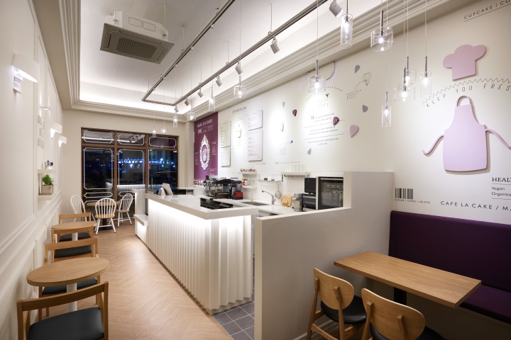

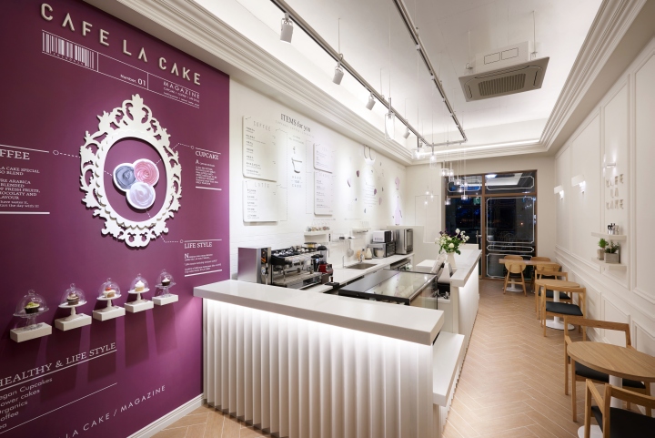
CAFE LA CAKE is the café that offers 100% Arabica coffee and healthy vegan cupcake. The café designed the space and branded itself, encompassing the mindset of the patissier who wishes for customers’ happiness with the cupcake decoration that is based on the motif of flower. As for the café’s logo, text was designed to conjure up the image of the cupcake’s side, and four flower leaves were utilized to express the form of a flower, and was completed by encompassing the significance of the brand.
The four flower leaves express the process for the production of the cupcake and coffee that can be enjoyed at the CAFE LA CAKE using flower. The significance is enriched even more by expressing the ability to decorate the whipped cream on top of the cake by making whipped cream with pastry blender to enjoy with a cup of Espresso using flower leaf pattern. Considering the long and narrow space with a high ceiling, the design plan was mainly focused on the wall. The design was unfolded with the magazine concept that is based on the home baking as the theme.
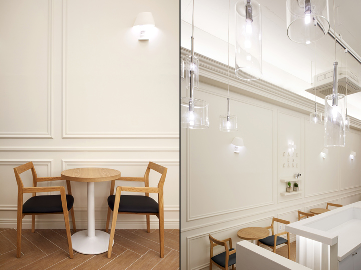
Design and brand were planned so that the customers who stay at the space can feel as if they are enjoying cake and a cup of coffee in a cozy house, while reading magazine in a relaxed manner.
The right wall was wrapped around with the molding that will express the home baking, to convey that feeling as if enjoying the healthy and vegan cake made at home, and to make the customers feel as if the whipped cream is piled up on the wall. The wall lighting that decorates the wall is of the table stand form that can be found easily at home. The lighting that lies in between the molding that uses the flower leaves which are parts of the CAFE LA CAKE’s representative logo enables people who stay in that space to feel comfortable by adding in the warm and cozy home-like ambience.

The left wall is a magazine wall, and makes people imagine, “What does it taste like? It looks delicious” when they see beautiful and delicious food in the existing food magazine. However, CAFE LA CAKE magazine enables customers to make selections right away to try when they see delicious cake and coffee on the page. In addition to the wall, design took place as an element of the multi-dimensional magazine just like a pop-up card when it comes to the counter and patissier’s work behavior. Customers who visit the café do not merely engage in two behaviors – eating and drinking. Instead, magazines’ pages 1, 2, 3 and 4 are composed of the 2D & 3D graphics, symbolizing the wish that the customers will enjoy seeing and walk away with simple knowledge while enjoying eating as well.

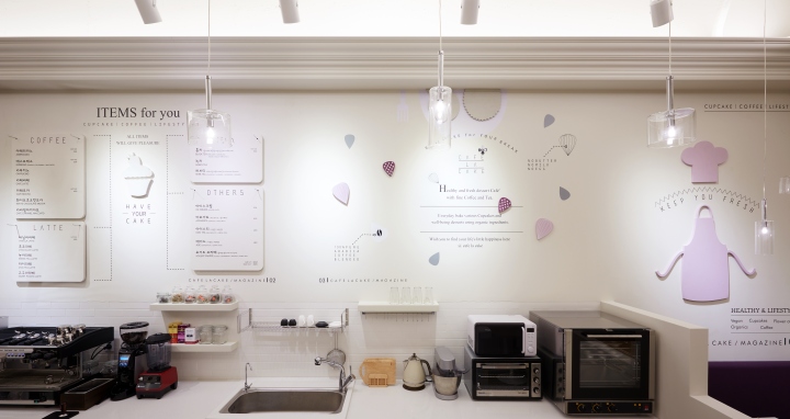
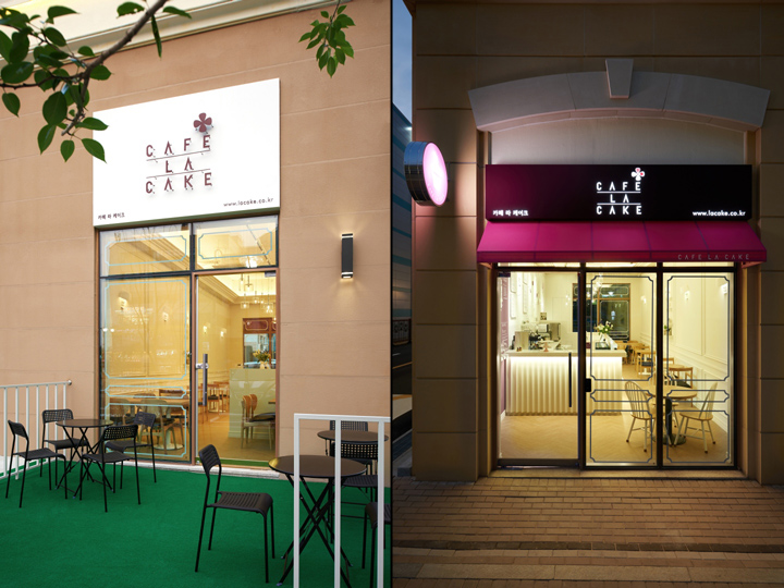
Two colors were used for the space. Classic gray was used for the overall space. Meanwhile, purple color preferred by the client was used as a means to add on that extra flavor and to conjure up the image of clean-cut cake cream. Feminine ambience was emphasized by conjuring up the image of a flower leaf on top of the cake. The purple wall that catches the attention of the people when they walk in through entrance is the first page of the MAGAZINE that introduces the cupcake, coffee and the healthy lifestyle that are sold and serviced at the café. It is expressed as multi-dimensional 3D magazine by displaying the cupcake, the store’s main product in the glass dome. The second page is comprised of the four multi-dimensional menu underneath the text, “ITEMS FOR YOU” at the back of the counter that conjures up the image of the cupcake’s place of origin, and it is comprised of the cupcake and diverse beverages and menus that can be enjoyed.
The third page is not only a wall graphic but the page that is completed fully when patissier makes cupcake or beverage. The wall graphic that shows the cupcake on a plate and the falling off the flower leaves from the coffee cup expresses the meaning of the CAFE LA CAKE’s logo, ‘delivering happiness to the people by encompassing flower into the cake and coffee’. Design and the space were created in a way that the customers can appreciate the view of the flower leaves that encompasses happiness falling off to the baking work station to fall into the cupcake that the patissier is making.
The pendant lighting that comes down to the top of the bar counter was expressed in a way that the freshness and cleanness of the CAFE LA CAKE’s cake can be expressed since it resembles cupcake’s glass dome. The last page, Page 4is the page in which patissier’s message to the customers is expressed. Chef’s hat and apron are used to express the patissier, and the desire for the customers to enjoy health and sweet healing casting away hectic everyday life in the CAFE LA CAKE space through the “KEEP YOU FRESH” text is expressed. CAFE LA CAKE is a space where customers can enjoy vegan cupcake along with coffee and tea, and it was branded and designed space-wise with the desire to enable healthy healing for the customers who visit the café.
Designed by M4


Add to collection