
‘CALMA’ is a sleeping environment specialized brand launched in 1999 with the philosophy of ‘sleeping is the basis of health’. The brand is specialized in all products that are used to sleep including bed, mattress, topper, blanket and others and that succeeded for the first time in Korea with the memory foam using polyurethane material, while handling from R&D to production. Products of the CALMA, a sleeping environment specialized brand, are manufactured by conducting R&D on the sleeping environment following Koreans’ body type and head. Likewise, its product line is comprised of the diverse product categories with optimized form and functions. Each of the product’s functions provide the solution for ‘good sleep’ amidst the customers’ sleeping environment.

However, it is true that the process for the customers to understand the sleep can be rather complex due to customers’ lack of awareness regarding sleeping, and lack of the spatial element and mechanisms that enables them to understand the functions following diverse sleeping environments easily. Likewise, this issue remains as a difficult assignment. Thus, development of the space design and elements that provides sleeping solutions to the customers and that enables customers to understand the functions optimized to the customers’ diverse sleeping environments easily were urgently called for.

There was a need to develop various mechanisms of the space that can deliver information on the functions of the CALMA’s diverse products to the customers easily, and that enables them to benefit from the product experience that suits the diverse needs for sleeping. During this process, the brand get the goal of facilitating understanding of the comfortable sleep and of impressing the customers by casting away the sales centered product display method which was carried out by the existing blanket brands. Instead, the brand transformed the display method to experience centered method.

We sleep even from the moment we are conceived and grow up in the mother’s womb even before we are born. We sleep during the infancy when our parents put us to sleep by reading us books, adolescence when we used to study while sleeping slightly in between just before a test, while we spend happy moments after marrying the person we love, and while waiting for the end of the life while lying down on the bed… We spend all the moments of the life with sleep.

Likewise, anyone would well understand the importance of sleeping well. However, many aspects of the sleep are still untapped. Since sleep is not visible and cannot be felt at the unconscious state, it is true that the standard for the good sleep is left as vague. The brand felt that the personal emotions can be expressed in a diverse manner amidst this vagueness and that they can be felt as diverse experiences. Moreover, sleep is bound to include very personal emotion in all processes of our life, and experience with sleep is bound to be diverse as well.

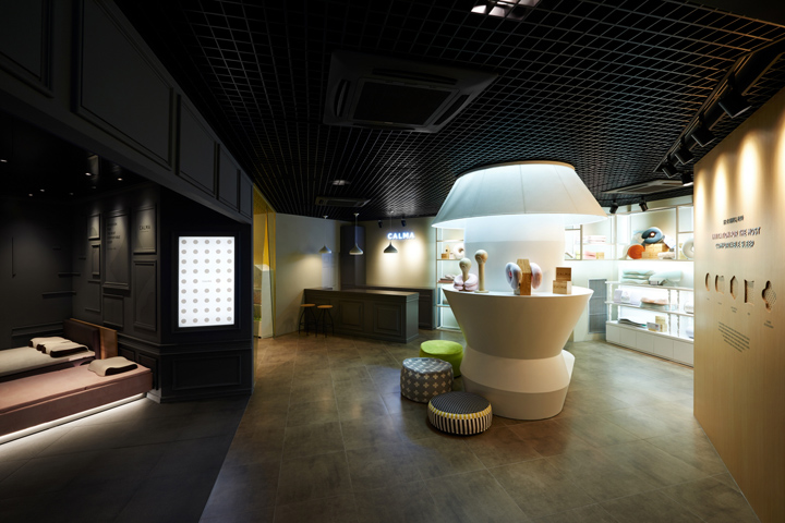
In the end, we hoped that the space would be turned into a space where all the moments of the life can be felt with the diverse experiences that can include personal emotion by changing the display method to the one centered on experience, and approached with the design motif of ‘Change of Display, Emotion of Personal Experience’. This motif was the essential approach for the vagueness of sleep. Space’s mood and various elements were carried out after analyzing the process for expressing the personal vagueness of the sleep. Over-scale, No boundary, Ambiguous shape, One color + different tone, and plain-like Tone & manner are formed.

As for the composition by each space, five space domains, Bed zone, Pillow zone, Beauty & care zone, Kids zone and Counseling zone were classified. The structure is such that it is filled with all the products related to sleeping for the overall life. It is comprised of the products for each function needed for the sleeping environment and by the scope of the products for each age group that can be used by children and grown-ups alike.

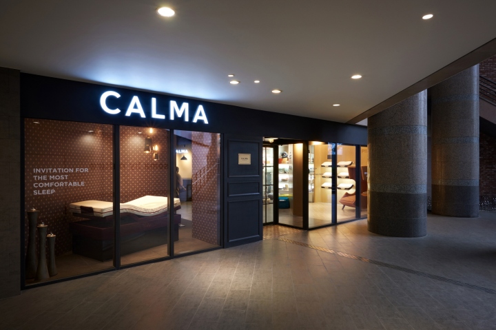
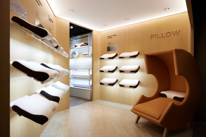
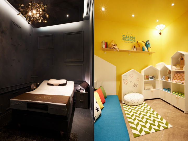
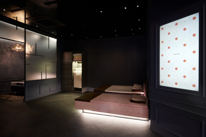
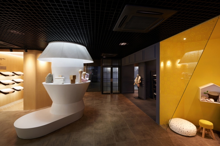
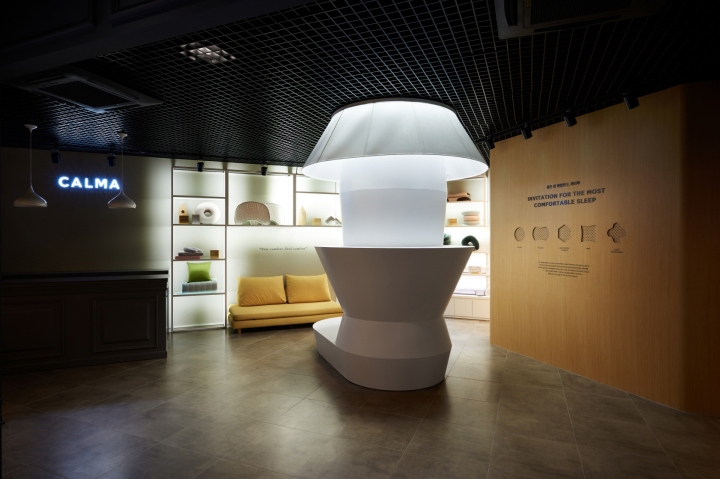
The store’s entrance is expressed as the entrance for the customers when they enter their house, inducing them to feel personal emotions even from the entrance. ‘Bed zone’ where bed is displayed is the domain of dream filled with exaggerated and unrealistic elements. It is comprised of the over-turned closet, mood stand that is half-melted, wall of the dark gray tone that expresses the subtle, blurry memory, moldings that disappear, and look and feel of the vague living room in the dream. In the ‘Pillow zone’, pillows with diverse functions are floating, and there is the C Chair of the Over-scale so that the customers can experience diverse products. Moreover, ‘Beauty & care zone’ section presented the look and feel of the vague living room with the Over-scale white stand. Meanwhile, ‘Kids zone’ was expressed as the space with the children’s enjoyment and imagination.

We hoped that the elements expressed in the space can serve as the support for helping consumers to get exposed to diverse experiences regarding sleep along with the individuals’ diverse emotions regarding sleep, and we hope that the consumers can feel as the space is theirs alone, feeling comfort while experiencing, and that the space will be filled with the diverse experiences, memories and nostalgia of the first person’s viewpoint.
Designed by M4


