
Founded in 2005 Klarna is today one of Europe’s fastest growing companies. Their idea is to do online shopping simpler, safer and smarter. When work began on the new HQ in Stockholm – the Klarna House – the brief to Koncept Stockholm was to create a techy, forward thinking environment to help employees work together creatively. That techy-ness combined with a warm simplicity conveys the down to earth attitude and service mindedness typical for Klarna.

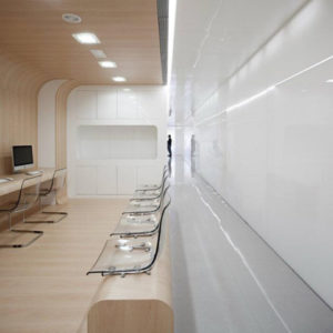
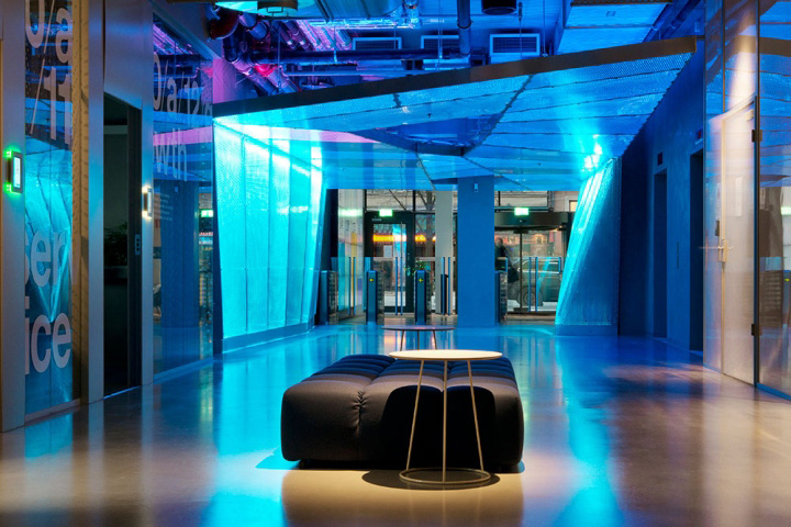
The Klarna experience starts in the reception area, which acts as an interface to the outside realm. Here all staff and visitors enter the office through a blue, metal shimmering tunnel. Beyond the tunnel is the Inner Space, an area designed to create ambiance and give glimpses into the concepts behind Klarna’s success story. The meeting rooms each interpret twelve different concepts; safety, flexibility, conversion, simplicity, mobility, growth, algorithm, service, data, transparency, consumer and merchant. ‘TRANSPARENCY’ uses 60s design, infinity mirrors and transparent plastic furniture to signal the company’s openness and honest approach. ‘GROWTH’ uses UV-lighting lamps for the wall-mounted plants exemplify the organic expansion of business.

‘ALGORITHM’ is a graphic room where complex code and derivatives are scribbled all over the walls with chalk in an Einsteinesque manner. The aim for the project was to create a work/play atmosphere where the 800+ staff can work creatively together to develop top technical solutions. Clean shapes, a mix of techy and natural materials and clear colours – neutral greys, tart orange and the company’s signature blue – have been used to signal the straightforwardness of Klarna’s approach.

Dotted around the office are spaces for impromptu meetings in order for staff to work in smaller teams. At the heart of the operation is the cantina. With its painted floor and large communal tables it’s a casual space for both work and after work action. Graphics are used throughout the office to give insights into the on-going digital activates that is the foundation of the operation. In essence the Klarna office provides the staff with the tools and spaces necessary to achieve the absolute best results possible.
Design: Koncept Stockholm


