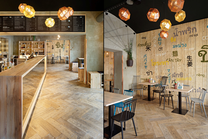

Modrý Zub in the Prague district of Smíchov is the third in a successful series of Prague restaurants focused on Asian cuisine. The entire interior was designed by architect Kryštof Blažek from studio minio.
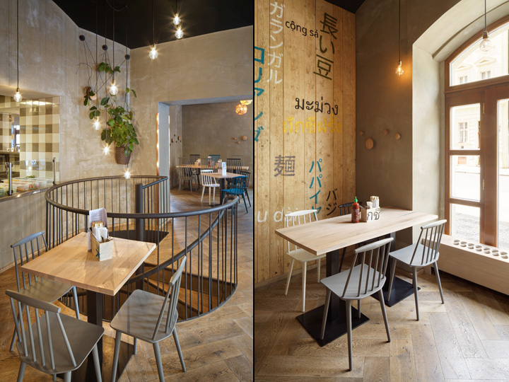
The restaurant is located in a corner building featuring segments of simple bossage on the façade and vertical windows rising into semicircular arches at the ground floor level. The entrance to the restaurant is from Stroupežnického. The space for restaurant customers is located on the ground floor of the building. The floor layout is fully connected and integrated, but there are different types of seating: the length or height of the tables and the type, colour or height of the chairs vary throughout the restaurant. Besides the vibrant range of seating options, customers are also offered a view of work in the kitchen, which will certainly catch their attention with its sounds, different lighting and ceramic tile motif: the gingham of kitchen tablecloths and dishcloths.

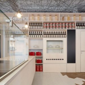
The interior is dominated by the use of distressed, slightly bleached solid oak, which was used as the primary material for custom-made furniture and fittings. The solid wood floorboards are made of the same wood, but are arranged in a herringbone pattern to evoke the pleasant sense of parquet floors at home. The front of the five metre-long bar running through the tasteful interior reflects the entrance area of the restaurant. The wall behind the bar is filled with “growing” shelves lit from below. A black menu framed in solid wood is installed on the lintel below the ceiling. The architect says installing this board perpendicular to the length of the bar was intentional, thus setting it apart from the usual fast-food menu charts. If the customer is not facing the counter, he or she can choose what they would like at a more relaxed pace.
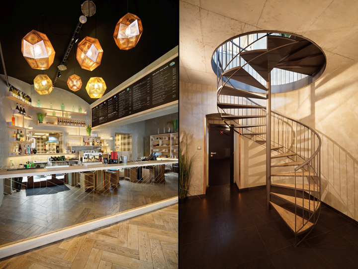
The original names of several typical Asian ingredients are shown as graphic details on the wood panelling along several walls. The rest of the vertical space is left in a neutral grey tone. The unstuccoed walls feel cosy. The black ceilings emphasise what is happening at eye level and tastefully accentuate the original vaulting. The coordinated light pastel tones of the interior are complemented with various coloured chairs, including black and white; accents of turquoise are offered in harmonious contrast to the golden brass and warm copper. The lighting in the sit-down part of the restaurant is in pleasant, glare-free warm tones. All pendant lamps and single hanging bulbs can be dimmed. Two sizes of functioning wooden coat hooks are firmly anchored to the walls in various places. The circular staircase is lit with a hanging spiral composed of individual light bulbs that lead restaurant customers to the black and white lavatory. The interior designer worked together with a landscape architect and sculptor to design the installation of flower pots with climbing plants hung in copper mesh baskets. Leafy flowering vines grow out of these baskets, crawling up the walls of the interior of Modrý Zub.
Design: minio / Kryštof Blažek
Photography: Jan Kuděj


Add to collection
