![](https://retaildesignblog.net/wp-content/uploads/2012/01/Webster-lamp-by-Jerry-Mejia-Design-Studio-300x300.jpg)
![](https://retaildesignblog.net/wp-content/uploads/2015/10/Foleys-Store-by-VOL2-design-Mexico-City-Mexico.jpg)
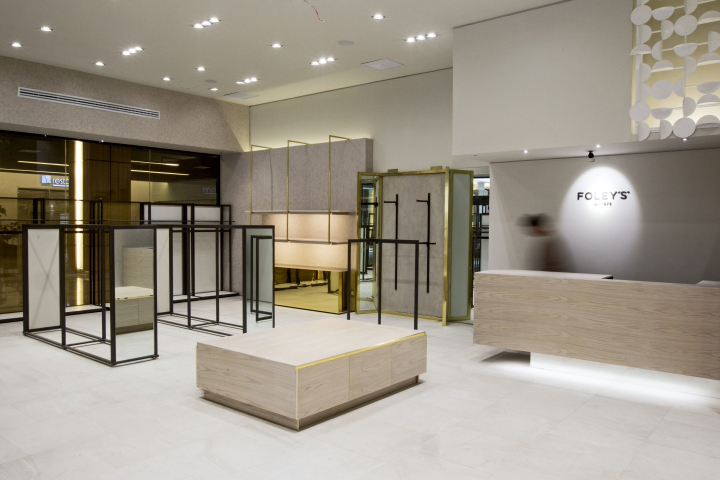
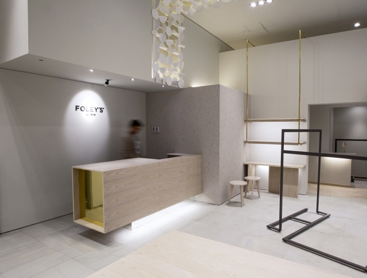
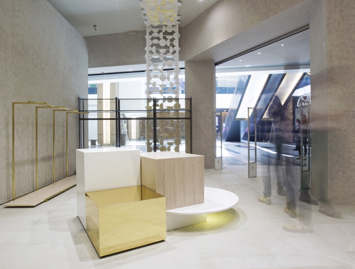
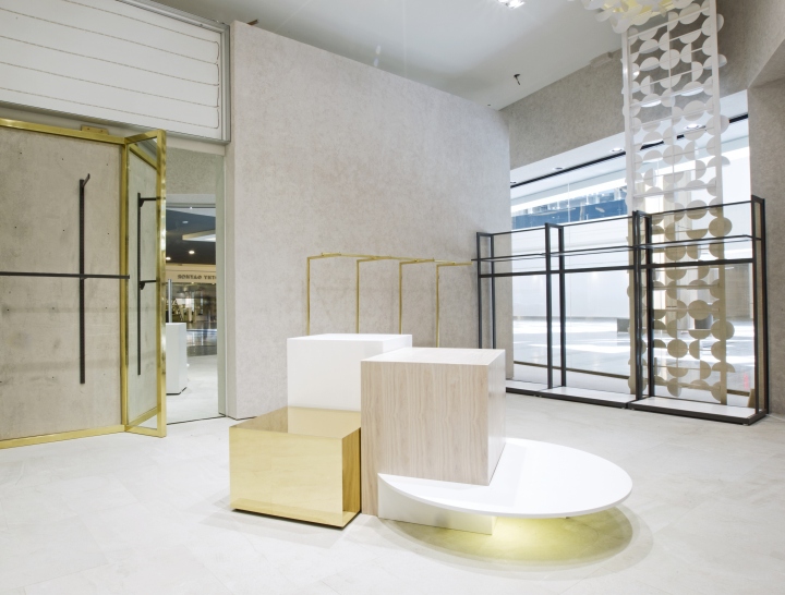
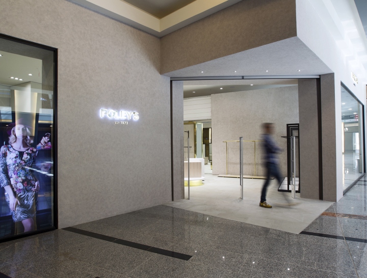
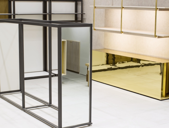
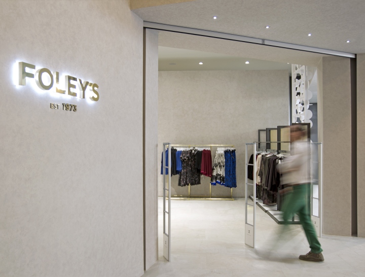
Based on the profile of Foley’s women we have created a discreet and sophisticated contemporary setting using simple volumes and texture play, a neutral stage to highlight the product. The lattice work, created as a brand space feature, came from the “O” in Foley’s as the only curved font and therefore a reference to femininity.
Design: VOL2 Design
Photography: Dario Vberastegui
![](https://retaildesignblog.net/wp-content/uploads/2015/10/Foleys-Store-by-VOL2-design-Mexico-City-Mexico-08.jpg)
![](https://retaildesignblog.net/wp-content/uploads/2015/10/Foleys-Store-by-VOL2-design-Mexico-City-Mexico-07.jpg)
![](https://retaildesignblog.net/wp-content/uploads/2015/10/Foleys-Store-by-VOL2-design-Mexico-City-Mexico-06.jpg)
![](https://retaildesignblog.net/wp-content/uploads/2015/10/Foleys-Store-by-VOL2-design-Mexico-City-Mexico-05.jpg)
![](https://retaildesignblog.net/wp-content/uploads/2015/10/Foleys-Store-by-VOL2-design-Mexico-City-Mexico-04.jpg)
![](https://retaildesignblog.net/wp-content/uploads/2015/10/Foleys-Store-by-VOL2-design-Mexico-City-Mexico-03.jpg)
![](https://retaildesignblog.net/wp-content/uploads/2015/10/Foleys-Store-by-VOL2-design-Mexico-City-Mexico-02.jpg)
Add to collection