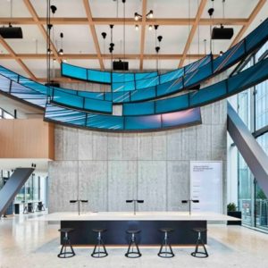
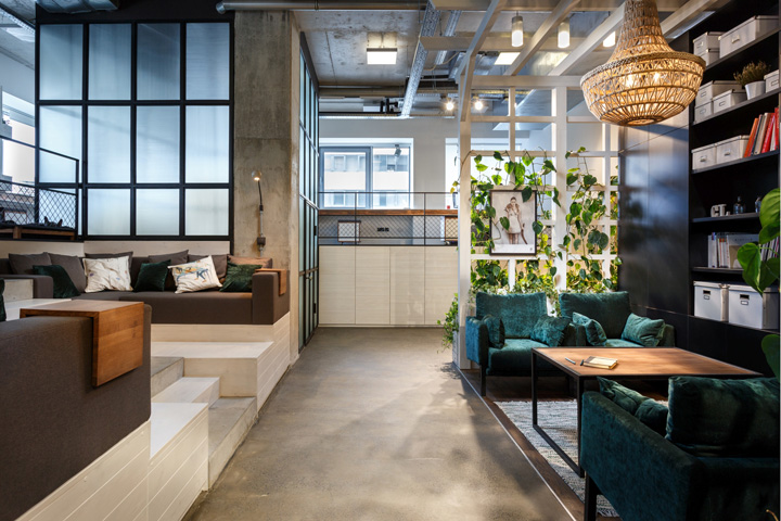

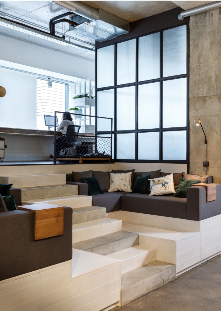
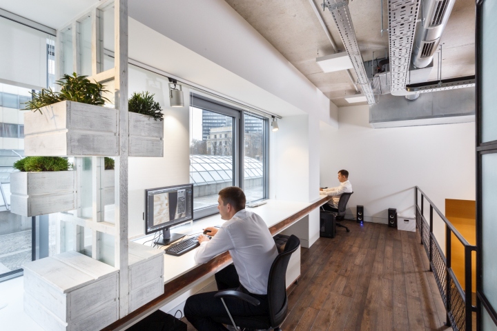
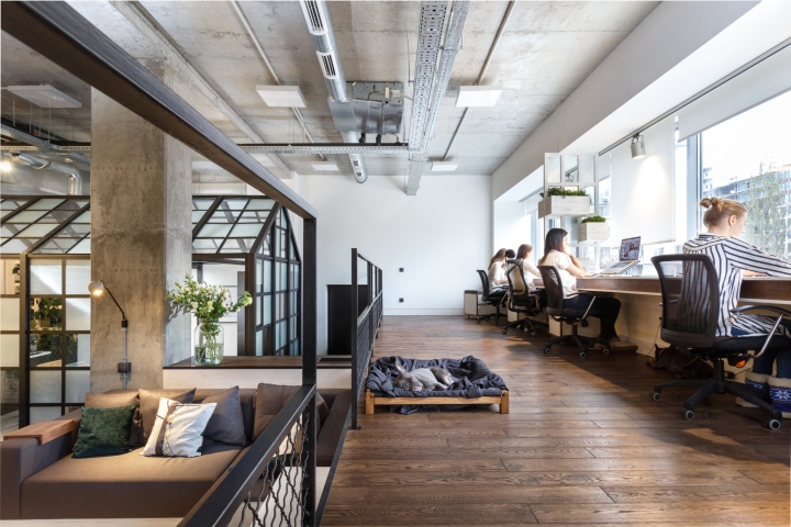
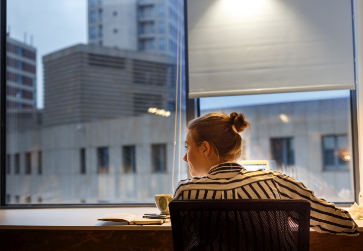
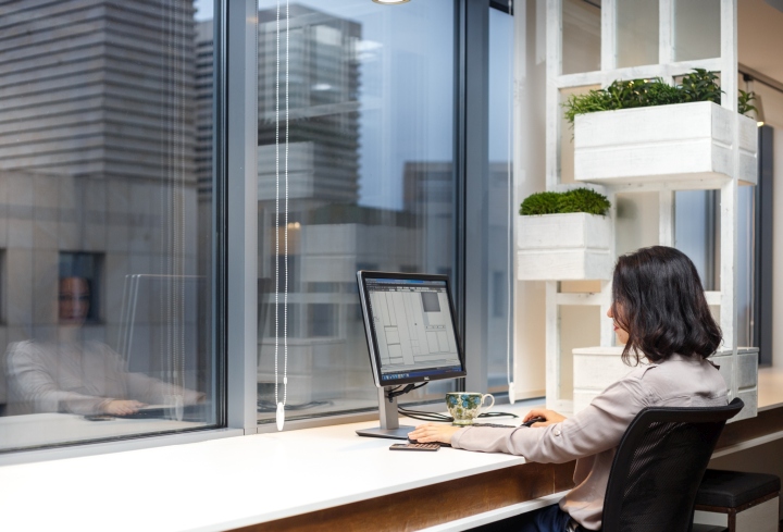
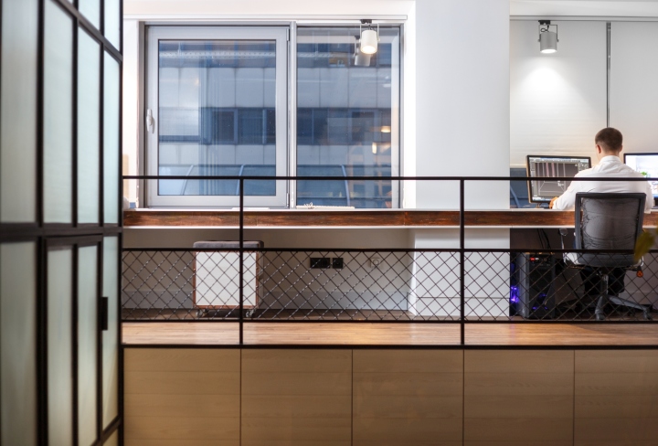
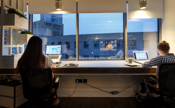
The space had to be carefully planned. It has quite an unusual structure: tall ceiling (4,5 meters) and high position of windows (they start from point of 2,1 meters). So we had to think outside of the box when we planned the space. The solution that we’ve came up with was to create a stage like construction with one communal table that goes along the line of windows. This way all our architects and designers could face natural light.

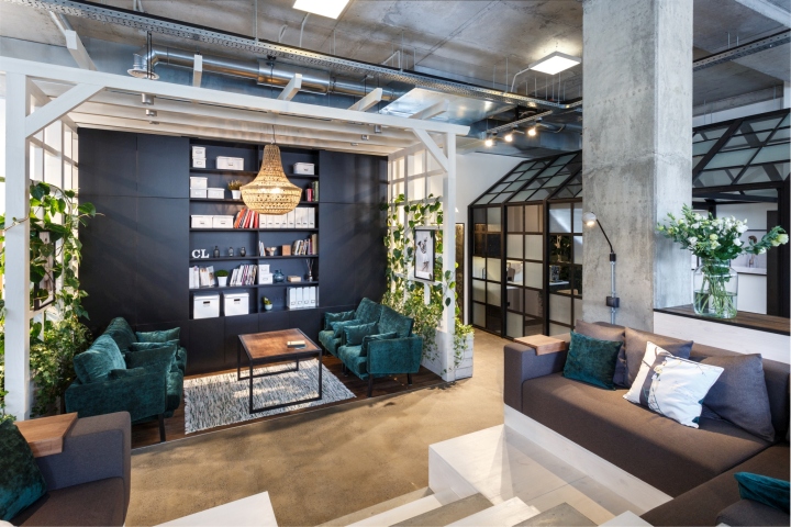
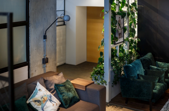
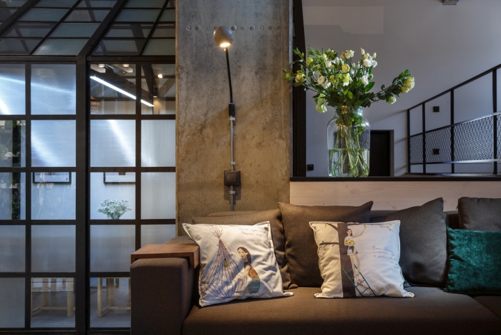
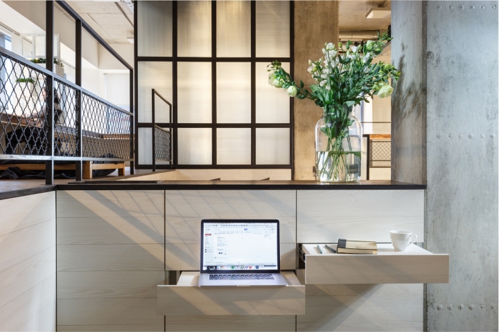
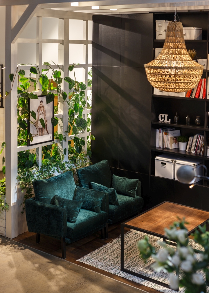
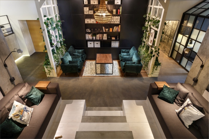
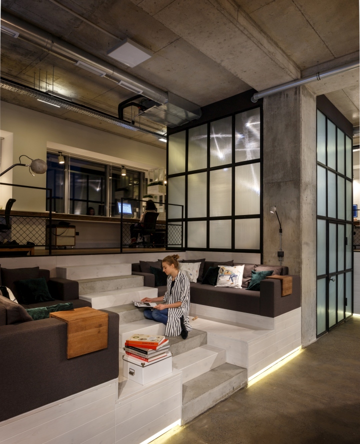
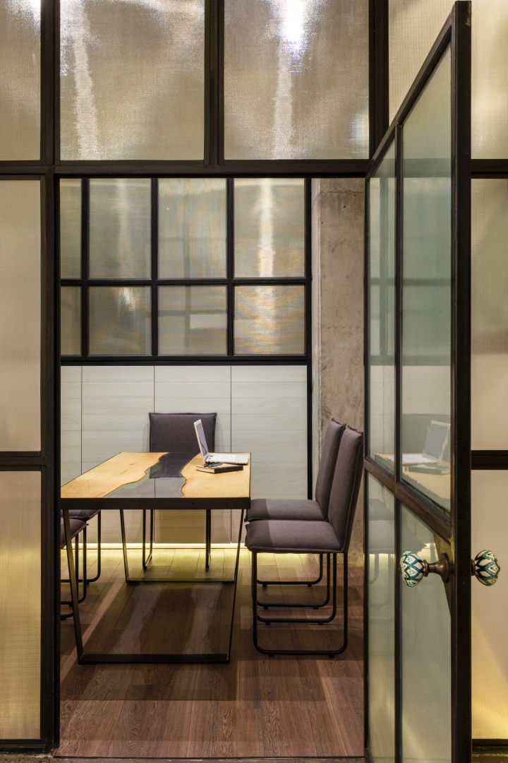
We decided to create open space with lots of different zones where our colleagues could move when they need the change of scenery for inspiration. For example, we have sofa area on both sides of stairs that leads to the main lounge zone with green armchairs. This way we’re moving and communicating all the time. At the same time we have a separate area dedicated to meetings with clients and suppliers. It can also be used when someone needs a moment of solitude. For those who have problem with back we’ve created mobile tabletops on the lower ground.

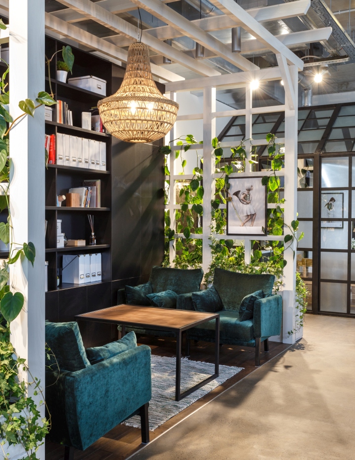
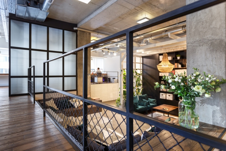
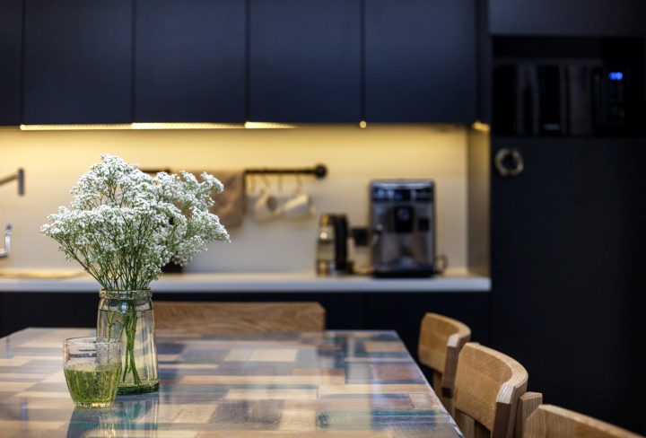
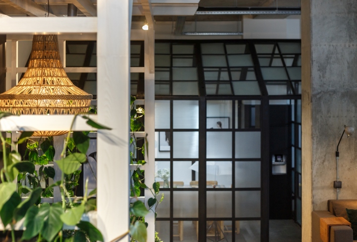
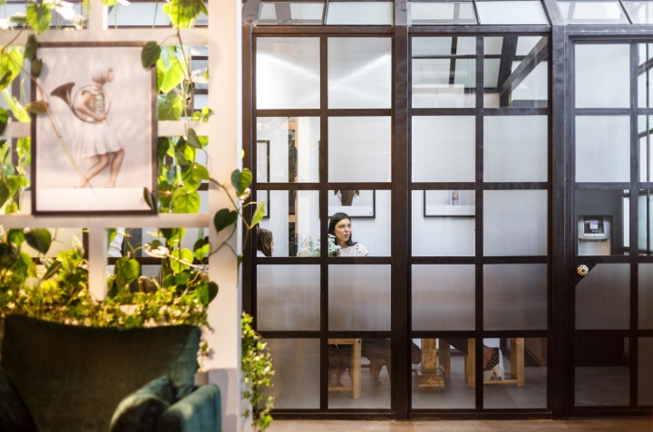
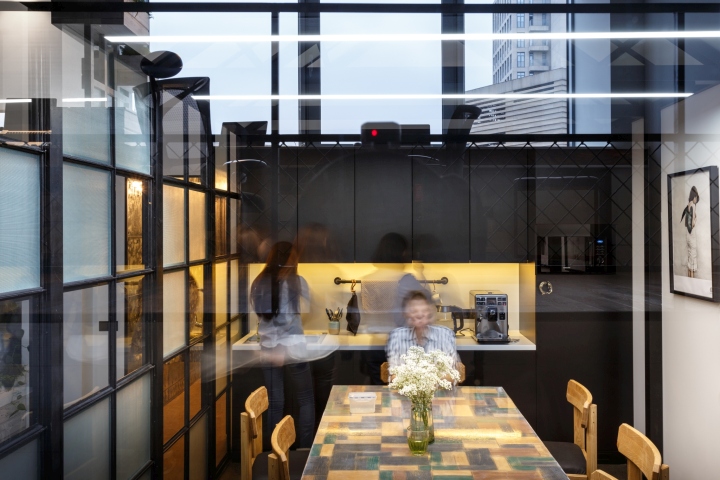
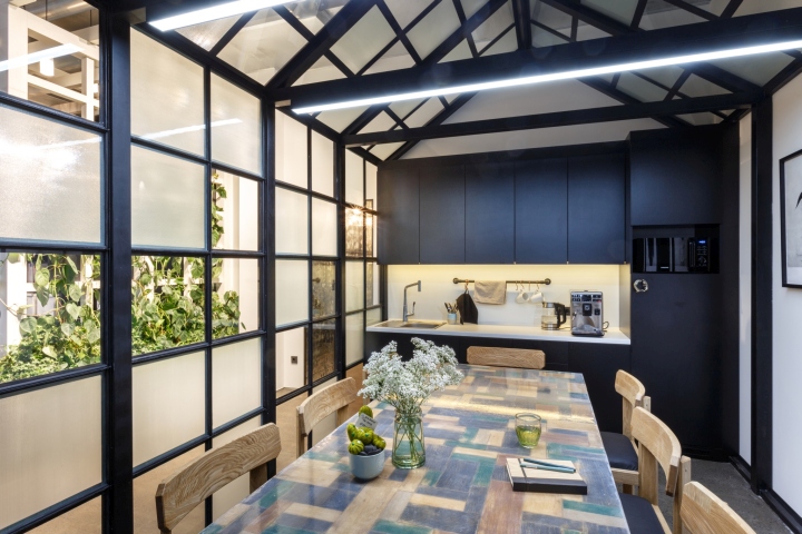
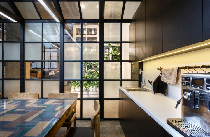
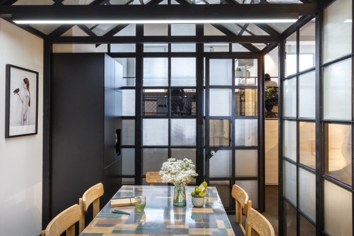
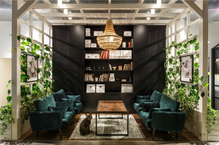
Thanks to the height of the ceiling we were able to play with the idea of integrating rooms within rooms. For example, our kitchen is situated in a glasshouse and the lounge area is placed under pergola. Lounge zone is surrounded by big planters with leafy plants which creates feeling of being in the garden.
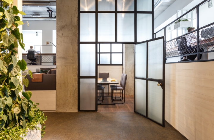
Glasshouse is made of metal construction with combination of different glass types: structured and clear. Thanks to the clear glass we continuously have additional light from the windows and thanks to the structured squares person inside doesn’t feel exposed. We work with big amount of different samples and we need a lot of storage, so all off the space under the stage is being used for this.
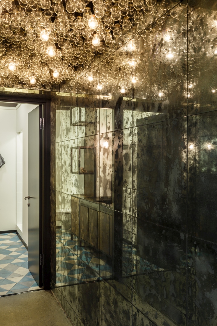
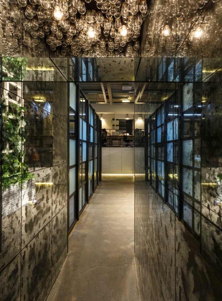
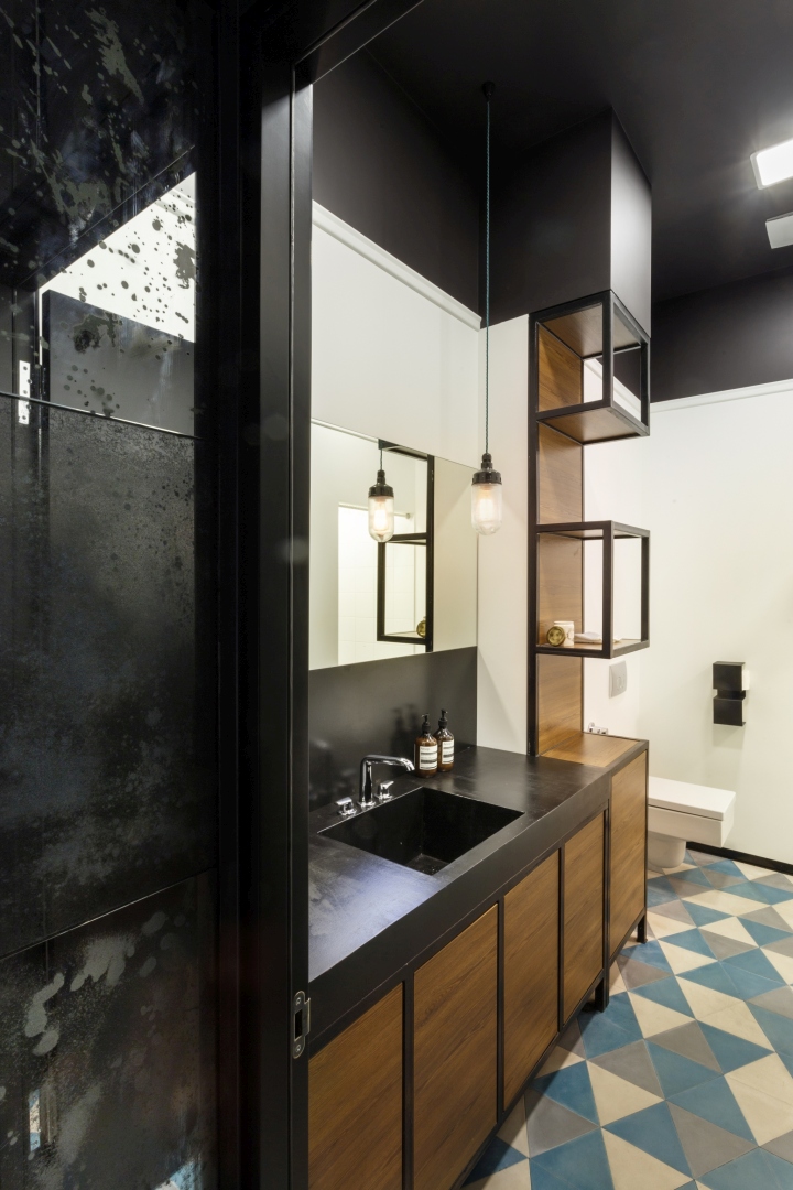
One of the brightest (literally) areas in our office is the hall that leads to the bathroom. At first this was very dull, dark and narrow corridor. To make it look wider we covered both walls with distressed mirrors, lowered the ceiling, painted it black and filled it with light bulbs. Now it’s almost an art installation.
Designed by Circle Line Interiors
Authors of the project: Kate Kuzmenko, Elisabeth Gundych, Olga Vodko, Daniil Naybich, Irina Filon







Add to collection

