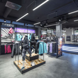
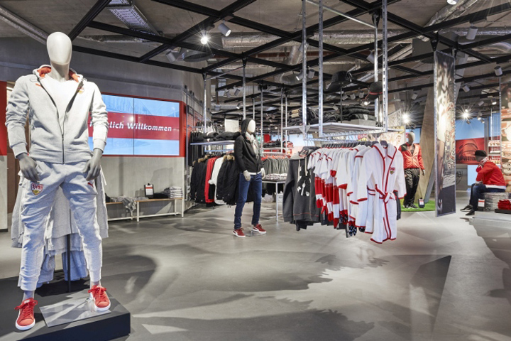

The architecture and interior design firm Blocher Blocher Shops, Stuttgart, has developed a new concept for VfB Stuttgart’ fan center, collaborating with the visual marketing experts at Blocher Blocher View as well as VfB Stuttgart. Following the VfB Shop in Stuttgart’s Mall Milaneo, a new, exciting place for fans has been created within steps of the Mercedes-Benz-Arena. With more space and more light, but also more emotion than ever, the 450-square-meter store tells stories about passion for football and the home team, and about the club’s exciting history.
Stuttgart. The football team VfB is as emblematic of Stuttgart as the TV tower, the Stuttgart Beer Festival, or the Wilhelma. Sincere fans who stand by their club in good times and bad represent the close ties between the club and the city of Stuttgart. And VfB has given them the gift of a new second home, the completely renovated fan center at the Mercedes-Benz-Arena. Blocher Blocher Shops’ interior designers created a genuine stadium feeling with materials, structures, and colours – using emotional messages to appeal to the fans’ feelings of club loyalty.
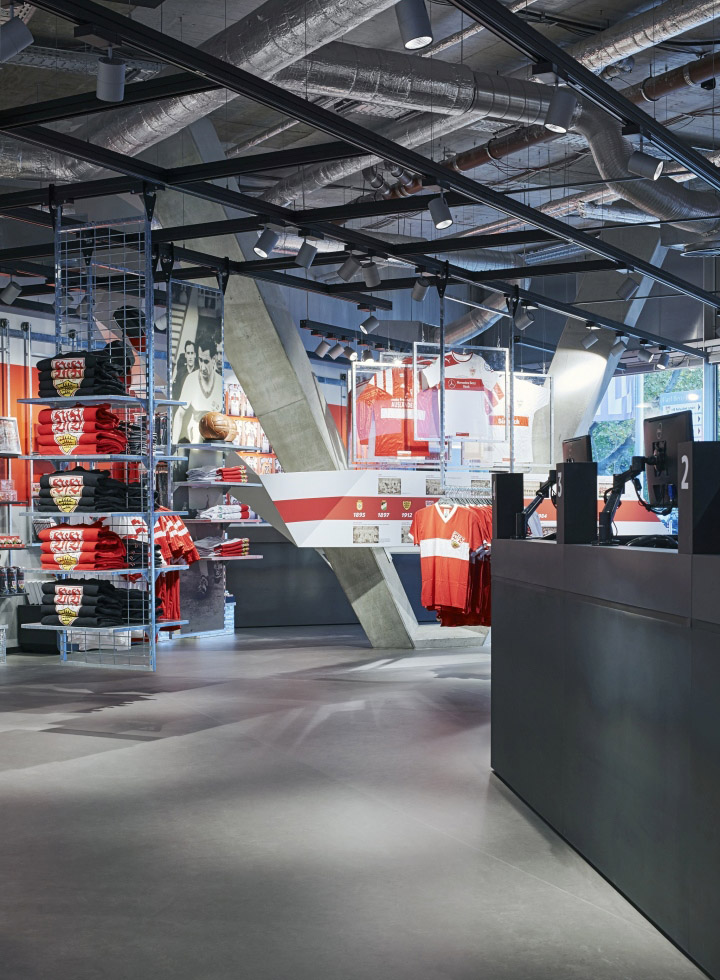
Before the renovation, the sales floor was no longer optimal for handling the crush of fans, especially on days when VfB was playing. So the interior designers began by enlarging the store by 150 to 450 square metres, adding office space that had become obsolete. In addition, they opened up the ceiling, which is now up to 4.50 meters high, and included the windows surrounding the space in the concept to make the sales floor lighter and more transparent. The planners also defined clear entrances and exits to even out the crush of visitors on days when VfB is playing.
The stadium in the store
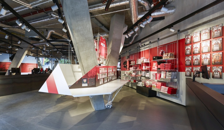
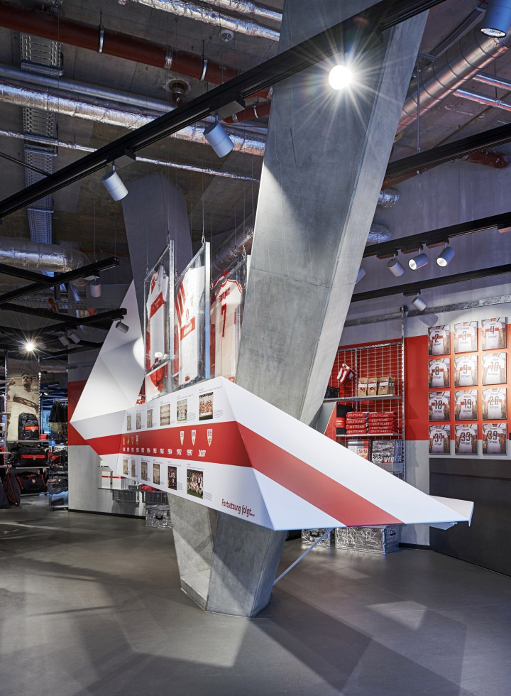
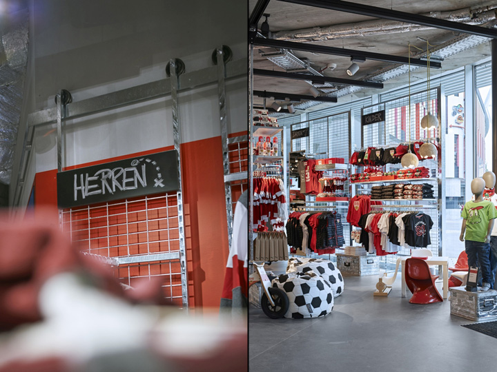
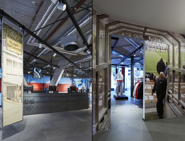
References to VfB’s stadiums are unmistakable in the store. To begin with, there are the characteristic colours: White, grey, and black form the background against which the accents in VfB’s CI red are high- lighted to best advantage. The look of concrete, galvanized metal, or the intentionally staged sports floor- ing, all used in a targeted fashion, are reminiscent of the stadium. The black ceiling grid, which defines the space and becomes denser toward the center of the store as a grid-like mesh, is reminiscent of the roof construction of the Mercedes-Benz-Arena. It enables flexible presentation; exhibitors, signs, emotionally charged graphics or lighting can be rearranged time and again and adapted to the varied flows of customers on days with or without football games. Massive concrete V pillars boldly break through the grid here and there, creating a dynamic space. Arrow symbols were sketched onto the dark grey floor as if with chalk, and grid-like merchandise displays give the walls a rough look.
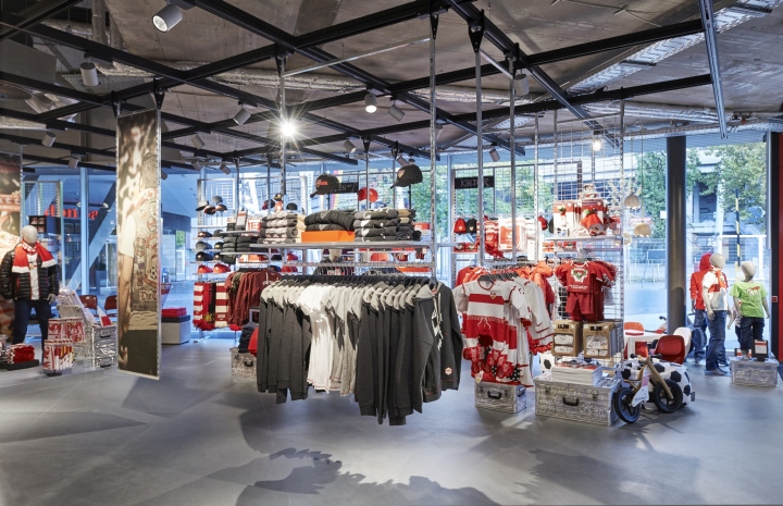
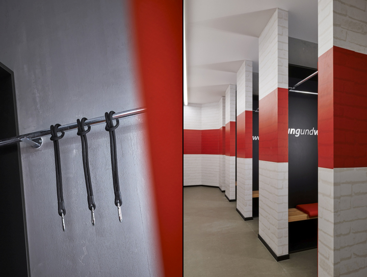
In the middle of the store, the planners created a decorative area with a grass-like carpet, goals, and alu- minium equipment cases; here, fans can put themselves in the shoes of their favourite players. Just like in the changing rooms, which are designed like real locker rooms. From here, a stylized stadium tunnel leads to the sales floor; large-format photos on either side imitate the view from the players’ perspective. Other references to the football arena include the staircase display that is reminiscent of a real stadium and is used for effectively presenting goods; and the original stadium seats that create an authentic atmosphere in the shop. One highlight – literally – is the lighting: The ceiling lamps are reminiscent of floodlights. In the children’s play area, kids will find the VfB mascot, the crocodile Fritzle.

The VfB is always at the center of attention: For example, the VfB team jersey’s red stripe is found in the store. As a two-dimensional graphical element, it extends along the walls as if holding the store together, but also occasionally breaks playfully out of its original form. At those spots, key buzzwords or important dates in the club’s history emerge from the red band. Elsewhere, a wall graphic featuring Stuttgart’s tourist attractions emphasizes the local pride of fans and their club. The club’s history is told along a metal band that is folded origami-like around one of the V pillars. Framed jerseys from years past and exude a nostalgic flair.
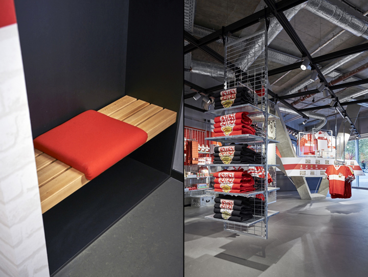
Emotional and welcoming
From the beginning, Blocher Blocher View’s visual marketing experts worked hand in hand with the interior designers and with VfB Stuttgart, for example on developing the storytelling concept. Blocher Blocher View also worked out the initial shelf stock, a challenge because of the unique floor plan in the shape of the arena. The planners decided to divide up the space according to the product ranges to ensure clarity within the diversity of goods. The product groups now extend from the back walls into the sales floor in order to make optimal use of the space. Pathways are oriented along the ceiling grid and are also defined by frames that guide fans intuitively through the diverse product range. Classical seasonal decoration in the store is low-key, since the history of the club and its fans was interwoven with the interior design concept from the start. The stairway display in the foyer and the focal point in the middle of the store leave sufficient room for bringing out a visitor’s emotions.


Add to collection

